Last week I penned that the BLS Jobs Situation Was Strong in November 2014 for the Establishment Portion But the Household Portion Shows Almost No Jobs Growth. The establishment portion showed job gains of 321,000 whilst the household portion showed job gains of 4,000. One question is whether this real discrepancy throws some cold water on the general belief that jobs growth is becoming fairly strong in the USA. Some think any government release is manipulated.
Barry Ritholtz penned Economics, Data and Conspiracy Theories which answers the question of government data manipulation better than I could, stating in part:
Let me remind you that when George W. Bush tried to fire a few U.S. attorneys for political reasons, that secret lasted approximately a nanosecond, eventually leading the U.S. attorney general to resign.
Now imagine trying to keep the purported book-cooking a secret at the BLS, where thousands of economists, statisticians and clerks help assemble all of the regular economic reports.
Ritholtz in this same post talked about the BLS jobs report and not concentrating heavily on any single month - but looking at the trends.
The USA is rather lucky in that there are two government data sets (the household and establishment surveys from the BLS) and a private data set from ADP where operational employment data can be obtained almost in real time. In addition there are several surveys (including NFIB small business and ISM surveys) that provide more information on employment.
Non-Government Data and Surveys
I can understand why some do not trust government data - but I trust NO DATA in isolation. And the data from one month tells you little - it is trend that tell you what is going on. One never knows if there are methodology or sampling errors. Further, there must be independent confirmation or correlation between independent data sets. I specifically distrust surveys (it is generally averages of opinions) but when a survey continues to say the same thing over and over, a certain confidence evolves in the message the survey is telling. Take the ISM surveys.
Institute of Supply Management (ISM) Employment Index - Manufacturing (blue line) and Services (red line)
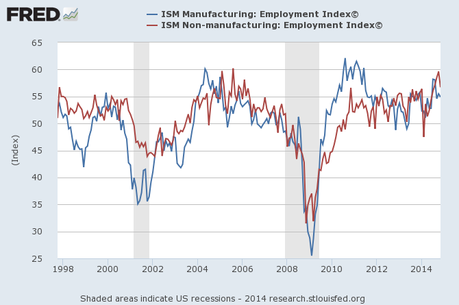
Since February 2014, both ISM surveys have been in an uptrend - but it is interesting to note that both surveys declined moderately in November 2014.
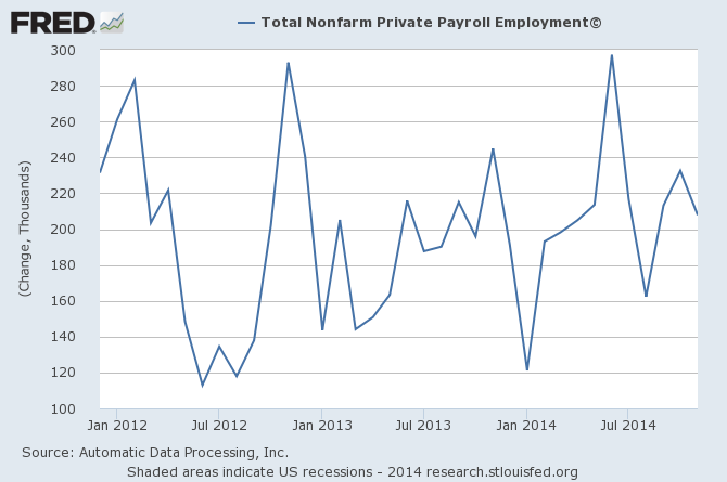
The ADP employment gains also were "less good" in November.
ADP Non-Farm Employment Seasonally Adjusted Employment Gains Each Month
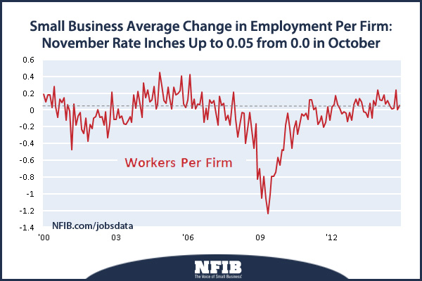
Finally, the NFIB's November Small Business optimism survey did tick up.
Government Data
The BLS produces two independent reports to summarize employment each month - the establishment survey and the household survey. The household survey samples the entire USA population whilst the establishment survey samples non-farm employers. From the BLS:
The Bureau of Labor Statistics (BLS) has two monthly surveys that measure employment levels and trends: the Current Population Survey (CPS), also known as the household survey, and the Current Employment Statistics (CES) survey, also known as the payroll or establishment survey. Employment estimates from both the household and payroll surveys are published in the Employment Situation news release each month.
These estimates differ because the surveys have distinct definitions of employment and distinct survey and estimation methods. (See the comparison of the surveys on page 4.) This report is intended to help data users better understand the differences in the surveys’ employment measures as well as divergences that sometimes occur in their trends.
Both the payroll and household surveys are needed for a complete picture of the labor market. The payroll survey provides a highly reliable gauge of monthly change in nonfarm payroll employment. The household survey provides a broader picture of employment including agriculture and the selfemployed.
Sometimes they say the same things - but usually they disagree. First a look at the seasonally adjusted data simply looking at yearly employment gains (in thousands of persons).
Yearly Growth in thousands - BLS Household Survey (blue line) and Establishment Survey (red line)
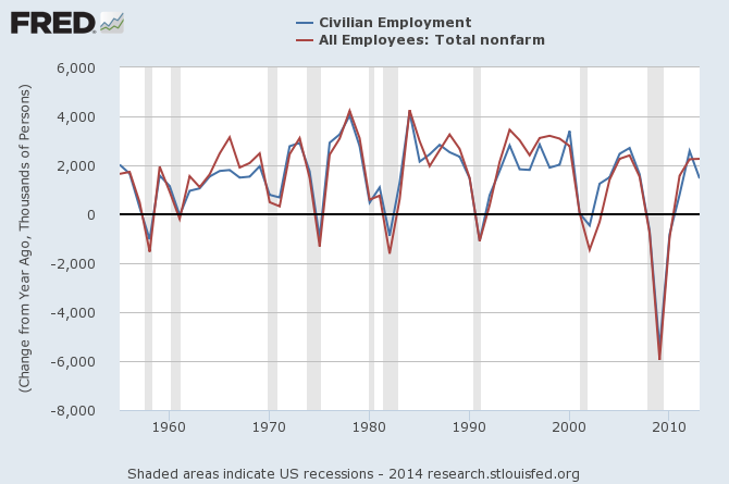
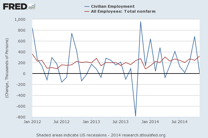
This historical data (graph above) shows that when one looks at total gains in each year - there is a general agreement. The disagreements are in the months the gains occur (graph below).
Monthly Growth in thousands - BLS Household Survey (blue line) and Establishment Survey (red line)
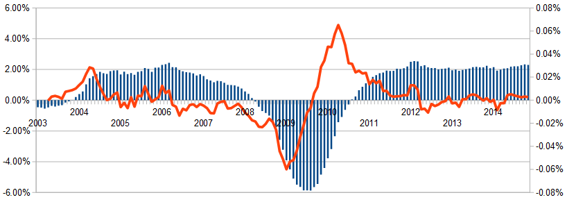
Putting November 2014 headline establishment numbers into perspective - the monthly private sector growth is the highest seen since October 2004 - but the rate of acceleration of growth (red line in graph below) shows a constant rate of acceleration of growth for the last 3 months [translation: the rate of growth has been growing for the last three months - but it did not "spike" in November.].
Unadjusted Non-Farm Private Employment – Year-over-Year Change (blue bars) and Year-over-Year Growth Acceleration / Deceleration (red line)
Preferring to look at year-over-year percentage growth, in November 2014 the growth rates match. And interestingly, both surveys show year-to-date growth at 2.7 million jobs.
Percent change Year-over-Year - BLS Household Survey (blue line) and Establishment Survey (red line)
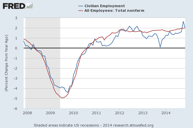
The takeaway from this post is that you cannot totally believe any one portion of the jobs data. The job growth movements every month should be viewed in the big picture - that the rate of jobs growth is slowly accelerating, and that rate of growth is currently around 2%.
Percent change Year-over-Year - BLS Household Survey (blue line), Establishment Survey (red line), and ADP (green line)
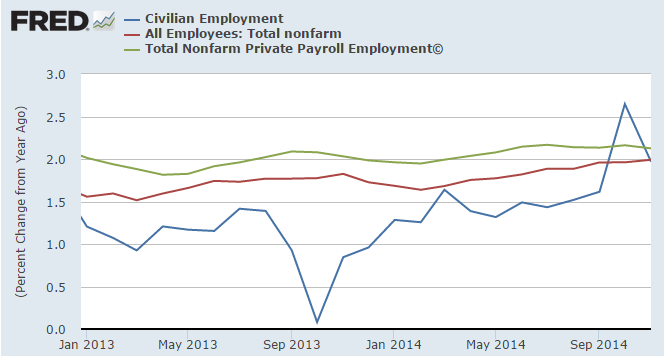
The establishment survey's huge gain for November 2014 stands out as an anomaly - but regardless the evidence shows we are in a period of strong jobs growth. For that matter, the low household survey may also be an anomaly. See special note that follows.
Special note: Most posts on the BLS data reports ignore the sampling error uncertainty which the BLS painstakingly tracks and reports. Generally the BLS reports an uncertainty of the order of +/- 100,000 for the establishment survey and +/- 400,000 for the household survey. So for the latest report the numbers should be recognized as 312,000 +/- 100,000 and 4,000 +/- 400,000. That means that with 90% confidence the maximum possible gain for the two surveys was almost identical (421,000 for the establishment survey and 404,000 for the household survey). It is at the minimum possible gain that the big discrepancy occurs with the establishment survey number +221,000 and the household number near -400,000 (-396,000).
This is an unusual discrepancy and should probably be be attributed to a month where the establishment survey sample was reporting higher than the full population actual value and the household sample was reporting lower than the full population actual. If the establishment sample was reporting one standard deviation high (should happen about 1/6 of the time) then the true total population number would have been somewhere near 250,000.
If the household number was reporting one standard deviation low (again will happen about 1/6 of the time) then the true population number would have been somewhere around 270,000.
The two actual population numbers could be almost identical if these two sampling error distributions actually happened. The chances of such an occurrence are around one month every three years.
It is the lack of understanding of the errors associated with small samples of very large populations that creates much misleading press.
Other Economic News this Week:
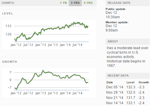
The Econintersect Economic Index for December 2014 is showing our index on the high side of a tight growth range for almost a year. Although there are no warning flags in the data which is used to compile our forecast, there also is no signs that the rate of economic growth will improve. Additionally there are no warning signs in other leading indices that the economy is stalling - EXCEPT ECRI's Weekly Leading Index which is slightly below the zero growth line.
The ECRI WLI growth index value crossed slightly into negative territory which implies the economy will not have grown six months from today.
Current ECRI WLI Growth Index
The market was expecting the weekly initial unemployment claims at 280,000 to 315,000 (consensus 295,000) vs the 294,000 reported. The more important (because of the volatility in the weekly reported claims and seasonality errors in adjusting the data) 4 week moving average moved from 299,000 (reported last week as 299,000) to 299,250. Rolling averages under 300,000 are excellent.
Weekly Initial Unemployment Claims - 4 Week Average - Seasonally Adjusted - 2011 (red line), 2012 (green line), 2013 (blue line), 2014 (orange line)
Bankruptcies this Week: dELiA*s, Lithium Technology
Click here to view the scorecard table below with active hyperlinks
Weekly Economic Release Scorecard
Which stock should you buy in your very next trade?
With valuations skyrocketing in 2024, many investors are uneasy putting more money into stocks. Unsure where to invest next? Get access to our proven portfolios and discover high-potential opportunities.
In 2024 alone, ProPicks AI identified 2 stocks that surged over 150%, 4 additional stocks that leaped over 30%, and 3 more that climbed over 25%. That's an impressive track record.
With portfolios tailored for Dow stocks, S&P stocks, Tech stocks, and Mid Cap stocks, you can explore various wealth-building strategies.

