You can learn a lot just by watching, runs one of Yogi Berra’s baseball-infused proverbs. Let’s take a page from the famed Yankees catcher and redirect it to the ebb and flow of weights in our strategy benchmarks. Can we learn something by watching the to and fro? Yes, or at least there are times when monitoring this data yields above-average insight.
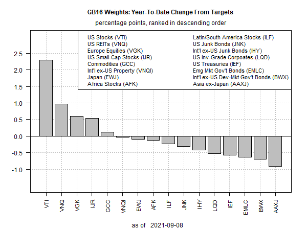
Is now one of those times? Perhaps. Consider our standard 16-fund opportunity set, which is used for our primary portfolio benchmark: Global Beta 16 (G.B16). The strategy is rebalanced to target weights every Dec. 31, which means that the asset allocation is allowed to drift on the whims of Mr. Market throughout the calendar year. How’s that been going? Glad you asked. The chart below summarizes year-to-date results for changes in the weights since the last rebal even at 2020’s close.
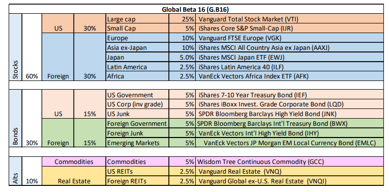
Can you spot the outlier? That would be US equities via Vanguard Total Stock Market Index Fund ETF Shares (NYSE:VTI), which is nearly 2.5 percentage points above its target 25% target weight (see table below for an overview of G.B16’s target weights for all the ETF holdings). In relative terms, that’s a big move.
At the other extreme: stocks in Asia ex-Japan have tumbled, relatively speaking. The iShares MSCI All Country Asia ex Japan ETF (NASDAQ:AAXJ) is nearly a percentage point under its 10% target weight.
What can you do with this information? For an investor who holds the G.B16 portfolio (or something similar), the chart above offers some context for deciding when and where to focus on rebalancing trades. The strategy will automatically rebalance at the end of the year, but tactically minded investors might consider pulling forward that date on the basis of the implied opportunities in the chart above.
The caveat, of course, is that no one knows in real time if a relatively high overweight reflects higher risk within the portfolio context or the market’s conviction to price in a higher allocation based on expectations for higher return. Minds will differ, as they always do on such matters. Nonetheless, investors leaning toward the conservative side of the risk-management scale may want to heed the disequilibrium per the chart above and take some money off the table re: the US equities space.
The markets that are below target don’t look as compelling as the case for trimming US equities, at least not according to the chart above. But in a world of relative change, beggars can’t always be choosy.
In any case, I’ll be updating this chart regularly going forward, along with the equivalent for the other benchmark strategies. Meantime, here’s a summary of all the strategy benchmarks. In addition, here’s last week’s performance and risk update.
Meantime, watch the bouncing asset allocation data.


