A couple of weeks ago, I wrote a post on the Fed’s success, or lack thereof, in meeting its dual targets of 5.5 percent unemployment and 2 percent inflation. The post featured the following “bullseye” chart, which had first come to my attention when Chicago Fed President Charles Evans used it in a recent speech. James Hamilton has since used the same type of chart on Econbrowser. It is a handy graphical device that looks likely to catch on.
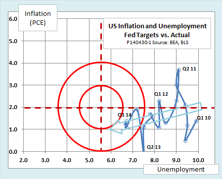
The axes on the chart show the unemployment rate and the inflation rate, as measured by the Fed’s preferred index for Personal Consumption Expenditure (PCE). An alert reader of my post commented that the axes are the same as those for a Phillips curve, yet the recent trend, shown by the arrow, has a negative slope, exactly the opposite of what the classic Phillips curve supposes. What is going on? Whatever happened to the Phillips curve?
What the raw data do (or don’t) tell us
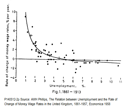
The original paper by A. W. H. Phillips, published in Economicain 1958 (downloadable here) showed an impressively close inverse relationship between inflation and unemployment for the British economy up to World War I, as shown in the next chart. It also noted a similar, if slightly messier, relationship for the interwar years.
However, if we make the same kind of chart for the US economy over the past half-century, we see essentially no correlation. The R2is an insignificant .006 and the faint trace of a trend, if we draw it in, runs in the wrong direction.
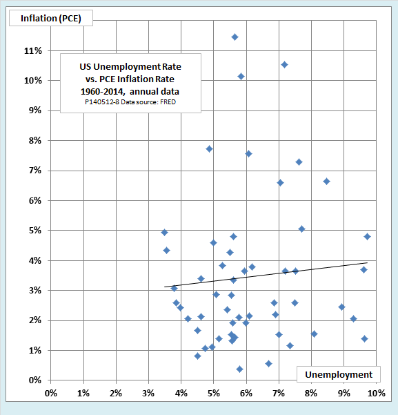
If that had been all there was to see, popular writers, policymakers, and some academic economists would never have seized on the Phillips curve as they did in the 1960s. They never would have declared it a policy menu that allowed policymakers to choose a combination of inflation and unemployment that suited their political tastes. The curve never would have survived for fifty years as a staple of college textbooks. To understand why the Phillips curve made such an impact, and to judge whether there is anything left of it, we have to make a much closer interpretation of the data. Here goes.
The Kennedy-Johnson years
The Phillips curve was at the height of its popularity when John F. Kennedy became president in 1961. Kennedy had been elected on a promise to “get the country moving again.” He and his successor, Lyndon Johnson, set out to do so with the help of some of the best and brightest economists of the day. We can catch the spirit of that self-confident decade in this passage from the 1966 Economic Report of the President, written by a Council of Economic Advisers consisting of Arthur Okun, Gardner Ackley, and Otto Eckstein:
We strive to avoid recurrent recessions, to keep unemployment far below rates of the past decade, to maintain price stability at full employment and indeed to make full prosperity the normal state of the American economy. It is a tribute to our success that we now have not only the economic understanding but also the will and determination to use economic policy as an effective tool for progress.
The result of their efforts at economic stimulus was something that, at least at first, looked very much like the classic Phillips curve, as we see in this next chart:
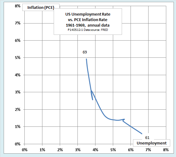
The only bothersome part of the 1960s expansion was the fact that the tradeoff between unemployment and inflation appeared to getting less favorable over time. As that became increasingly apparent, Milton Friedman and Edmund Phelps, among others, proposed an explanation. The the positively sloped Phillips curve, they suggested, is only a short-run relationship. The long-run Phillips curve is better represented as a vertical line at the economy’s natural rate of unemployment. In the Friedman-Phelps version, the short-run Phillips curve shifts up and down along the long-run vertical curve as the expected rate of inflation changes.
The shifting Phillips curve and the stop-go cycle
The next chart shows the dynamics of inflation in a simple version of the shifting Phillips curve model. The long-run Phillips curve is vertical at the assumed natural unemployment rate of 5 percent. The figure includes three short-run Phillips curves, each intersecting the long-run curve at the corresponding expected rate of inflation.
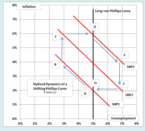
In this simple version of the model, we assume that each year’s expected rate of inflation is equal to the previous year’s observed rate. The observed rates of inflation and unemployment for each year are jointly determined by the position of the short-run Phillips curve and the rate of growth of aggregate nominal demand. Finally, we assume that policymakers alternately apply expansionary measures when they feel political pressure to “do something” about unemployment and contractionary measures when they are pressured to do something about inflation.
Putting all of these assumptions together produces a dynamic in which the economy moves in a clockwise direction around an irregular loop. Starting from equilibrium at point A, with moderate inflation and unemployment at its natural rate, suppose that fiscal or monetary stimulus increases the growth rate of aggregate nominal demand. With inflation expectations still anchored at 2 percent, the economy moves up along SRP1 to point B, where unemployment falls to 3 percent and observed inflation rises to 4 percent.
The 4 percent inflation observed at point B raises the next year’s expected inflation to 4 percent, shifting the short-run curve upward to SRP2. Assuming continued expansionary policy, the economy next moves to point C.
At point C, inflation is a worrisome 6 percent. The government must do something, so it puts on the fiscal and monetary brakes. However, the economy can’t simply slide back down along SRP2, because the 6 percent inflation observed at point C has shifted the short-run curve upward again to SRP3. Instead, contractionary policy pushes the economy across to point D. We get the dread “stagflation” scenario where unemployment rises even as the rate of inflation remains stubbornly high.
If the authorities have the political fortitude to stick to a contractionary policy, they can eventually purge the economy of inflation. In the next year, the economy would slide down along SRP3 to point E. At that point, observed inflation is finally less than expected, so the short-run Phillips curve begins to shift downward. In theory, skillful policy could steer the economy back to a soft landing at point G, right where it started.
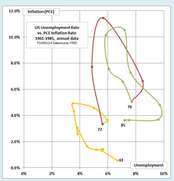
Simple though it is, the inflationary dynamics of this model correspond remarkably well to the behavior of the US economy over the two decades following Kennedy’s inauguration. The next chart plots the actual data. The main difference between the historical pattern and the stylized version is that the loops of the historical stop-go cycle seem to drift upward over time. A reasonable explanation would be that policymakers react more rapidly and more strongly to political pressures to reduce painfully high unemployment than to subsequent pressures to reduce unwanted inflation.
The Great Moderation
Just as it seemed that the stop-go cycle with an inflationary bias might become a permanent feature of the US economy, vindicating the shifting Phillips curve model, the picture changed. The US economy entered a 20-year period now known as the Great Moderation. As the next chart shows, during that period the unemployment and inflation rates stayed remarkably close to the bullseye defined by the Fed’s current targets of 5.5 percent unemployment and 2 percent inflation.
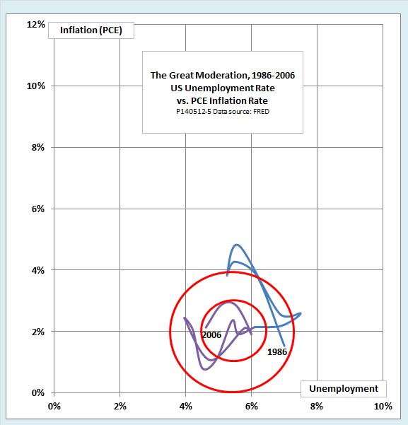
During the Great Moderation, the looping stop-go cycle so evident in the 1960s and 1970s becomes both diminished and more irregular. It is hard to tell if the Phillips curve has disappeared entirely in this period, but if it is still there, its effects seem to be obscured by random shocks. The correlation of inflation and unemployment is faintly positive and the R2of just .025 is insignificant.
From the Great Moderation to the Great Recession
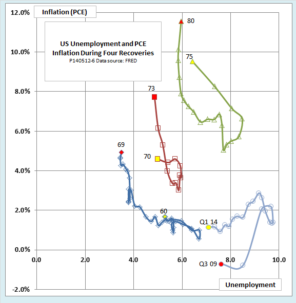
The Great Moderation ended with the Great Recession, which began in late 2007. The next chart compares the most recent data to the behavior of the economy in the 1960s and 1970s. To sharpen the focus, this chart differs in two ways from our earlier ones. First, it shows quarterly rather than annual data. Second, it shows data only for the trough-to-peak phases of the business cycle (recovery and expansion), leaving out quarters in which GDP decreases. Because the main purpose of the chart is to compare the recent expansion with those of the 1960s and 1970s, when the shifting Phillips curve model was clearly operating, it omits the four cyclical recoveries between 1980 and 2006.
The three earlier cycles are similar in certain ways that we can explain easily in terms of the shifting Phillips curve model.
First, the earlier recoveries all begin with a phase during which the rate of inflation begins to fall while the unemployment rate is still rising. In the shifting Phillips curve model, that pattern can occur when tight fiscal and monetary policy restrain the growth of aggregate nominal demand while falling inflation expectations are shifting the short-run Phillips curve progressively downward. According to the model, the rate of unemployment should still be above the natural rate during this phase of the recovery, as it appears to be. The CBO estimates that the natural rate rose from about 5.5 percent in 1960 to about 6.5 percent by 1980, which would explain the rightward drift in the first three recovery tracks shown in the chart.
Second, in each of the three early cases, inflation and unemployment both begin to rise no later than seven quarters into the recovery. The subsequent segments are the ones that look superficially like classic negatively-sloped Phillips curves, but are better explained as the result of expansionary policy acting on a short-run Phillips curve that is shifting upward under the influence of rising inflation expectations. The shifting-curve model suggests that unemployment should fall below its natural rate as inflation accelerates, which seems generally consistent with the data.
Good data on inflation expectations for the 1960s and 1970s would bolster the shifting curve model as an explanation of the patterns followed by the three early recoveries shown in the chart. Unfortunately, data on expectations for those years is skimpy. In an attempt to fill the gap, a recent study by Jan Groen and Menno Middeldorp of the New York Fed attempts to construct a proxy series for inflation expectations that reaches back to the 1970s. Their reconstruction is consistent with the notion that inflation expectations fell in the early part of the recovery of 1975 to 1980, but it does not go back far enough to cover the two earlier recoveries.
Let’s turn now to the recovery from the Great Recession, which began in mid-2009. Its pattern is very different. As in the early cycles, the unemployment rate lags behind GDP and continues to rise in the first few quarters of the recovery. However, in this case, the rate of inflation rises, rather than falling, in the early part of the recovery. It does not reach its mid-recovery peak of 2.9 percent until the third quarter of 2011.
During the whole period from Q3 2009 to Q3 2011, unemployment is far above its natural rate. It is impossible to produce the combination of rising inflation together with unemployment that is both rising and above the natural rate with a simple shifting Phillips curve. In that model, unemployment can be above the natural rate only if the observed rate of inflation is less than the expected rate, and that, in turn, would cause a steady downward shift of the short-run Phillips curve from quarter to quarter. Under those circumstances, either the unemployment rate or the inflation rate would have to fall from quarter to quarter.
After Q3 2011, the current recovery takes a different direction. From then until the most recent observations, the trend has been falling unemployment combined with falling inflation. It is technically possible to produce that result in the shifting Phillips curve model if we combine an unemployment rate initially above the natural level, falling inflation expectations, and demand management policy that is gradually becoming more expansionary. A few short segments seem to fit that pattern during the earlier cycles, most notably the period from the fourth quarter of 1975 through the fourth quarter of 1976.
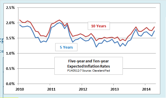
The problem is that there is no evidence of falling inflation expectations in the most recent period. If anything, as the next chart shows, inflation expectations have been gently rising from mid-2011 to the present. Without falling inflation expectations, the shifting Phillips curve model is incapable of producing a sustained period during which both the inflation rate and the unemployment rate decrease.
The bottom line
This post began with the question, What ever happened to the Phillips curve? We now have our answer.
The classic stationary Phillips curve—the version that people once optimistically viewed as a stable policy menu—died long ago. Already by the end of the 1960s, the Friedman-Phelps shifting Phillips curve model had taken its place. In our simplified version, that model has these four components:
-
A vertical long-run Phillips curve
-
A negatively sloped short-run Phillips curve that intersects the long-run curve at the expected rate of inflation
-
An expected rate of inflation primarily determined by observed inflation in the recent past
-
Aggregate nominal demand as the determinant of the economy’s position along the short-run Phillips curve that applies at any given time
When we combine these assumptions with fiscal and monetary policies that react to alternating political pressures to do something about unemployment and then do something about inflation, the shifting Phillips curve model produces a stop-go cycles very much like observed from the early 1960s through the mid-1980s.
After that, even the shifting version of the Phillips curve runs into trouble. Its usefulness begins to fade already during the Great Moderation, and it becomes altogether incapable of producing the pattern of inflation and unemployment we see during the first five years of the recovery from the Great Recession. The reason appears to be a breakdown of two of its key principles, first, that unemployment higher than the natural rate can occur only when inflation is slower than expected, and second, that inflation persistently slower than expected must cause a downward revision of expectations.
Instead, what we see during the past five years is persistently high unemployment combined with low and stable inflation expectations and a falling observed rate of inflation. If the Phillips curve is not dead, we must at least declare it in a persistent vegetative state from which it will not awaken without some radical change in circumstances.
