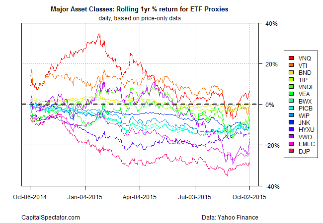
Robeco’s Lukas Daalder has a bit of an issue with rolling-performance graphics. Bashing a recent chart of 1-year price returns on these pages that profiled ETF proxies for the major asset classes, he charges that “this information is useless to anyone with any sense.” Oh, dear. That sounds like trouble. Has your editor led you down a dead end? Apparently. “So if the people who compiled the graph were hoping to draw our attention to any one particular issue, they have failed,” Daalder asserts. But failure sometimes has a way of turning into success, or at least it did in this case. After advising that there was no value in a chart of rolling 1-year returns of funds representing the major asset classes, he adds that this information “still tells us something.”
Is it a useful something? That’s a reasonable conclusion, suggests Daalder, who goes on to investigate the topic that he just dismissed, namely, the unusual sight of across-the-board losses (in price-only terms) in the global capital and commodity markets at one point in September. He claims that “the information is poorly presented,” yet “the underlying message is worth explaining.” Success! In fact, the chart “gives a pretty good picture of what has been happening in the financial markets in the recent past.” Hmmm, maybe rolling one-year performance data isn’t analytical garbage after all.
Well, of course. That’s the point. A rolling 1-year performance graph is no silver bullet for analyzing the markets, but as a quick tool for profiling the directional bias for a set of assets it’s useful first step. There’s no reason to focus exclusively on 1-year results, of course, although it’s a decent starting point because the historical window straddles the midway point between short- and medium-term horizons.
To be fair, rebased performance indexes, which Daalder apparently prefers, have a productive role too. Agreed, which is why they also routinely appear on The Capital Spectator—last week’s review of US equity sector ETFs, for instance.
The one thing you can’t (or at least shouldn’t) do with a rolling return chart is confuse it with indexed performance data. Daalder’s advice that the rolling performance graph “would have been clearer if the lines had actually started at 0%” is a bit perplexing. Returns, after all, should usually be viewed as dispensed by Mr. Market.
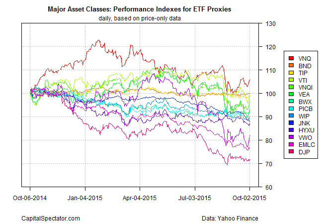
In any case, returns and performance indexes are distinct but in some ways complimentary. Reviewing both sides of this coin is a step up from looking at just one or the other. On that note, let’s update last month’s offending post and add a chart of rebased return indexes for comparison. As before, I’m using price-only data here, which is to say prices that exclude dividends and other distributions. No doubt someone reading this will go off the deep end and recommend that total return numbers are preferable. In some cases, that’s correct. But price-only comparisons aren’t exactly chopped liver. For example, if you’re interested in a cleaner measure of the crowd’s appetite (or the lack thereof) for an asset in the marketplace, there’s a case for tracking demand in price-only terms. Yes, total return figures deserve close attention as well, but sometimes they’re not appropriate.
But I digress. For now, let’s stick with an apples-to-apples comparison for continuity with the previous post. In the first chart below we can see that the price-only returns in some cases have turned slightly positive in recent days. In particular, real estate investment trusts (REITs) are again sitting on a modest gain—6.5%–for the trailing one-year period through Oct. 2, based on the Vanguard REIT ETF (VNQ). (In total-return terms, VNQ’s trailing one year return is even higher, courtesy of dividends–roughly +10.8%.)

Now let’s shift gears and look at how the same set of ETFs stack up in a performance chart that’s rebased at a starting value of 100 for all the funds at Oct. 5, 2014 closing prices. As the second chart shows, this view offers a slightly different perspective. The graph tells us how $100 investments in each fund fared through the sample period (before factoring in dividends and distrbutions).

Is one perspective better than another? Maybe, depending on the agenda, but that’s not the same thing as saying as one or the other is junk. What’s beyond debate is that each chart is providing different information that’s worthy of review. The rolling 1-year return data is useful because it provides context for assessing the state of price momentum (or the lack thereof) in one fell swoop across a range of asset classes. This isn’t the only way to measure momentum. But this definition of momentum is a bit harder to see in the rebased performance chart. That said, if you’re interested in comparing how a set of investments fared as a buy-and-hold strategy, the second chart above is superior.
To restate the obvious, there are many ways to slice and dice market activity. Minds will differ on where the greatest analytical value lies for a given task. But one thing is clear: rolling return charts can be beneficial. They’re far from the last word on market analysis, but they’re hardly useless.
