The Federal Reserve’s FOMC meeting minutes were released earlier this week indicating many (few, majority, most, all?) members were leaning towards terminating some aspects of the current quantitative easing (QE) purchases sooner rather than later.
….A few participants noted that they already viewed the costs as likely outweighing the benefits and so would like to bring the program to a close relatively soon. A few others saw the risks as increasing fairly quickly with the size of the Federal Reserve’s balance sheet and judged that the pace of purchases would likely need to be reduced before long.
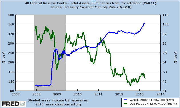
This conjured up images of market volatility, yet the markets reacted positively. So much for the belief that this market run up was on the back of QE, and effectively disproving a withdrawal of QE is necessarily market negative. The following graph points the the low correlation between market prices and QE.
While it is true they both the markets and FOMC balance sheets are rising, they are not in sync – and from an analytical standpoint it is hard to claim QE is the only dynamic (or even the driving dynamic) in the market run up. And pay attention on the above graphic to the market drop at the beginning of the latest round of QE beginning in late 2012. Mr. Market does not believe there is a correlation – and other dynamics may be in play (such as inflows from foreigners escaping European financial investments).
More from the FOMC meeting minutes:
Many participants, including some of those who were focused on the increasing risks, expressed the view that continued solid improvement in the outlook for the labor market could prompt the Committee to slow the pace of purchases beginning at some point over the next several meetings, while a few participants suggested that economic conditions would likely justify continuing the program at its current pace at least until late in the year.
In this portion of the FOMC minutes, only a “few” participants (assuming “few” is less than a majority) want the current QE programs to go unchanged until the end of the year. This means this drama will continue – the following is the schedule for 2013 of the FOMC meetings where decisions are made on QE.
April/May 30-1
June 18-19
July 30-31
September 17-18
October 29-30
December 17-18
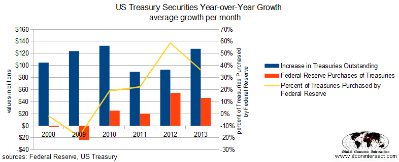
Logically, QE might have a larger impact on treasuries. Although here too the correlation is far from perfect, with QE removing bonds from the public sector at the rate of $80 billion per month. One would think that removing a $80 billion buyer would generally cause the yields on the entire bond market to rise (as fewer buyers are purchasing bonds). 
Focusing on Treasuries only, consider that since 2012 the Fed has been purchasing around half of all new Treasuries issued. In the graph below, the Treasury information for 2013 is for January and February only, and has been averaging a little over $40 million per month.
To replace the current rate of Fed’s QE Treasury purchases, $40 billion new money monthly is needed. In perspective, the USA household sector over the last 4 years has only contributed $20 billion per month to all financial assets including equities (including value of financial asset appreciation). There will be little support from the household sector – leaving the vast majority of the $40 billion to the financial sector and foreigners. And foreigners appear to love treasuries, and with the turmoil in Europe causing inflows – now may be the best time to end QE.
Is there a bottom line? Is it possible for forecast the effect of the end of QE on the financial markets? If the USA put up a huge financial fence around the borders, the ending of QE would trigger negative dynamics across the financial markets. But, as I have been complaining about QE from the beginning, the dollar is THE global currency – and monetary policy for the dollar flows out of the USA – and has marginal impact within the borders.
At this point QE may be a nearly worthless endeavor.
Other Economic News this Week:
The Econintersect economic forecast for April 2012 improved marginally, and is now in a zone which says the economy is beginning to grow normally. There are some warning signs that our interpretation is not correct – but we will see how these play out in the coming months. Not to end on a negative note, the majority of pulse points are improving.
The ECRI WLI growth index value has been weakly in positive territory for over four months – but in a noticeable improvement trend. The index is indicating the economy six month from today will be slightly better than it is today.
Current ECRI WLI Growth Index 
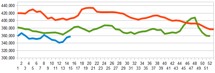
Initial unemployment claims fell from 385,000 (reported last week) to 346,000 this week. Historically, claims exceeding 400,000 per week usually occur when employment gains are less than the workforce growth, resulting in an increasing unemployment rate (background here and here).
The real gauge – the 4 week moving average – slightly worsened from 354,250 (reported last week) to 358,000. Because of the noise (week-to-week movements from abnormal events AND the backward revisions to previous weeks releases), the 4-week average remains the reliable gauge.
Weekly Initial Unemployment Claims – 4 Week Average – Seasonally Adjusted – 2011 (red line), 2012 (green line), 2013 (blue line) 
Bankruptcies this Week: Central European Distribution, Rotech Healthcare
Data released this week which contained economically intuitive components (forward looking) were:
- Rail movements which are mixed.
- Is ending of Quantitative Easing a negative dynamic?
Weekly Economic Release Scorecard:
Click here to view the scorecard table below with active hyperlinks

