You've heard it for some time now: the global economy is finally showing signs of improvement - especially over the past year or so. Most economists and central bankers cite a slew of stats to justify their optimism: Nonfarm payrolls, nominal and real GDP, consumer confidence surveys, employment statistics, the producer price index.
The list goes on and on.
I'll admit, scouring the endless stream of economic metrics released every other week isn't an exciting way to spend your downtime.
Instead, there's a simple shortcut to tracking the health of the global economy, courtesy of free markets.
It's called the gold-to-copper ratio.
On the surface, gold and copper prices don't seem to bear a direct relationship to each other. Yet this simple ratio is one of the untold wonders of market analysis. Want to know how the global economy is doing? Let this simple indicator do the talking.
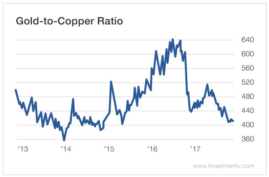
This week's chart shows the gold-to-copper ratio over the past five years.
The gold-to-copper ratio tells us how many ounces of copper it takes to buy 1 ounce of gold. The less copper it takes to buy an ounce of gold, the lower the ratio. The more copper it takes to buy gold, the higher the ratio.
But the secret to understanding this ratio is not its current value. What's much more important is the directional trend of the chart.
A rising gold-to-copper ratio shows a weakening economy, while a declining ratio shows a strengthening economy.
Now, judging from the above chart, we see a sharp economic turnaround that began in the middle of 2016. The gold-to-copper ratio has been dropping steadily since then; a simple and reliable sign of a strengthening global economy.
To be fair, an economy that's building momentum isn't the same as an already robust economy. There's still a lot of progress that needs to be made. Even still, this simple indicator does tell us that the macro picture is getting brighter for global markets.
The Market's Doom-and-Gloom Indicator
To really understand the gold-to-copper ratio, you must understand its components.
Gold is well-known as a safe haven asset. Investors like gold when market pessimism runs high. Since gold prices are not intimately tied to stock prices, holding gold can help weather turbulent financial downturns.
In contrast, investors tend to sell their gold holdings when market optimism is stable and stock gains are red-hot. For that reason, I like to think of gold as a doom-and-gloom indicator.
And if gold is Dr. Doom, then copper is Dr. Boom.
Copper is not only an important base metal for industrial uses but also a well-known indicator of global economic health. Here's why: Copper is used heavily in many sectors of the industrial economy. It's found in everything from TVs, computers, cars and wristwatches to houses, bridges and roads. As a result, the demand for copper - and other base metals - reflects whether an economy is growing or slowing. As industrial demand for copper rises, prices also rise. That signals a strengthening economy. But when demand drops, prices slump. That signals a weakening economy.
Since copper's low at the start of 2016, prices have surged as much as 66% - more than double gold's price at its peak performance.
The bottom line is this: Copper's outperformance over gold signals a positive outlook for economic growth going forward.
It's a great example of how the laws of supply and demand can help you foresee and strategically invest in developing trends in the economy.
Based on those laws, the gold-to-copper ratio can provide a reliable snapshot of the future.
