The nascent recovery of new and existing home sales may be losing some steam.
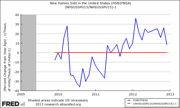
- New home December 2012 sales were the worst year-over-year gain in 2012.
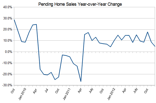
- Pending Home December 2012 index was the worst year-over-year gain in 2012. Pending home sales are counted when a purchase agreement is signed for an existing home.
What is being seen is a cooling of the growth in home sales. The evidence at this point is not strong, and could be argued it might be a transient effect.
Defining the Effect
First a look at pending home sales (graph below), there was a drop in the index in December 2012.
New home sales also had a drop in the December Data. Could this drop be a sporadic month of data (one month is not a trend).
Year-over-Year Change – Unadjusted New Home Sales Volumes (blue line) with zero growth line emphasized (red line)
These observations change when three month rolling average of data is used to smooth out the data and make trends more noticeable. Here it is obvious new home sales are in a six month down trend, while the down trend in pending home sales is there but not obvious at first glance because of a smaller slope value.
3 Month Rolling Average of Year-over-Year Growth of Pending Home Sales (blue line) and New Home Sales (red line)
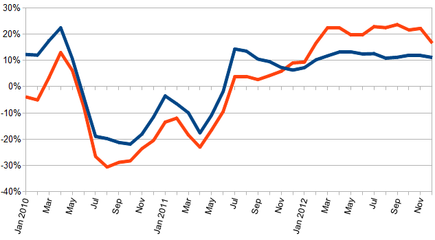
Using 3 month averages, any change in the graph is a trend. Note that the turning points are similar in pending homes and new home sales.
Playing With Possibilities
The most likely possibility is changing seasonality. Home sales seemed to have gotten on track in 2012 and become fairly predictable. Maybe the fiscal cliff or bad weather kept buyers away from houses more in 2012 than in previous years.
Maybe a piece of the puzzle lies in the continuing decline of inventory of homes for sale.
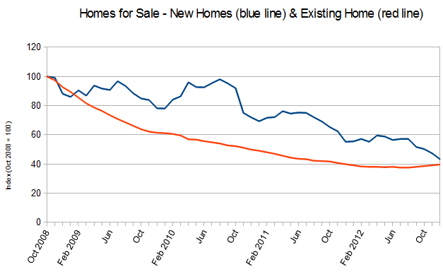
This continuing decline in inventory has been puzzling. Without inventory, there are not enough homes for sale. So there is no doubt there are not enough sellers. The question is why.
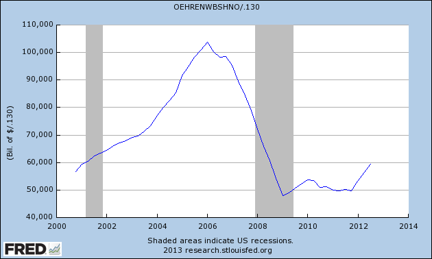
The average for equity in a home has fallen almost half. This means fewer existing owners can bring enough money for a new mortgage, or if cashing out – fewer have enough money to close after paying expenses. The graph below shows existing home equity divided by 130 million homes. In most cases, a seller would become a buyer of another home but fewer sellers can get in that position. So they sit and wait.
It will be interesting to see how home sales plays out in 2013. However, the dynamics which are in play are slowing improvement in home prices and flat per capita income. Slowly growing mortgage interest rates may also provide a drag – 2013 home sales year-over-year growth may be closer to zero than double digits.
Other Economic News this Week:
The Econintersect economic forecast for February 2012 continues to show weak growth. The underlying dynamics have a whiff of improvement – but the zinger in the data was a supply chain contraction. However all the recession markers have evaporated, and one of our alternate methods to validate our forecast remains recessionary (but still only slightly so). Basically, we are saying that not enough products (crude, intermediate, and finished) were moved for sales or manufacture in February.
ECRI now believes a recession began in July 2012. ECRI first stated in September 2011 a recession was coming . The size and depth is unknown. The ECRI WLI growth index value has been weakly in positive territory for over three months – but in a noticeable improvement trend. The index is indicating the economy six month from today will be slightly better than it is today.
Current ECRI WLI Growth Index

Initial unemployment claims fell marginally from 368,000 (reported last week) to 366,000 this week. Historically, claims exceeding 400,000 per week usually occur when employment gains are less than the workforce growth, resulting in an increasing unemployment rate (background here and here).
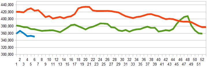
The real gauge – the 4 week moving average – fell marginally from 352,000 (reported last week) to 350,500. Because of the noise (week-to-week movements from abnormal events AND the backward revisions to previous weeks releases), the 4-week average remains the reliable gauge.
Weekly Initial Unemployment Claims – 4 Week Average – Seasonally Adjusted - 2011 (red line), 2012 (green line), 2013 (blue line)
Bankruptcies this Week: General Automotive Company, America West Resources, Sino-Forest Company
Data released this week which contained economically intuitive components (forward looking) were:
- Rail movements are somewhat improving looking at the 4 week average, but longer term trends are still declining.
Weekly Economic Release Scorecard:
Click here to view the scorecard table below with active hyperlinks.
