The High Yield Corporate Bonds ETF (NYSE:HYG) is at an interesting juncture.
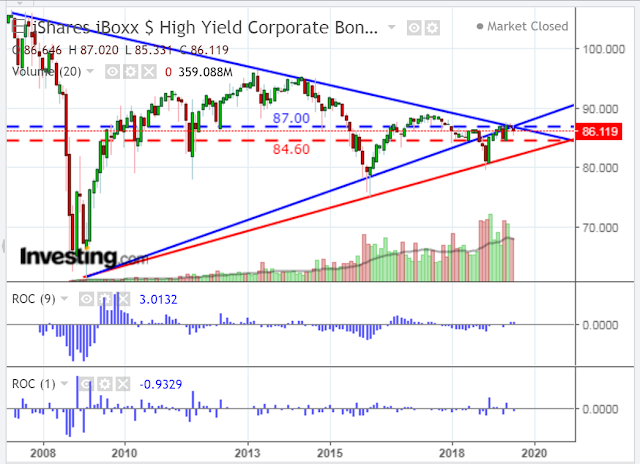
There are, potentially, two uptrend lines that one could apply to form a large long-term triangle pattern on the following monthly chart. In turn, two possible triangles and two apexes emerge.
Price has been bouncing in between both apexes (and the upper edge of this triangle) since February of this year. Attempts to fully break out and move higher have failed repeatedly since then.
In the short term, I’m more interested in the upper apex (blue) because the price, once again, sits outside and below the smaller triangle, while it’s still inside the larger one.
I’ve added the rate-of-change (ROC) indicator in two formats. The input value of the first one is the default nine-period length, while I’ve changed the input value on the second one to a short one-period length.
If price breaks and holds above this upper apex, I’d monitor the second ROC indicator in the near term to see whether there is a sustained acceleration (above its zero level) to confirm support for continued buying. At the moment, it is accelerating to the downside below the zero level.
Otherwise, if it holds below this upper apex, price may decline to the lower apex, or lower, especially if the second ROC continues to accelerate on the downside.

Chart powered by TradingView
