Tonight I would like to take a look at the US dollar as it's been showing a little strength lately. Over the last month or two I’ve been showing some commodities indexes that have been very weak, which I think has to do with the strengthening US dollar.
The move up in the US dollar hasn’t been that big yet, but the reserve currency could be in the beginning stages of a rally phase that could send this index higher. How high is anyone’s guess, but any strength will have an impact on the commodities sector and possibly the precious metals complex. It has been a while since we looked at the US dollar so let's take a look under the hood and see what we can make of the reserve currency.
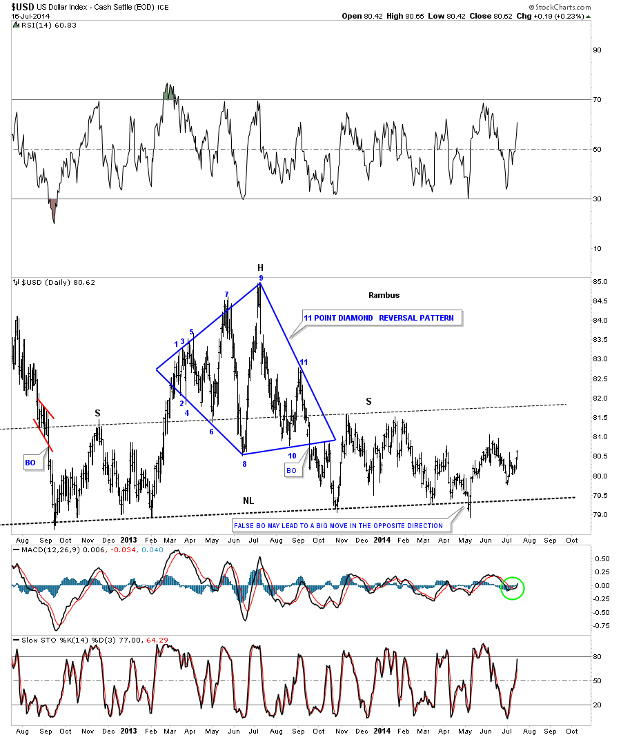
The first chart I would like to show is a long term daily chart we were watching very closely back in May of this year. At the time, it looked like the US dollar was building out a massive H&S top formation. As you can see, the neckline was broken to the downside but quickly reversed direction and rallied back up above the neckline. At the time I said that was probably a very bullish development. When you get a false breakout like that and the price action reverses quickly, that is generally a sign of exhaustion. So far that has been the case.
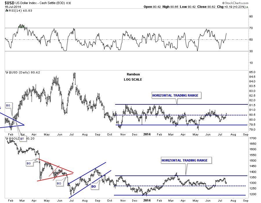
The daily dollar chart is really quite boring for the short term as there aren’t any good chart patterns to be seen at this time. The longer term daily chart does show a big horizontal trading range going all the way back to November of 2013, which corresponds with a similar sideways trading range for Gold. It’s not perfect but you can see the inverse movements between the US dollar and Gold. If you look at the last month of trading for both the US dollar and gold, on the combo chart below, it’s very clear that they are moving in the opposite direction.
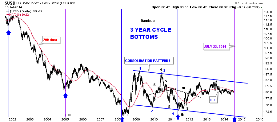
This next chart, for the US dollar, is one I’ve been following for many years. It shows a three year cycle low that comes around like clockwork. It’s hard to believe that the next three year cycle low is due on July 22 of this year. Please notice the three year cycle low in 2008 and 2011, each of which coincides pretty closely to important tops in the PM sector. Are we going to experience the same thing again three years after the 2011 cycle bottom? It’s something I’m keeping a very close eye on.
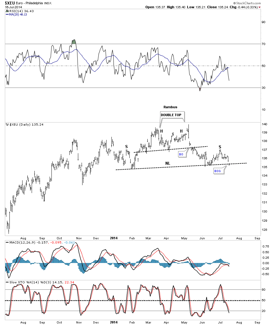
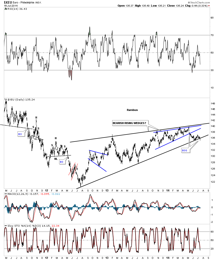
If we’re going to look at the US dollar, we need to take a close look too at the Euro-Philadelphia Index (XEU) as the euro is the biggest component in a basket of stocks for the dollar. Unlike the daily chart for the US dollar, which doesn’t have a decent short term daily pattern in play, the euro does. It looks like the euro broke out of a H&S top yesterday, with a small gap. This could be an important top that has just formed. I’ll show you why below.
Below is a very long term chart for the euro, which shows two bearish rising wedges, one inside the other. Notice the last bar on this chart. It’s the same small gap that accompanied our little H&S top on the chart above. Now you can see why this is such a big deal. If the euro starts to drop precipitously it will have a positive affect on the US dollar which will have a negative impact on the commodities complex.
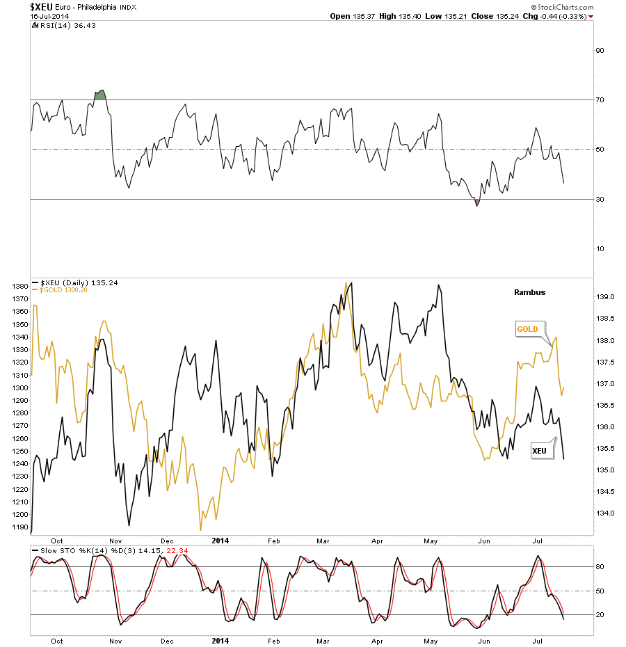
In this next chart, I’ve overlaid the euro on top of gold so you can see the similar correlation. Again it’s not perfect by any means but it does give you a sense that when the euro is strong or weak so is gold. You can do the same thing with the other important currencies and get a similar result. Again, something I’m keeping a close eye one.
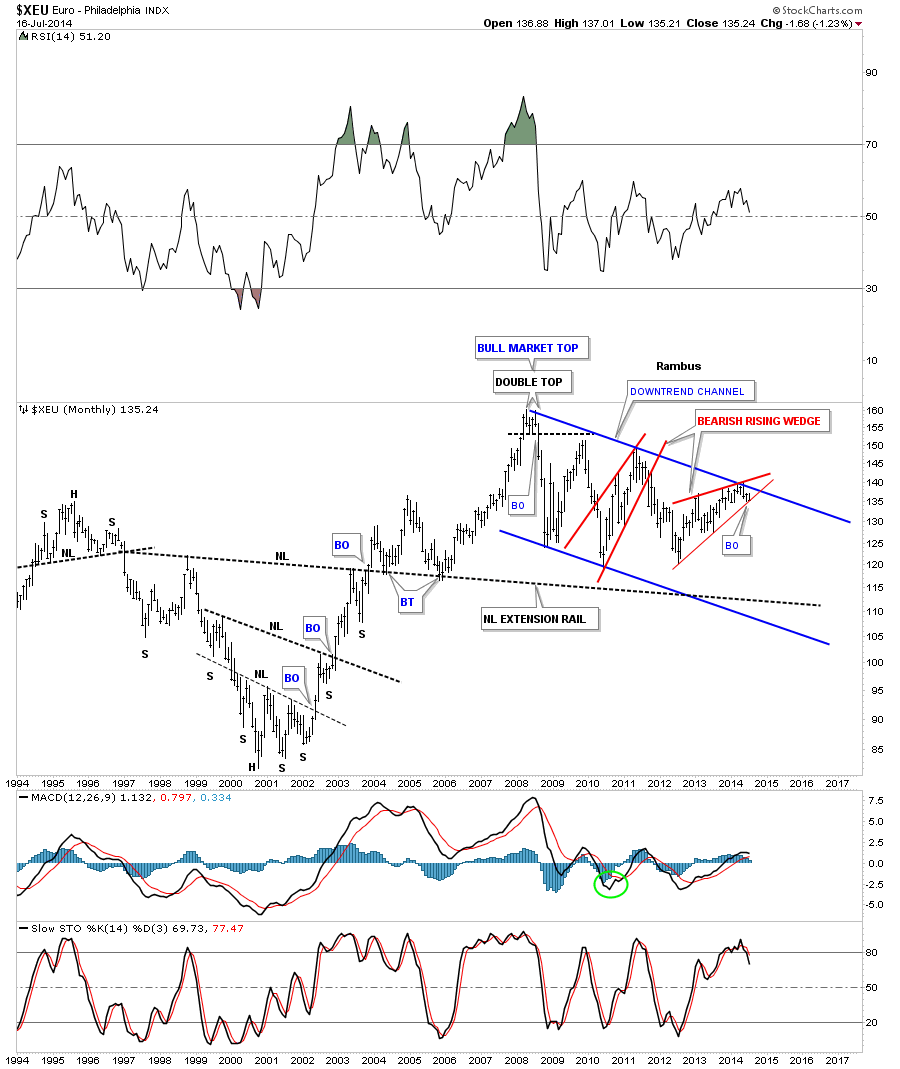
This last chart is a very long term monthly look that shows you just how precarious the euro situation is. I showed you a bearish rising wedge for the euro earlier in this post, which just broke the bottom trendline yesterday with a gap. This is the same bearish rising wedge only on the monthly view. You can't see the gap on this chart, but the daily chart does show it’s now breaking the bottom trendline. This could be a very big deal.
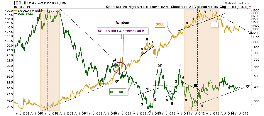
Below is a very long term chart in which I’ve overlaid gold on top of the US dollar. This chart clearly shows you the inverse correlation over the long haul. It doesn’t look or feel like it, but the inverse correlation has been pretty good since the commodities complex topped out in 2011 along with the US dollar bottoming about the same time.
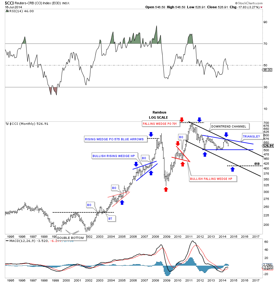
Below is the CCI Commodities Index which we’ve been following and has been showing weakness since the approximately the beginning of the year.
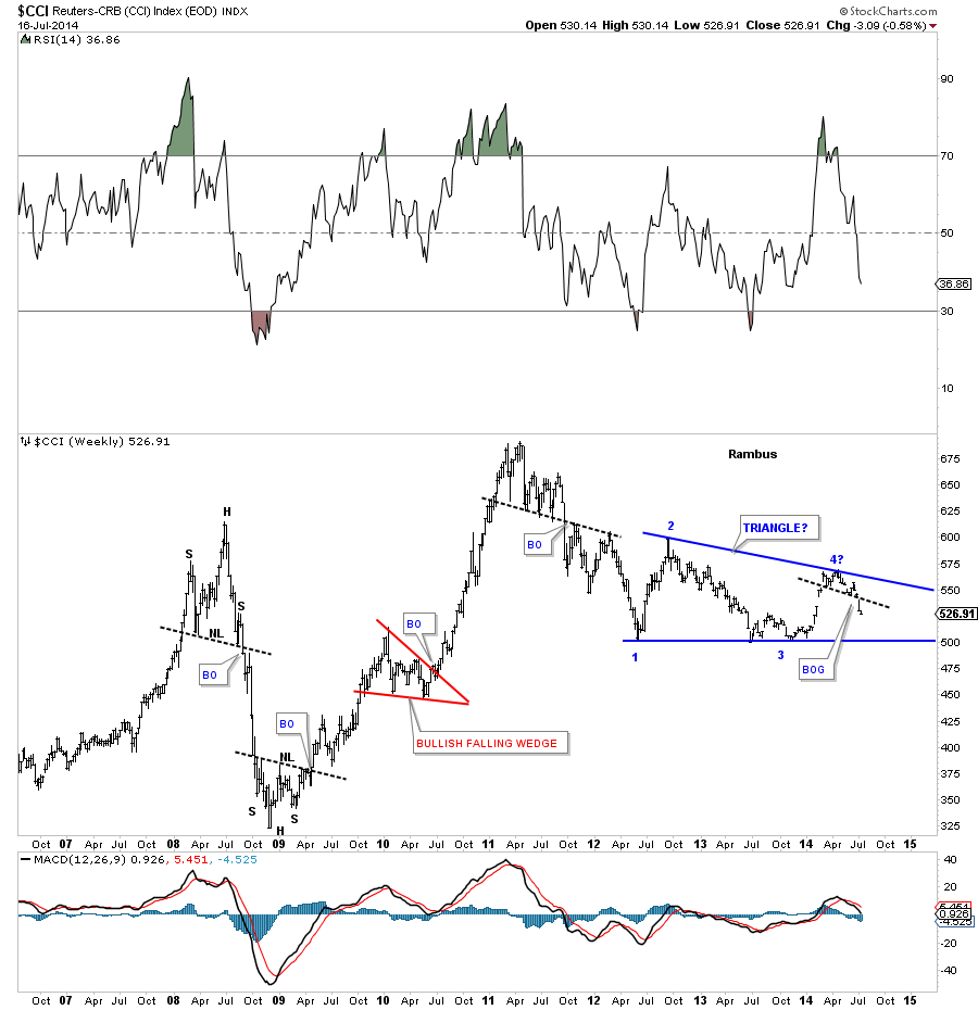
CCI monthly view:
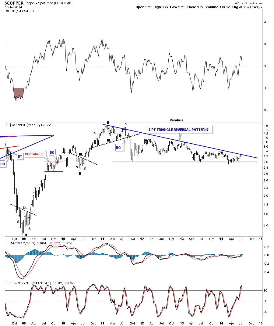
Let's take a quick look at Copper to help give us direction, since it’s one of the more important commodities. As you can see, it has been building out a massive triangle pattern that started to form way back in 2011 when the commodities complex topped out. It’s now testing the top rail which would be the 7th reversal point if it holds, which would make this triangle a reversal pattern to the downside.
On the other hand, if it breaks out through the top rail, that would be very bullish for the various global economies.
The US dollar is at a critical juncture right here and right now. Based on the XEU, which is just starting to break down, this would imply that the US dollar will show strength in the coming months.
The weakness in the commodities complex has already shown up, which is suggesting deflation is more pronounced than inflation at this moment. There are areas of strength in the commodities, such as the industrial metals, which have been doing pretty well, but other areas like agricultural are doing very poorly.
The million dollar question: How will the precious metals complex fare? Will it buck the trend and move to the beat of its own drummer? We will know the answer to that question only in hindsight. Right now we have to be ever so vigilant and keep looking for clues that may help us understand the answer to that question.
DISCLOSURE: This has been prepared solely for information purposes, and is not an offer to buy or sell or a solicitation of an offer to buy or sell any security or instrument or to participate in any particular trading strategy. The information presented is for general information purposes only. Although every attempt has been made to assure accuracy, we assume no responsibility for errors or omissions. Examples are provided for illustrative purposes only and should not be construed as investment advice or strategy. The information presented herein has not been designed to meet the rigorous standards set by the Commodity Futures Trading Commission for disclosure statements concerning the risks involved in trading futures or options on futures. That disclosure statement must be provided to you by your broker. The materials in this site do not attempt to describe the risks to investors that may be associated with the way trading is conducted in any particular options market or in any market for an underlying or related interest.