The run-up in the price of Tesla (NASDAQ:TSLA) stock has been fun to watch as few stocks have been able to replicate such a move in such a short period of time. The questions now become: Has Tesla run too far too fast? Can the stock keep up this level of momentum? Yes it can, but history suggests that’s a very difficult hill to climb.
Rather than guess how many electric vehicles they can sale or how many windows they can throw rocks at, I’m interested in the charts. I’ve gone back to 1995 and looked at many prior large cap stocks that have made a similar parabolic trend higher. This is not an exhaustive list, I pulled out some that were a result of a massive single day gap higher and/or didn’t reflect a similar trend length that lasted more than just a handful of days.
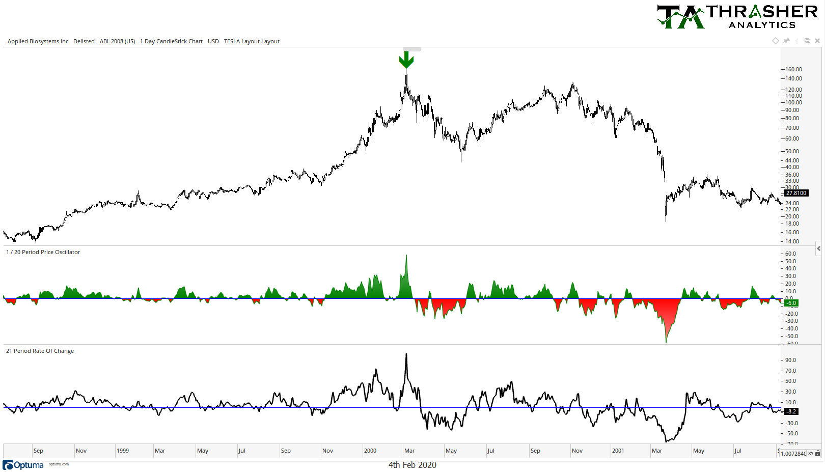
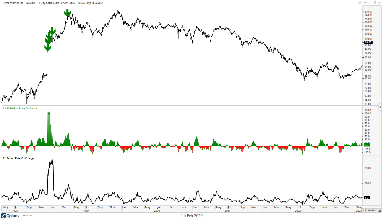
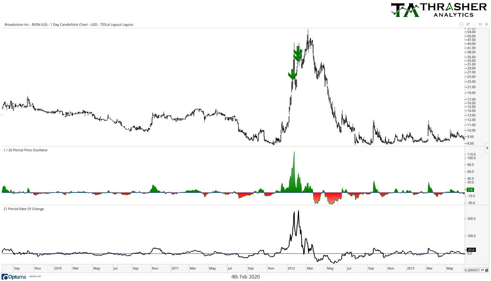
I’m going to show many of them below and you’ll see a common pattern:
-Few are able to continue the trend higher (a couple did)
-Many of them occurred during the heyday of the tech bubble during the late 1990s, where many stocks were making incredible runs. I’d argue this isn’t such an environment today.
My objective was not to try and find analogs of Tesla’s latest move. Some stocks that hit my screen replicated a similar run in a longer period of time, others shorter, some went up by a larger percent, others not as much. There are many ways to slice up Tesla’s impressive chart, what I describe below is just one such method.
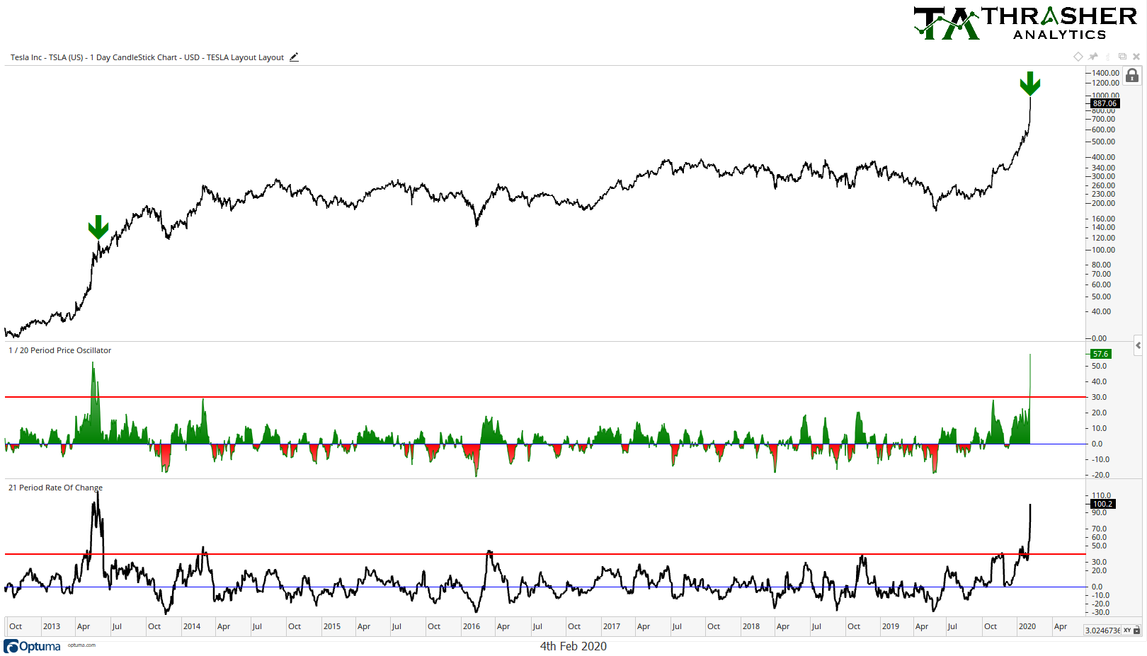
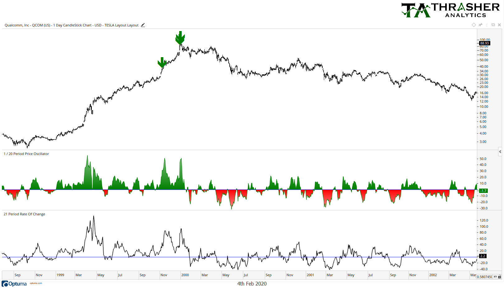
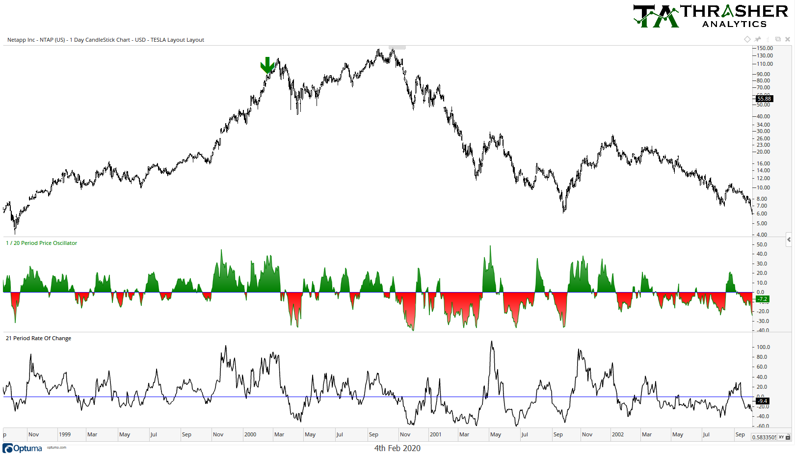
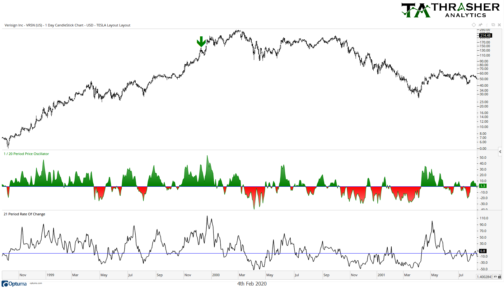
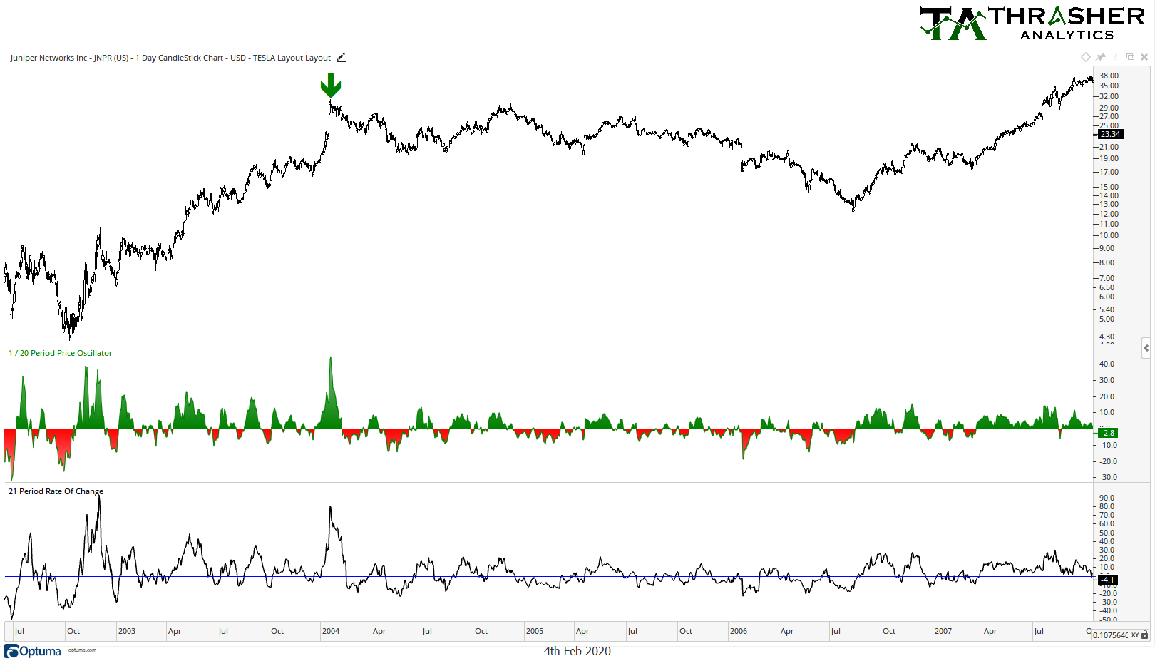
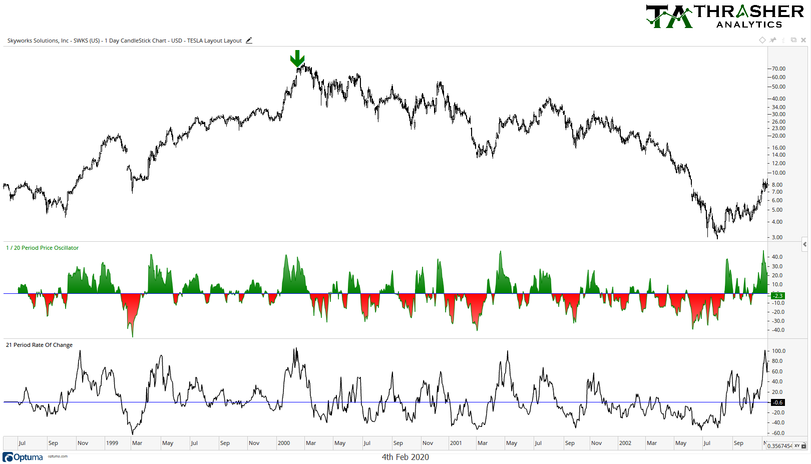
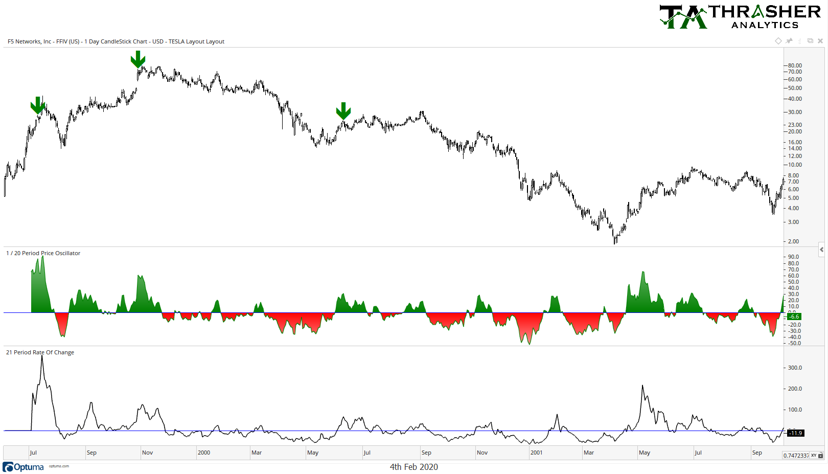
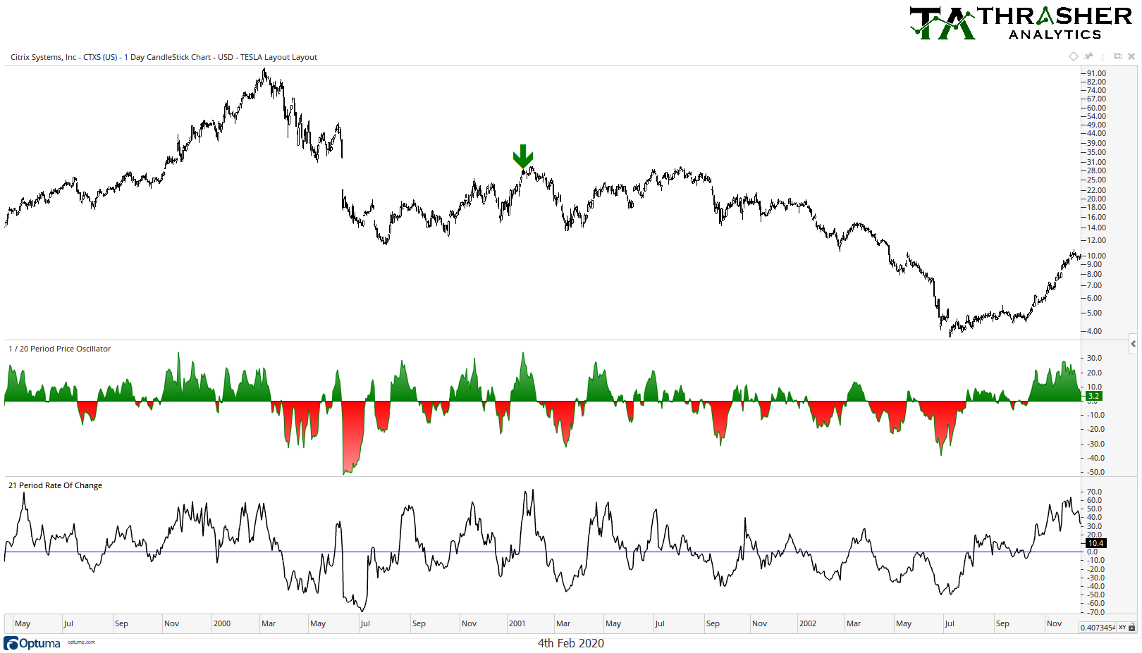
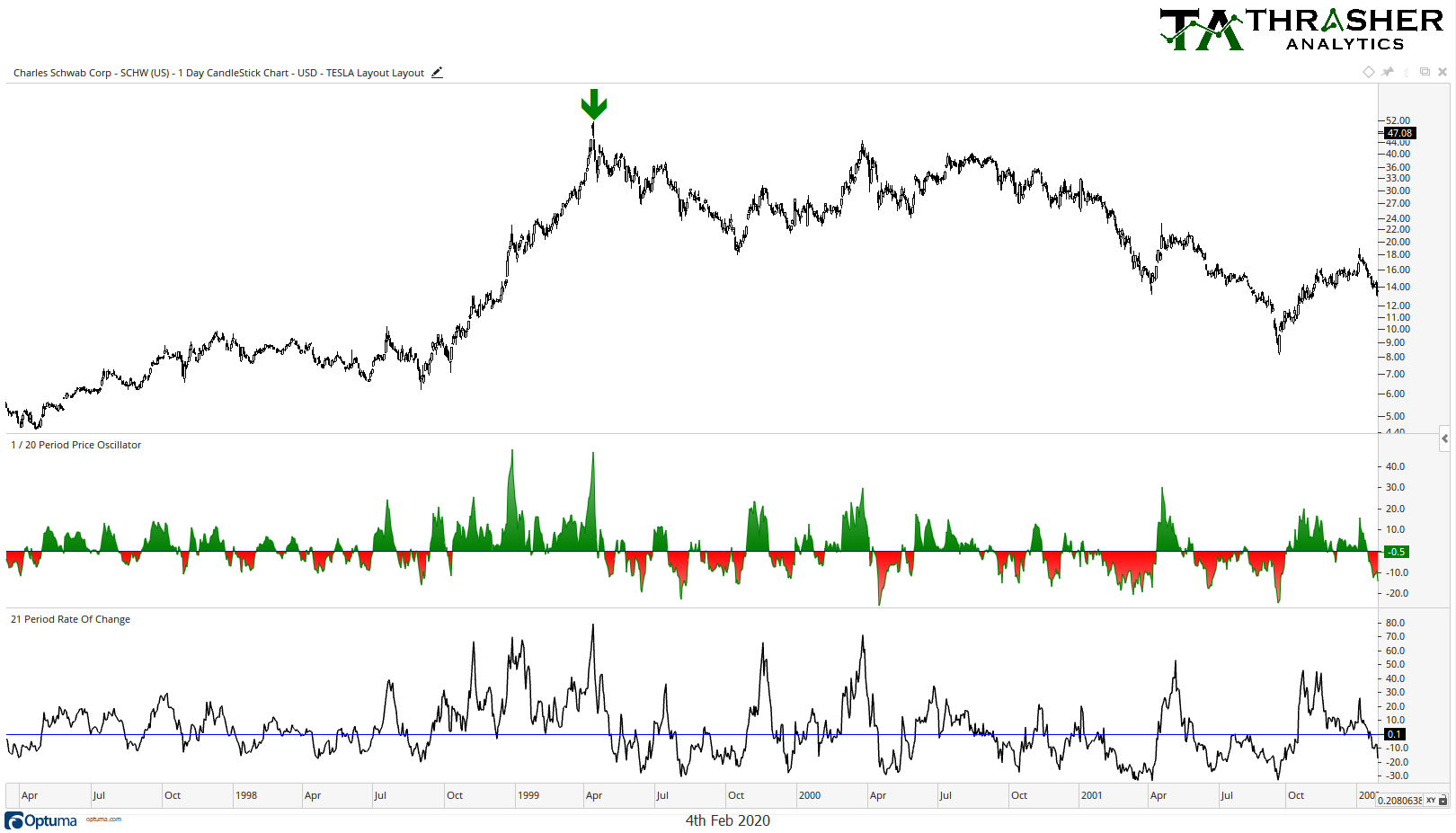
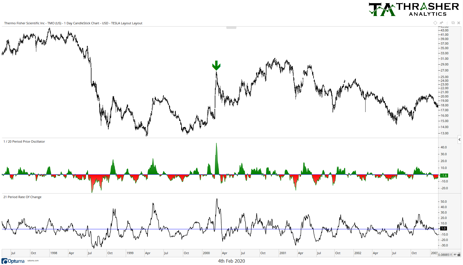
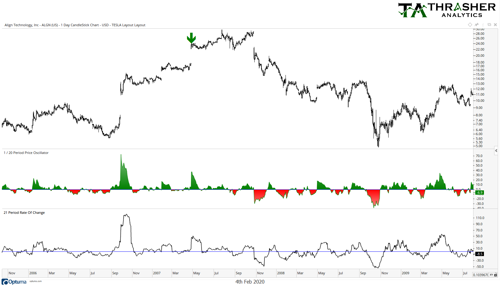
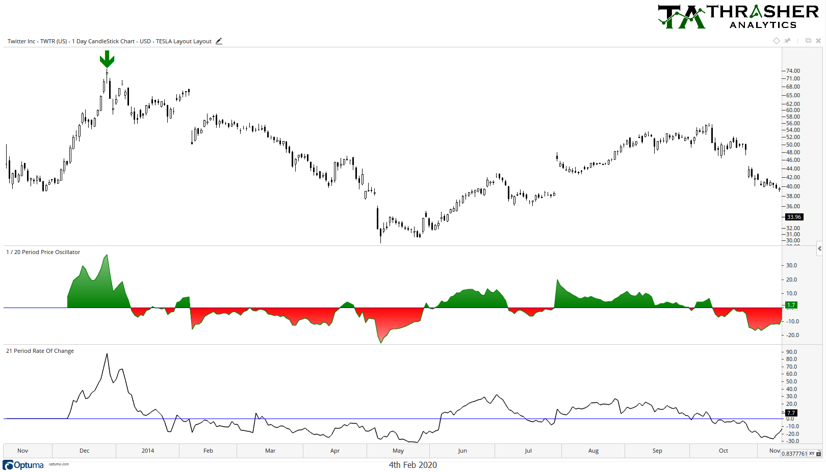
First, I ran a study that looked for stocks that met the below criteria (green arrows mark on the chart when the criteria was met):
-The stock is trading above $20 per share
-Had two back-to-back gaps higher (open > prior day’s high)
-The stock is trading 50+% above its 20-day Moving Average
-The stock did not have a recent IPO (many stocks experience parabolic-like moves after coming to market, not a fair comparison to what Tesla’s done).
– The stock has risen at least 100% over the last 21 days
Unsurprising, this drew just a few results, so I relaxed the study a bit and set the bar at ‘just’ 30+% above the 20-day MA and 40+% 21-day return. You’ll see on the charts below that some were able to keep moving higher a little while longer, some peaked immediately but what stands out to me is that most were unable to keep the trend and once it broke, sellers jumped all over it.
The two gaps and the fact that it’s run up 100% in one month is what made me begin to question the sustainability of Tesla’s trend and interested in looking for similar chart setups over the last 25 years. The Tesla chart will be one few will forget and likely end up in future editions of investment books, but if history is our guide, the charts suggest we could see Tesla’s chart come back to earth first.
Full Disclosure: I do own a position in Tesla (NASDAQ:TSLA) options in my personal account.
Disclaimer: Do not construe anything written in this post or this blog in its entirety as a recommendation, research, or an offer to buy or sell any securities. Everything in this post is meant for educational and entertainment purposes only. I or my affiliates may hold positions in securities mentioned in the blog. Please see my Disclosure page for full disclaimer. Connect with Andrew on Google+, Twitter, and StockTwits.
