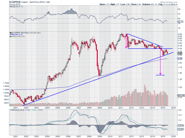
The year is almost halfway over and it is time to check in on some important charts going back to the beginning of the year. One of these is copper. At the beginning of the year copper looked to be in big trouble. It had just broken down from a descending triangle pattern and was testing long term trend support.
Roll forward six months and the worst has not happened. But the picture does not look any better either. The chart below tells the story.

Starting in January the price of copper bounced off of that 14 year rising trend support line. And it continued higher. That imaginary line worked again. Go figure. The RSI turned higher as well, bouncing off the oversold level at 30. And the MACD bottomed and turned back up towards a cross.
But none of that goodness lasted long. The price seems to have found resistance upon a retest of the breakdown price. The RSI is turning back lower, and the MACD has avoided a positive cross and is heading lower. A dead cat bounce. With the Measured Move to 1.40 still in place, it does seem that copper is still hanging on by a thread, or a thin copper wire.
Disclosure: The information in this blog post represents my own opinions and does not contain a recommendation for any particular security or investment. I or my affiliates may hold positions or other interests in securities mentioned in the Blog, please see my Disclaimer page for my full disclaimer.
