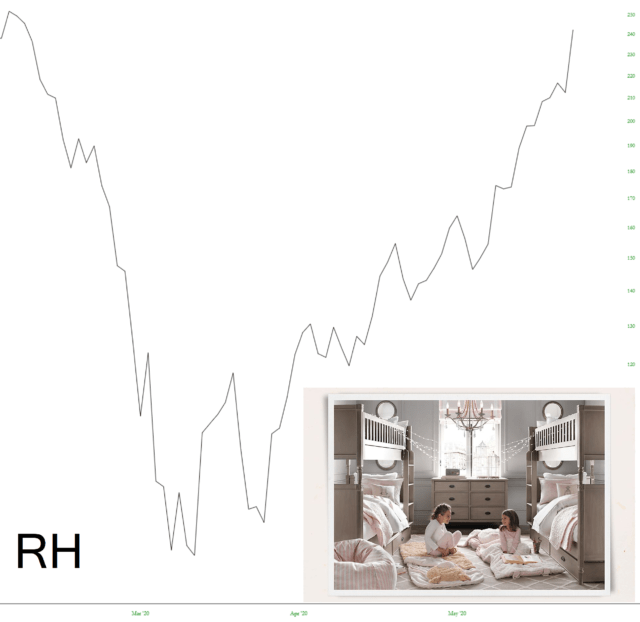
There are plenty of good candidates, but allow me to offer as the Poster Child of this insane 10-week run-up a stock known as Restoration Hardware (NYSE:RH)

Most of you probably know this retailer, but they sell home furnishings with what I would suspect are exceptionally high mark-ups. The stock plunged from around $240 to $70 and, thanks to JPow, is around $240 again. It’s like nothing ever happened.
One might suspect that with 20% unemployment, a nation on fire, and retail stores closed for the past three months, a seller of overpriced furniture might not exactly be thriving. But the stock market is bitterly divorced from reality, and although sales of {{|RH}} are surely through the floor, enthusiasm about stocks–any stocks–is through the roof.
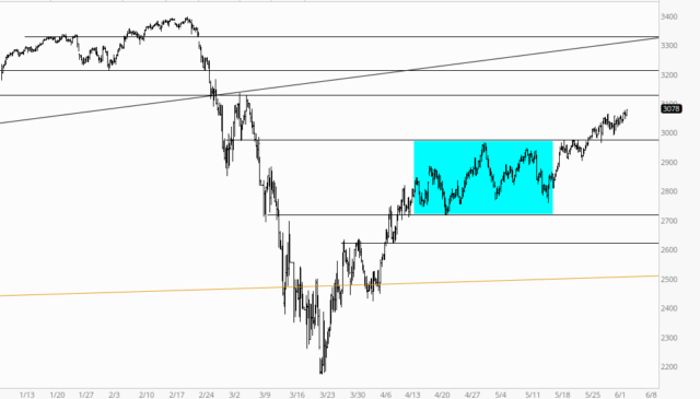
The last, best hope for a renewal of selling was cruelly aborted on May 14th (I don’t even have to look up the date; it’s burned into my skull). For many weeks, we had been shaping out a powerful reversal pattern, but thanks to our wealth-transfer chieftains in D.C., it was slashed to ribbons. We’ve been going up every single day ever since. It’s vomit-inducing.

Now, in all honesty, I don’t want my role to be dishing out whatever thin gruel I can possibly muster for any surviving bears so they can cling on to some hope that even a hint of an organic market might re-emerge. Hell, I’ve been exposed to that kind of mission by way of our friends in Gainesville for years on end now, and it’s kind of stomach-turning.
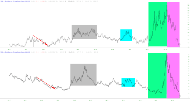
I would, however, like to share an interesting tidbit by way of the ultra-short Russell chart whose symbol is TWM. Here is my analog (and, for crying out loud, surely I don’t have to mention you can click on it for a huge version):

What this is showing is two specific periods of time which, I believe, have a tremendous amount in common. What it illustrates, by way of those green and magenta tints, is the explosive run-up in the value of TWM (when the market was collapsing) followed by an absolute obliteration of all those gains.
The bottom portion of the analog is recent history, up until today, whereas the upper portion is during the financial crisis. What’s interesting to me is that the end of the analog matches New Year’s 2009, at which time there was still about ten weeks of punishment remaining for small caps.
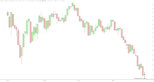
I have illustrated this below with the chart of the $RUT leading up to the new year (peak of the chart) down through the early March 2009 bottom.

I’ll say once again how my focus remains on product development and my participation in this joke of a “market” is extraordinarily light. I am down to a mere 30 positions, with a whopping 120 in my Bear Pen. Fine specimens, one and all, but in this environment………….I just can’t.
