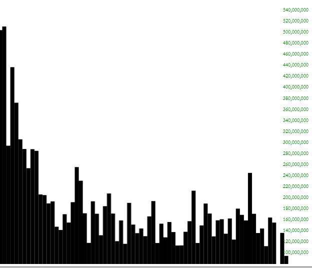
Does the market seem dull to you? It’s not your imagination. Just take a look at the volume of the SPY. We have gone from an organic, price-discovering market to one which just goes up half a percent, day after day, based on “trade talk optimism”. Apparently volume isn’t necessary:
Using the spiffy new version of SlopeCharts, I pulled down a bunch of ETFs (click on any for a bigger version). They are below and I’ve caption each of them with a few words. They are each marked as Green (bullish), Red (bearish), or Yellow (unclear).
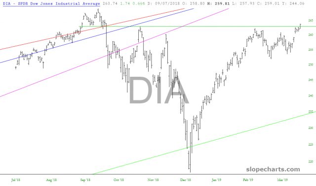 Green: The DIA it has pushed above its neckline. It’s up to Friday’s job report at this point.
 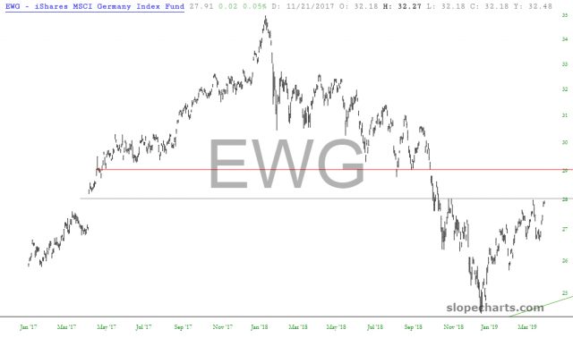 Red: Germany is coming up against important resistance, but if it clears that first horizontal, the next target (the higher horizontal) is more formidable.
 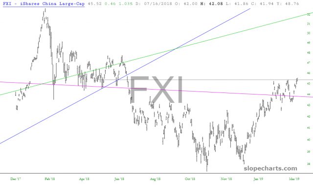 Green: China has completed a cup with handle pattern
 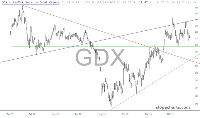 Green: Precious metals miners have formed a powerful base
  Yellow: HDGE, the fund that shorts stocks, has reached a lifetime low (understandably).
 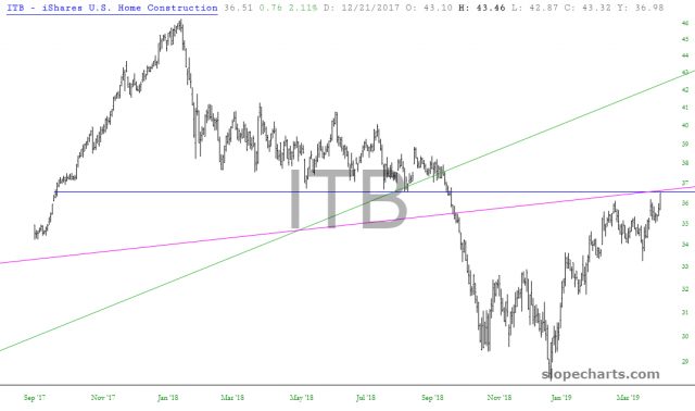 Red: Home construction is mashed up against two importance resistance lines
 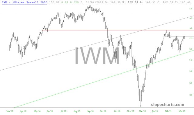 Yellow: Small caps have been lagging the large caps; the red line is key resistance
 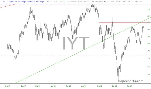 Yellow: iShares Transportation Average (NYSE:IYT) have been weaker than industrials; the price gap is still intact.
 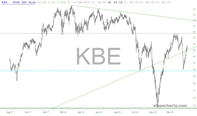 Red: QQQ - as long as the “lower lows” stay intact
 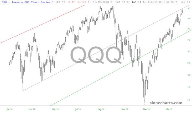 Yellow: SMH - that trendline represents important resistance, and earnings season is coming
 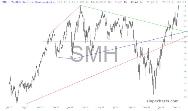 Green: Semiconductors seem unstoppable these days
 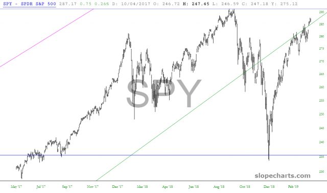 Yellow: TLT - A terribly messy pattern; lifetime highs are closed, but this does not look poised to vault much higher than it already has
 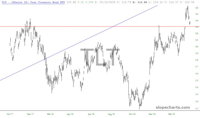 Green: We have successfully tested the breakout so far; just need to stay above red line
 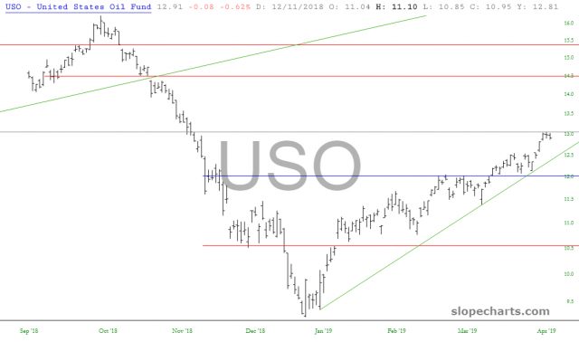 Yellow: USO - Encountering weakness recently; a break of the ascending trendline, and more important, a break of the grey horizontal beneath would send this much lower
 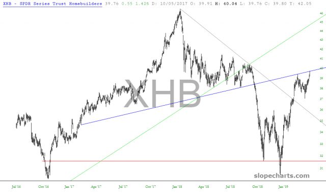 Red: Homebuilders have pushed up to major resistance
 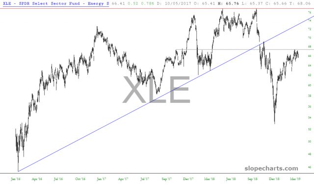 Red: Energy companies seem very prone to downturn, and any weakness in crude oil will be exhibited more strongly with the oil companies themselves
 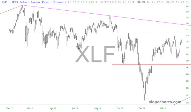 Yellow: XLF - we are range-bound; long-term direction is at the mercy of which of those horizontals gets broken
 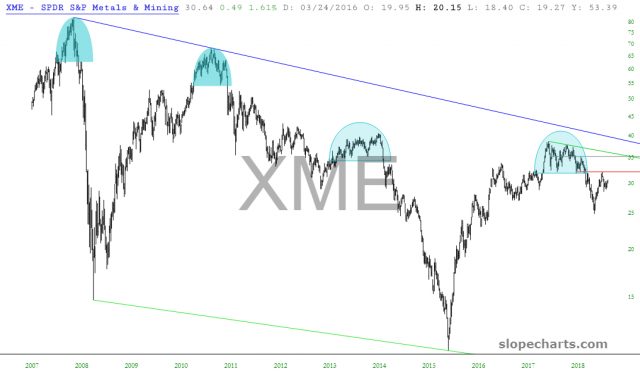 Red: XME Long-term pattern still down, in spite of recent strength
