Last week I looked at some charts of gold and the levels of support and resistance I’ve been keeping an eye on. This week we had broken through support, but with yesterday’s bullish move and today’s strength it looks like we are back above the trend line I discussed. Today I want to dive into the relationship between gold and the S&P 500 ($SPX).
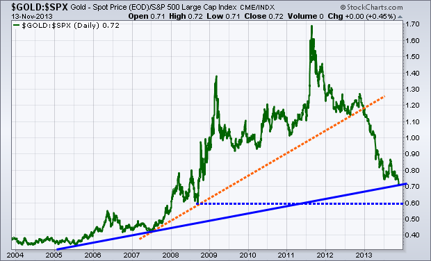
Below we have a chart of the ratio between gold and the S&P going back to 2004. When the green line is rising, that tells us that gold is outpacing the performance of stocks (via the S&P 500) and vica versa when it’s falling. You’ll notice that we started off 2013 with a break of the orange dotted line, which had been support off the 2007, 2008, and 2012 lows. This told us that we should expect stocks to outperform gold going forward, which is indeed what’s taken place.
With the strong relative performance in equities in relation to gold, we are now approaching another long-term trend line in the ratio of the two markets. The sold blue line is a trend line off the 2005 and 2007 lows. If gold continues to weaken against the equity market, then we could eventually see a test of the 2008 low, shown with the dotted blue line.

Disclosure: Do not construe anything written in this post or this blog in its entirety as a recommendation, research, or an offer to buy or sell any securities. Everything in this post is meant for educational and entertainment purposes only. I or my affiliates may hold positions in securities mentioned in the blog.
