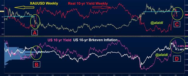
It's time to revisit the weekly gold chart and review the similarities with the horror year of 2013—which included a 25% collapse in the Apr-Jun period. Last year, I published several videos on why gold's decline to the $1690s (in summer 2021) would be reversed rather than repeat the collapse of summer 2012.
But now that we've held the lows of March and Aug 2021 is the signal flashing an unequivocal green light for the rest of the year? Or will gold bulls sustain fresh blows as inflation comes back to bite in autumn?

Before getting to the intermarket technicals, let's briefly address the fundamentals. There are several scenarios ideal for gold bulls. Realistically, the most plausible setup is for the Fed to retreat from (or reduce the scale of rate hikes) in order to accommodate broader signs of economic cooling, but not a total growth standstill or harsh recession. We're currently at the easy part—when CPI and core PCE are pulling back off their peaks.
That Was The Easy Part
Things will get tricky around October/November when various inflation readings (breakevens, surveys, consumer expectations, factory) start to send mixed signals. These could entail rebounds in core PCE and declines or no change in CPI. Variations between m/m and y/y readings, or contradictions between consumer demand and wage data. Don't get me started with divergences between breakeven inflation and employment cost index or the contrast between fed funds futures and the dot plot. Imagine the loud cacophony of mixed rhetoric from a dozen FOMC officials during such a messy direction. Such a period will revive volatility in indices, bonds, and metals but may not necessarily alter the general trend.
Reading Some Charts
Reading the above charts, we notice the clear contrast between the renewed decline in real 10-year yields (red graph in C) and the sharp run-up in real yields in 2013 (red graph in A). Although breakeven inflation appears currently to fall off its peak (white graph in D) as it did in 2013 (B), the current phase is more gold-positive as it is accompanied by declining nominal bond yields (pink graph in D)--a contrast to soaring yields in 2013 B. This sounds favorable for metals.
