As we know, history tends to rhyme. It’s never the same, but when you zoom out, the bigger picture often looks very similar. What does it mean for gold?
Short-term implications
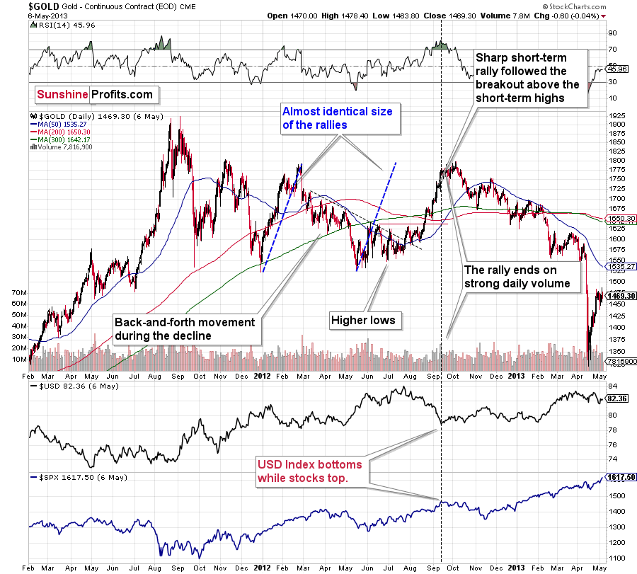
With gold’s back-and-forth price action mirroring its behavior from 2012, the yellow metal is likely destined for devaluation.
Back then, gold zigzagged with anxiety before suffering a material drawdown. In fact, in early October 2012, it moved slightly above the initial highs right before sliding.
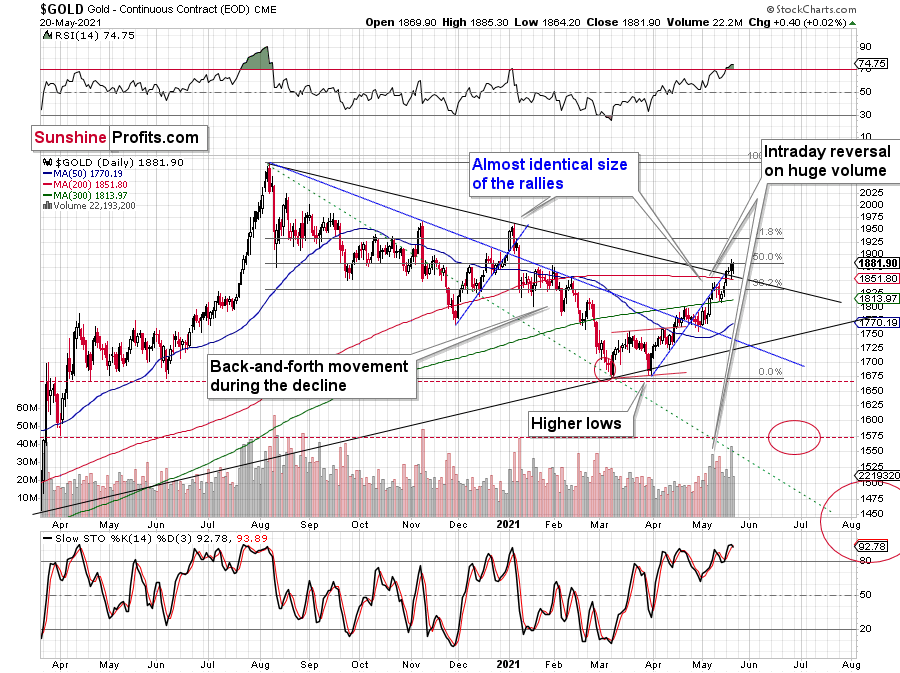
Moreover, while the yellow metal has bounced above its declining resistance line (the black line below), the price action mirrors gold’s behavior from early January. If you analyze the blue line below, you can see that investors’ optimism regarding gold’s short-term breakout quickly faded and the yellow metal sunk like a stone. In addition, with gold’s RSI (Relative Strength Index) moving slightly above 70 before the January swoon occurred, an identical development is already playing out in real time.
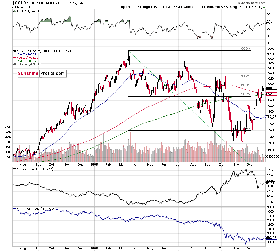
Gold seems to be insisting on repeating – to some extent – its 2012 performance, and – to some extent – its 2008 performance. Either way, it seems that gold is about to slide.
The reversal in gold took place after gold moved very close to its mid-January highs and the 50% Fibonacci retracement based on the August 2020 – March 2021 decline.
The sizes of the current rally (taking the second March bottom as the starting point) and the rally that ended at the beginning of this year are practically identical at the moment.
Just as the rallies from early 2012 and late 2012 (marked with blue) were almost identical, the same could happen now.
The March 2021 low formed well below the previous low, but as far as other things are concerned, the current situation is similar to what happened in 2012.
The relatively broad bottom with higher lows is what preceded both final short-term rallies – the current one, and the 2012 one. Their shape as well as the shape of the decline that preceded these broad bottoms is very similar. In both cases, the preceding decline had some back-and-forth trading in its middle, and the final rally picked up pace after breaking above the initial short-term high.
Interestingly, the 2012 rally ended on huge volume, which is exactly what we saw also on May 19 this year. Consequently, forecasting much higher gold prices here doesn’t seem to be justified based on the historical analogies.
The lower part of the above chart shows how the USD Index and the general stock market performed when gold ended its late-2012 rally and was starting its epic decline. In short, that was when the USD Index bottomed, and when the general stock market topped.
Back in 2008, gold corrected to 61.8% Fibonacci retracement, but it stopped rallying approximately when the USD Index started to rally, and the general stock market accelerated its decline. This time the rally was not as volatile, so the lower – 50% Fibonacci retracement level will hold the rally in check.
Taking into consideration that the general stock market has probably just topped and the USD Index is about to rally, then gold is likely to slide for the final time in the following weeks/months. Both above-mentioned markets support this bearish scenario and so do the self-similar patterns in terms of gold price itself.
MACD and the Long Term
Approaching the subject from a different side, remember the huge gap between the U.S. 10-Year Treasury yield and the U.S. 10-Year breakeven inflation rate? The situation in the very long-term MACD indicator is yet another confirmation that what we saw recently is similar to what we saw before the huge 2012 – 2013 slide. We get the same confirmation from the gold to bonds ratio, and I’ll move to that a bit later.
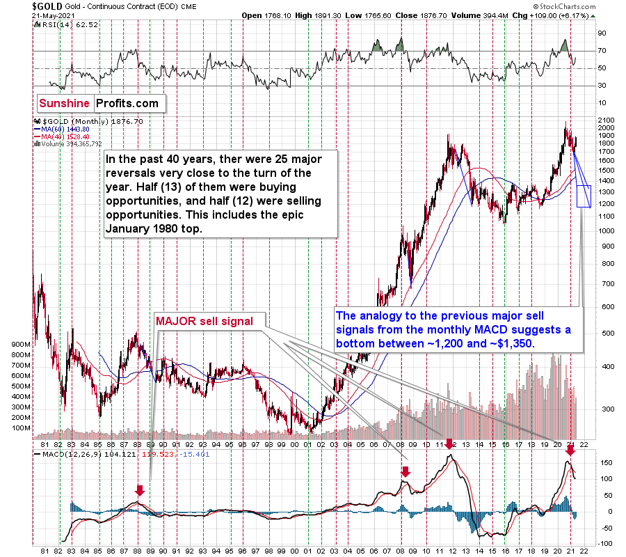
With February’s monthly close the last piece of the puzzle, the MACD indicator’s sell-signal is now perfectly clear. If you analyze the chart below (at the bottom right), you can see that the MACD line has crossed the signal line from above – a development that preceded significant drawdowns in 2008 and 2011.
Based on gold’s previous performance after the major sell signals from the MACD indicator, one could now expect gold to bottom in the ~$1,200 to ~1,350 range. Given the price moves that we witnessed in 1988, 2008 and 2011, historical precedent implies gold forming a bottom in this range. However, due to the competing impact of several different variables, it’s possible that the yellow metal could receive the key support at a higher level.
Only a shade below the 2011 high, today’s MACD reading is still the second-highest reading in the last 40 years. More importantly though, if you analyze the chart below (the red arrows at the bottom), the last four times the black line cut through the red line from above, a significant drawdown occurred.
Also ominous is that the magnitude of the drawdowns in price tend to coincide with the magnitude of the preceding upswings in MACD. And with today’s reading only surpassed by 2011, a climactic move to the $1,250/$1,450 range isn’t out of the question for gold. The above is based on how low gold had previously declined after a similarly important sell signal from the MACD
Now, the month is not over yet, so one might say that it’s too early to consider the sell signal that’s based on monthly closing prices, but it seems that given the level that the MACD had previously reached and the shape of the top in the black line, it makes the situation so similar to 2011/2012 that the sell signal itself is just a cherry on the bearish analytical cake.
Considering the reliability of the MACD indicator a sell signal for major declines, the reading also implies that gold’s downtrend could last longer and be more severe than originally thought. As a result, $1,500 remains the most likely outcome, with $1,350 still in the cards.
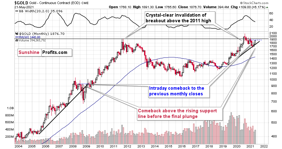
As further evidence, if you focus your attention on the monthly price action in 2008, you can see that gold is behaving exactly as it did before it suffered a significant decline.
Please see below:
To explain, after making a new all-time high in 2008 (that was a breakout above the 1980 tops), gold declined back to its rising support line before recording a short-term corrective upswing. This upswing ended approximately at gold’s previous monthly closing price. I marked it with a horizontal, blue, dashed line.
Similarly, if you analyze the right side of the chart, you can see that an identical pattern has emerged. With gold’s corrective upswing following a reconnection with its rising support line, history implies that a sharp decline should occur in the coming months and that the reversal is at hand or already behind us. After all, the thing that triggered the decline almost a year ago was the fact that gold made a new all-time high. Moreover, the recent high was very close to the previous high in terms of the monthly closing prices (Dec. 2020 - $1,895.10 vs. the recent intraday high of $1,891.30).
What about the HUI Index?
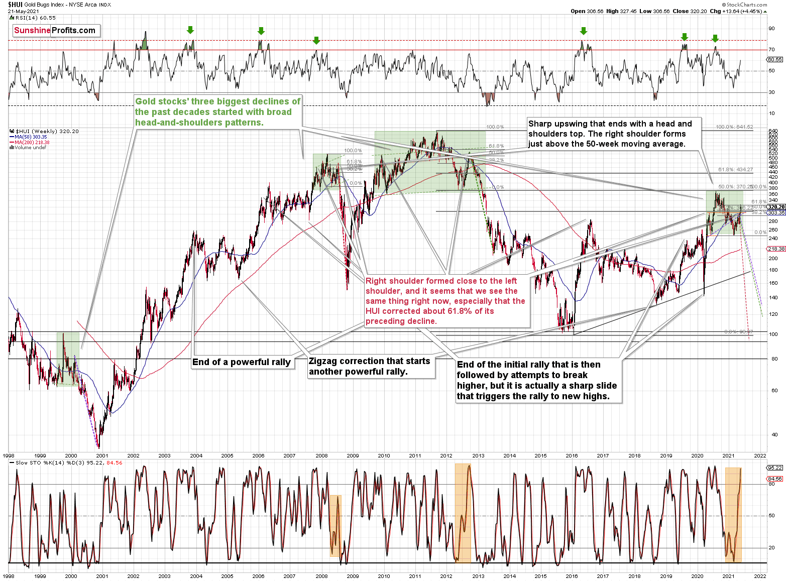
Not only are ominous signs emerging from gold’s medium-and-long-term charts, but beneath the surface, the gold miners are also folding their hands. If you analyze the chart below, you can see that the HUI Index back-and-forth price action mirrors its behavior from 2008 and 2012 and its bearish head and shoulders pattern is also gaining similarity. In addition, the BUGS (after all, HUI is called the Gold Bugs Index) stochastic oscillator has moved all-in like the 2012 analogue (depicted at the bottom part of the chart below), and thus, it seems to be only a matter of time before the HUI Index completely blows its bankroll.
Please see below:
To explain, the HUI Index retraced a bit more than 61.8% of its downswing in 2008 and in between 50% and 61.8% of its downswing in 2012 before eventually rolling over. And with investors rejecting the HUI’s recent attempt to break above the 61.8% level, the house of cards is slowly coming down.
The bottom line?
If the HUI Index hasn’t already peaked, history implies that a top is increasingly imminent. As a result, in my opinion, now is the time to enter short positions and not exit them.
Now, in both (2008 and 2012) cases, the final top – the right shoulder – formed close to the price where the left shoulder topped. And in early 2020, the left shoulder topped at 303.02.
That’s why I previously wrote that “it wouldn’t be surprising to see a move to about 300 in the HUI Index”. And that’s exactly what we saw (a move above 320 is still close to 300 from the long-term point of view). To clarify, one head-and-shoulders pattern – with a rising neckline – was already completed, and one head-and-shoulders pattern – with a horizontal neckline – is being completed, but we’ll have the confirmation once miners break to new yearly lows.
In addition, the recent rally is not a game-changer, but rather a part of a long-term pattern that’s not visible when one focuses on the short term only.
The thing is that the vast majority of individual investors and – sadly – quite many analysts focus on the trees while forgetting about the forest. During the walk, this might result in getting lost, and the implications are no different in the investment landscape.
Which stock should you buy in your very next trade?
With valuations skyrocketing in 2024, many investors are uneasy putting more money into stocks. Unsure where to invest next? Get access to our proven portfolios and discover high-potential opportunities.
In 2024 alone, ProPicks AI identified 2 stocks that surged over 150%, 4 additional stocks that leaped over 30%, and 3 more that climbed over 25%. That's an impressive track record.
With portfolios tailored for Dow stocks, S&P stocks, Tech stocks, and Mid Cap stocks, you can explore various wealth-building strategies.

