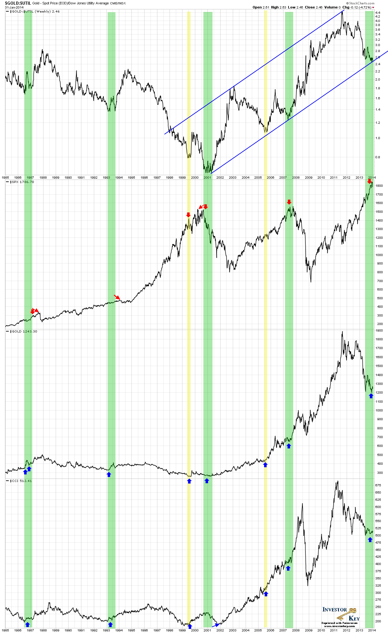
In my previous article, “Gold, Bottom or Bounce”, I displayed a chart that accurately predicted a high probability bottom in Gold on Dec 30 with an uptick confirmation on Dec 31, and that Gold was about to undergo a very substantial rally. However, there were other reasons for displaying that particular chart that will now become apparent when you look at it below. Namely, this ‘mystery chart’, which is the relative strength ratio of Gold divided by the Dow Jones Utility Average, also assists in determining where we approximately are in the business cycle. Yes, I said the “b” word, despite international free trade, the business cycle still exists, only that it now seems to be more synchronized amongst all the industrialized countries. Sometimes I think it only exists because the central banks and investment bankers conspire to make it exist as a way to profit from “their” invisible hand herding the sheep (to slaughter).
The turning points of the Gold/Utilities ratio, often precedes topping action in the US stock market (S&P 500 shown) and bottoming action in Gold and Commodities (CRB ex oil shown). Where traditionally relied upon technical indicators on the absolute price of any of the above named asset classes may have failed, the Gold/Utilities ratio succeeded this time. To all those calling for Gold $1000, better luck next time. 
*The arrows on the chart highlight where the Ratio successfully predicted sizeable and tradable moves in the asset classes shown.
*If you remove the yellow 1999.5 and the 2005.5 vertical markers, the spacing between the cycles will actually becomes clearer and seems to be quite symmetrical. The thicker green bars measure 6~7 years, and appears to catch the stronger business cycles. More careful analysis could probably pick up the intermediary cycles.
Congratulations to Craig Di Bias, Rod C. and Geoff V-A. for correctly guessing the underlying symbols in the ratio – they were awarded a respective 6 month, 3 month and 1 month free subscription to InvestorKey.
- English (UK)
- English (India)
- English (Canada)
- English (Australia)
- English (South Africa)
- English (Philippines)
- English (Nigeria)
- Deutsch
- Español (España)
- Español (México)
- Français
- Italiano
- Nederlands
- Português (Portugal)
- Polski
- Português (Brasil)
- Русский
- Türkçe
- العربية
- Ελληνικά
- Svenska
- Suomi
- עברית
- 日本語
- 한국어
- 简体中文
- 繁體中文
- Bahasa Indonesia
- Bahasa Melayu
- ไทย
- Tiếng Việt
- हिंदी
Gold Hitting $1,000? Not This Time
Published 02/01/2014, 10:39 PM
Updated 07/09/2023, 06:32 AM
Gold Hitting $1,000? Not This Time
Latest comments
Loading next article…
Install Our App
Risk Disclosure: Trading in financial instruments and/or cryptocurrencies involves high risks including the risk of losing some, or all, of your investment amount, and may not be suitable for all investors. Prices of cryptocurrencies are extremely volatile and may be affected by external factors such as financial, regulatory or political events. Trading on margin increases the financial risks.
Before deciding to trade in financial instrument or cryptocurrencies you should be fully informed of the risks and costs associated with trading the financial markets, carefully consider your investment objectives, level of experience, and risk appetite, and seek professional advice where needed.
Fusion Media would like to remind you that the data contained in this website is not necessarily real-time nor accurate. The data and prices on the website are not necessarily provided by any market or exchange, but may be provided by market makers, and so prices may not be accurate and may differ from the actual price at any given market, meaning prices are indicative and not appropriate for trading purposes. Fusion Media and any provider of the data contained in this website will not accept liability for any loss or damage as a result of your trading, or your reliance on the information contained within this website.
It is prohibited to use, store, reproduce, display, modify, transmit or distribute the data contained in this website without the explicit prior written permission of Fusion Media and/or the data provider. All intellectual property rights are reserved by the providers and/or the exchange providing the data contained in this website.
Fusion Media may be compensated by the advertisers that appear on the website, based on your interaction with the advertisements or advertisers.
© 2007-2024 - Fusion Media Limited. All Rights Reserved.
