A Rebound Gets Underway – Will It Have Legs?
Ever since the gold indexes have broken below the shelf of support that has held them aloft since late 2016 (around 165-170 points in the HUI), the sector was not much to write home about, to put it mildly. Precious metals stocks will continue to battle the headwinds of institutional tax loss selling until the end of October, to be followed by the not-quite-as-strong headwinds of individual tax loss selling in the final weeks of the calendar year – a fairly regularly recurring script in recent years. Nevertheless, recent developments make it worthwhile to take another look at the situation. Here is a daily chart of the HUI:
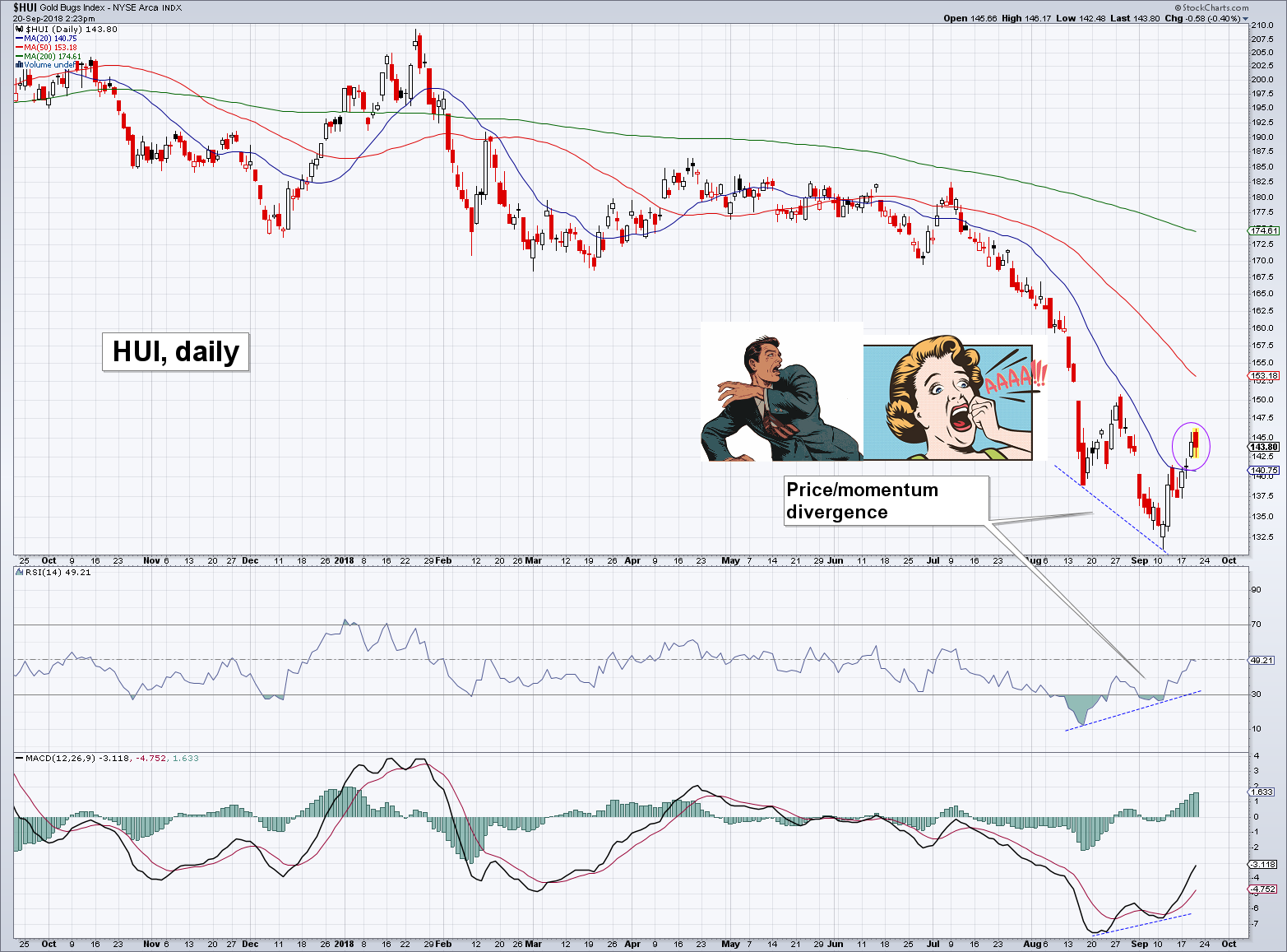
The HUI daily, plus two proxies for gold investors shortly after looking at their end-of-August statements. As the annotation indicates, one reason to take a closer look is the recent strong divergence between prices and momentum oscillators such as RSI and MACD. But that is not the only thing that is of interest.
Apart from the divergence between prices and RSI/MACD at the recent lows it is worth noting that although it feels hesitant, the recent rebound was actually one of the most vigorous rallies of the entire year in a span of just seven trading days. For the first time since early July just before the breakdown, at least two consecutive closes above the 20-day moving average (blue line) could be scraped together, and a third one seems likely at the time of writing.
We have added 50- and 200-day moving averages to the chart as well. These tend to be important for the index, but more importantly, we feel reminded of the situation in late August to late September 2015, when a similar set-up was in place. As we pointed out at the time, the sheer distance of the index to its 200-dma made a strong short term rebound highly likely, even if the medium to long term trend did not change.
The index promptly spiked by almost 40% in early October 2015, which was not even enough to reach its 200-dma; obviously it failed to attain “escape velocity” and fell back almost as fast as it had rallied (aforementioned tax loss selling pressure was a likely culprit). And yet, it was certainly a playable move for nimble traders. Such huge moves in such short time periods rarely (never?) happen in other market sectors.
Futures Positioning – Speculators at Odds With Each Other
According to the legacy CoT report large speculators have completely abandoned their net long exposure to gold futures, going slightly net short for the first time since gold prices crossed the $270 level to the upside more than 17 years ago. The disaggregated CoT report splits large speculators into two major groups – and it turns out these groups strongly disagree on the future direction of prices.
The “managed money” category (which includes CTAs, hedge funds, etc.) has amassed the largest net short position in at least the history of the disaggregated report, which begins in 2006. Over the past two weeks these traders have slightly reduced their downside exposure, but their net short position nevertheless remains at an extremely high level:
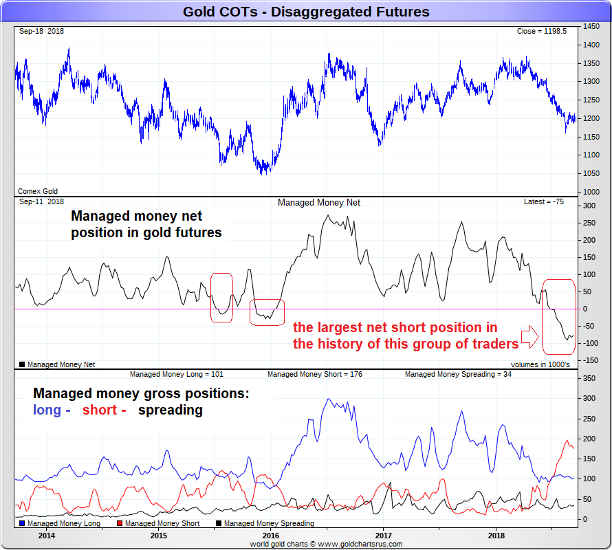
“Managed money” remains net short gold futures by 75,000 contracts, slightly down from the recent peak of almost 90K in late August, but still quite stretched historically.
Since we know from the legacy CoT report that large speculators in toto are only net short by 8,000 contracts (which is practically flat), there must be an offsetting speculative position. This position is represented by the category referred to as “other reportables”. Whoever came up with these classifications apparently didn’t want to become overly creative with the naming. Here is a slightly longer-term chart showing the positions of this particular group of traders:
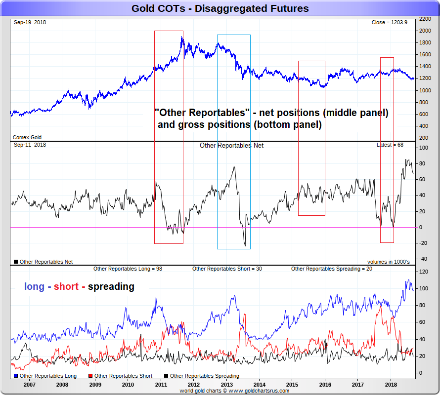
The positioning history of “other reportables” since disaggregated CoT reports were first published. We have highlighted four distinct time periods in order to bring trend changes in the gold price into context with significant changes in the aggregate net position of this group of traders.
What is the difference between these two groups of speculators? The “managed money” category consists of investors managing other people’s money (OPM). “Other reportables” by contrast are traders such as proprietary (multi-asset) trading houses, local traders, family offices, etc. – in other words, primarily traders risking their own capital.
The time periods highlighted on the chart show that these traders are usually doing the opposite of trend-followers (who seem to be ubiquitous in the managed money category). In other words, they quite often take counter-cyclical positions. In the time period delineated by the blue rectangle, they turned out to be wrong. When gold fell through lateral support in 2013, they were forced to rapidly change their opinion and sell their sizable long position, which definitely exacerbated the decline.
However, they had already proved quite savvy by fading the final blow-off into the 2011 peak – well before the fundamental backdrop for gold became increasingly bearish. Similarly, they stubbornly maintained a large net long position ahead of the late 2015 low, and proceeded to get out of their long positions at the peaks in late 2017 and early 2018 – all well-timed moves. All in all their contrarian approach seems to be working well enough.
The next chart shows the net positions of all four reportable trader categories – in addition to “managed money” and “other reportables”, it includes swap dealers and producers/merchants, the two categories of commercial hedgers. Note by the way that these classifications are a question of “who are they” rather than “what is the purpose of their trades”. A hedger may for example occasionally enter into speculative positions.
We mainly want to show though that the two groups of large speculators are actually quite often (though by no means always) at odds with each other.
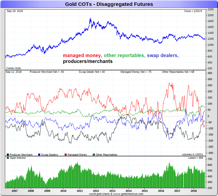
The scaling makes it a bit difficult to see, but there were several occasions when the net positions of other reportables (green) and managed money (red) were moving in opposite directions or at least saw large gaps opening up between them.
Admittedly, the sample size is very small, and it is not possible to derive hard-and-fast rules from these data. Moreover, by the time such rules become widely known and part of accepted lore, they are often just about to change again. Still, we felt that these observations would be of interest to our readers. Keeping an eye on trends in these indicators may well pay off.
Fundamentals – The Interest Rate Front
As we have mentioned a number of times over the past year, the fundamental drivers of gold were far from unequivocally bullish. On the contrary, most of the drivers of investment demand were rather bearish (or at best neutral) and remain so. A few subtle shifts seemed to emerge recently – credit spreads are off their lows and look as if they could easily widen further, deficit spending by the US government seems to be getting out of hand, and the Fed may well be too nonchalant about the possibility of finding itself “behind the curve” one day.
Arguably the most important gold price driver in recent years were real interest rates (or rather, market perceptions of real interest rates). The chart below shows an overlay of the gold price with the inverted 5-Year TIPS yield (gold and TIPS yields are inversely correlated). At first glance it looks as though they behave like coincident indicators most of the time, but upon closer inspection, it turns out that the gold price often leads TIPS yields slightly at turning points (since it can occasionally lag as well, there are unfortunately once again no hard and fast rules one can rely on).
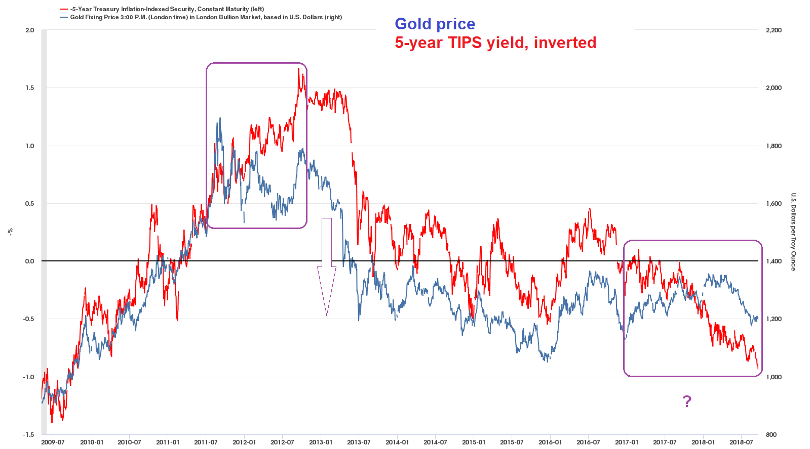
5-year TIPS yield, inverted (note: the percentage scale on the left has to be multiplied by (-1) to make sense) vs. the gold price. In recent years the two series were tracking each other very closely most of the time, which is in line with what one would expect. The period between the late 2011 peak in gold prices to mid-2013 is quite noteworthy though: first, gold diverged strongly from TIPS yields, warning of an impending trend change (the first purple rectangle contains the divergence). Then it declined sharply, clearly leading the surge in TIPS yields.
One has to squint a little to see it, but gold has been leading on occasion of several smaller fluctuations since then as well. Since early 2017, a strange new divergence started to take shape: gold entered a labored uptrend, but TIPS yields remained stubbornly in positive territory and have increased further since then (the second purple rectangle delineates this time period). While gold has in the meantime changed direction, moving down as it was “supposed to”, a sizable divergence remains in place.
Based on this, we can conclude that traders in the “managed money” category are currently aligned with the trends in important fundamental gold price drivers, while their counterparts in the “other reportables” category are apparently once again trying to anticipate a coming change in these trends. Which view will turn out to be correct remains to be seen.
Lastly, gold seemed to ignore the yield curve for long time. A steepening yield curve is generally considered to be bullish for gold and a flattening yield curve is considered to be bearish. And while gold is diverging to some extent from its normally strong negative correlation with TIPS yields, it has begun to track the yield curve more closely again since late last year – and so has the HUI Index:
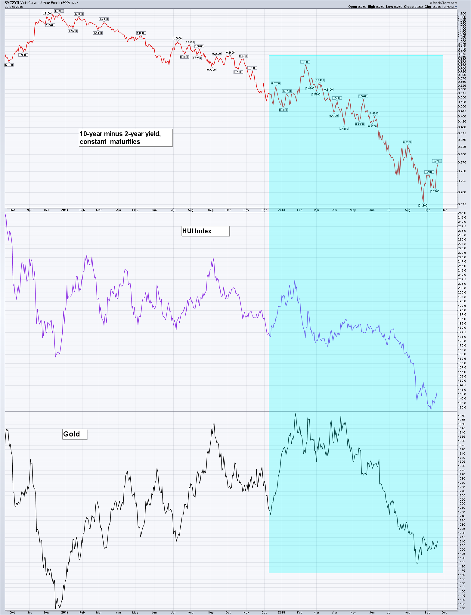
10 minus 2 year treasury yield spread, the HUI index and gold – the area highlighted in light blue shows the “recoupling” between the yield curve, gold stocks and gold this year.
Clearly this is also a correlation one should keep an eye on. Once such correlations are reestablished again, they often turn out to be quite persistent. In that case the yield curve could become a very useful tool for traders in gold and/ or gold stocks.
Conclusion
A short term trading opportunity may be at hand in the gold sector – if not now, then probably soon. It is possible that a retest of the lows will be required first, and the FOMC announcement next week represents “event risk” to some extent. As noted above, tax loss selling will definitely remain an issue as well. We believe the ingredients required for a sizable technical rebound are probably already in place, but until this idea is confirmed by follow-through, one has to remain cautious. With the market just off its lows it should be quite easy to control risk though.
No-one likes gold anymore… as an aside, the daily sentiment index (DSI) of gold futures traders fell to just 6% a little while ago. That is quite an extreme reading (the all time low was 5% if memory serves).
Finally, if a noteworthy rally does eventually take hold, the fundamental drivers of gold will have to be closely monitored to see whether they are beginning to shift, which can easily happen with a slight lag (a list of the most important macro-drivers can be found here). Depending on that, a rebound could either turn out to be short-lived or become quite substantial.
