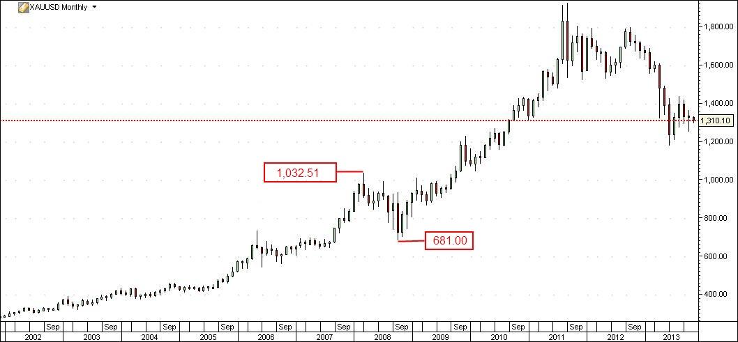
Everybody wonders where gold is headed now and no one knows the answer. As we all know, history tends to repeat itself, so I decided to look for a clue in the past and analyse the previous resumption of the uptrend by gold and some correlated markets to the yellow metal - silver and the Aussie ( from the bottom in October 2008, as shown on the monthly chart ). I am looking for recognizable price patterns appearing at an early stage of the price recovery, with a higher probability of success, offering the possibility of placing a close stop loss and a high risk/reward ratio. XAU/USD Monthly Chart" title="XAU/USD Monthly Chart" height="491" width="1058" />
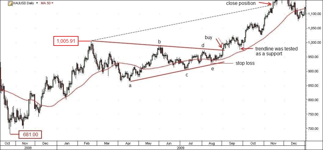
Switching to the daily chart, we can see gold bouncing off the low at USD 681,00 per ounce and after reaching a high at USD 1,005.91 an ounce, consolidating within a triangle ( the formation can be better seen on the weekly chart ). The buy signal was triggered in September 2009, when the price for the precious metal closed above the upper trendline. The stop loss should be placed just below the fifth leg of the triangle. Using a popular technique the traders could easily set the target. XAU/USD Daily Chart" title="XAU/USD Daily Chart" height="491" width="1058" />
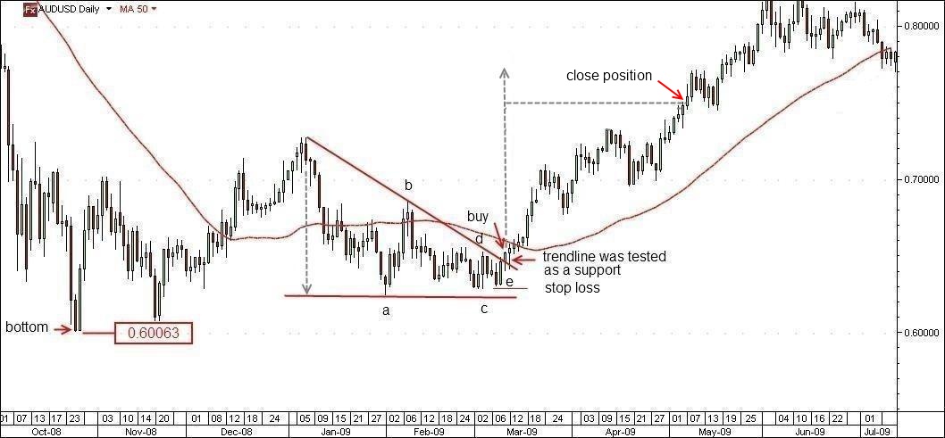
There was a similar situation by the aussie. First an upmove from the bottom at AUD/USD 0.60063, then a consolidation again, this time in form of a descending triangle, as illustrated on the AUD/USD daily chart below. An interesting fact to note: despite the bearish character of the pattern - the lower highs, an indication for the increasing pressure of the bears—it was resolved to the upside, giving a buy signal in March 2009.
Using a familiar measuring technique, the market participants could easily determine where to take their profit. AUD/USD Daily" title="AUD/USD Daily" height="491" width="1058" />
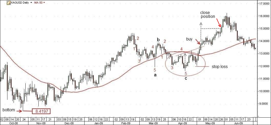
As one can see on the silver daily chart below, the corresponding formation by the white metal was a zigzag ( 5-3-5 ) - three wave declining pattern labeled a-b-c. Not a double or triple, but a single zigzag. All Elliotticians could easily recognize it. But even a novice could have identified the head and shoulders pattern ( area marked with a red ellipsis ) and should have known where to enter the market, to place the stop loss and to close the position. The buy signal was triggered in May 2009. The risk/reward ratio of silver should be 1:1. Of course, experienced traders would have entered the market earlier, gaining a bigger profit.
The buy signals on the charts should have been backed up by a sharp increase in the level of volume. To all three trades, as described above, are applied simple, well known techniques. They all are successful with a high risk/reward ratio. I am not going to calculate the exact profit a trader could have gained which each of those three case studies. This is not the purpose of my article.
All three aforementioned financial instruments bottomed almost simultaneously in October 2008. The buy signals we discussed were triggered at a different time: first by the AUD/USD pair in March 2009, followed by silver in May 2009 and finally by gold in September same year.
We don't know how the fundamentals will play out in the future, but as a technician, I do believe, that investors' behaviour repeats itself and when we are in a long - term trend we have to look patiently for recognizable price patterns on the daily and weekly charts and to avoid trading on smaller time frames with a lot of market noise, without having any clear idea about the further market direction. One doesn't need to be a technician junkie to spot such formations, or a full - fledged trader to know how to play out the set-up. And we all should try to keep it simple, making trading a pleasure and not a stressfull undertaking.
