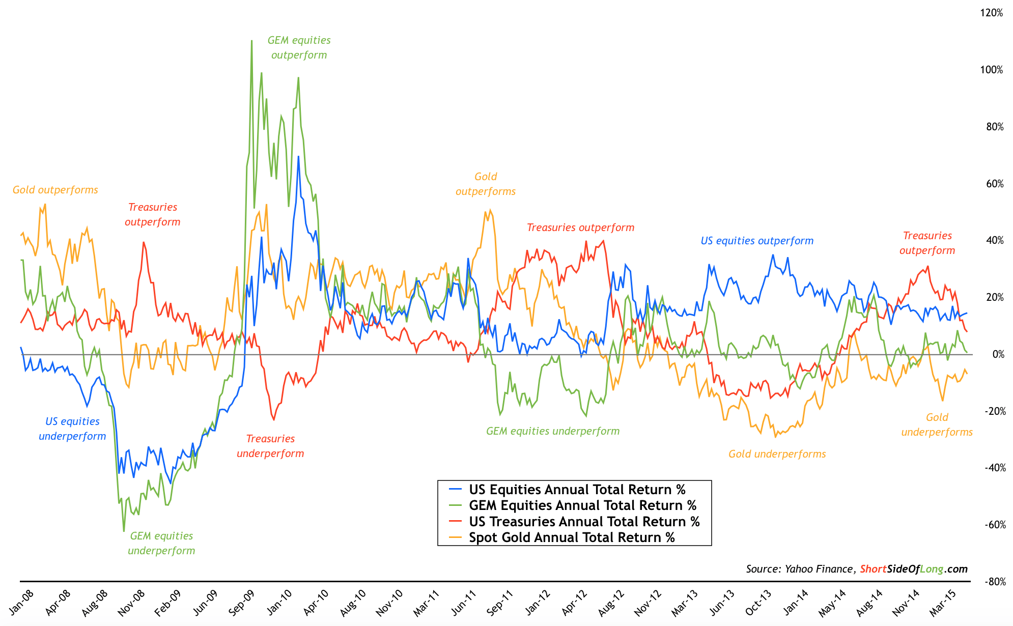
Today's chart of the day focuses on major global macro assets yet again. In the latest post published last weekend, our chart of the day looked at the total return price of US equities (via ARCA:SPY ETF), Emerging Market equities (via ARCA:EEM ETF), precious metals (via ARCA:GLD ETF) and US government bonds (via ARCA:TLT ETF).
This chart looks at same assets but in another format, via annualised rolling performance. The chart below shows the performance of four major global macro assets, assuming an investor bought in the prior 12 months and held the position without trading in and out.
Chart Of The Day: Macro performance of US equities:

It is quite clear that US equities have been the strongest performer, gifting investors positive annualised returns non-stop since late 2009. Current 12 month performance still remains in the double digit territory, but below the 20% level. US bonds have achieved a similar kind of a return, however with a lot more volatility... including a huge correction period in 2013. This is quite ironic, because investment advisors always state that government bonds are quite safe and less volatile then stock investment.
Foreign equities, and in particular emerging markets, have had a very mixed period over the last several years. While the performance was very good throughout 2009/10, there have been many periods of disappointing returns throughout 2011/12 as well as in 2013. Returns over the last 12 months remain flat. Finally, we look at gold which is also decent barometer of the commodity prices, but without the issues of contango. Basically, since topping out in late 2011, gold prices have disappointed with negative annualised returns for the last three years.
Let us remember that periods of under-performance eventually lead to periods of outperformance and visa versa. Therefore the main the question now is whether US equities can continue to deliver. And will gold keep posting negative annualised returns year after year?
