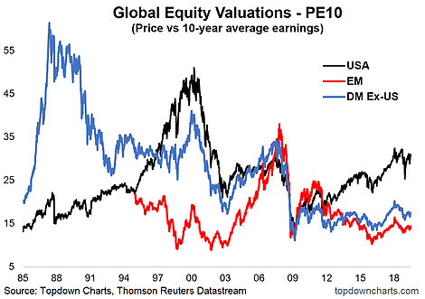
Today's chart comes from the recently launched "Top 5 Charts Of The Week" report.What we've got here is the PE10 (i.e. price divided by average earnings of the past 10 years) for the major chunks of global equities. There's a couple of key standout observations on this chart, and a couple of non-obvious points to note.

First and most obvious is U.S. equities are clearly the most expensive of the 3 big chunks of global equities (both relative to their own history and relative to DM and EM equities). Second, EM equities are the cheapest (most obviously on a relative basis, and slightly cheap vs their own history).
DM Ex-U.S. (i.e. Developed Markets, excluding USA) are still trading quite cheap/low relative to where they have traded in the past, and clearly are much cheaper than the U.S. They are more expensive relative to emerging market equities, but not excessively so—and depending on your perspective, with lower risk.
So what do you do with this kind of data? To me valuations are an anchor point and help in setting return expectations over the medium-longer term. In other words, they matter most for medium-term portfolio allocation decisions. In that respect we continue to favor a tilt to global equities ex-U.S. with valuation being a key consideration.
There's a few other pieces to the puzzle of course (like relative economic/earnings outlook), monetary and fiscal policy settings, shifts in governance risk, and other key variables like the path of the U.S. dollar.
Some of these factors are starting to fall into place, so it's certainly something to think about, even on the key insights of today's chart alone.
