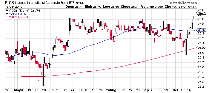
After a months-long period of treading water, corporate fixed income in foreign markets caught fire last week, posting the strongest gain for the major asset classes, based on a set of exchange-traded funds.
Invesco International Corporate Bond ETF (PICB) has been on a tear since Oct. 10 and extended the rally last week by posting gains in every trading session. By Friday (Oct. 18), PICB closed at a 1-1/2 year high.
Last week’s biggest loser among the major asset classes: broadly defined commodities. After topping the horse race in the previous week, iShares S&P GSCI Commodity-Indexed Trust (GSG) fell back into a familiar pattern of losing in relative and absolute terms in recent history. The fund fell 0.7% for the trading week, its third loss in the past four weeks.
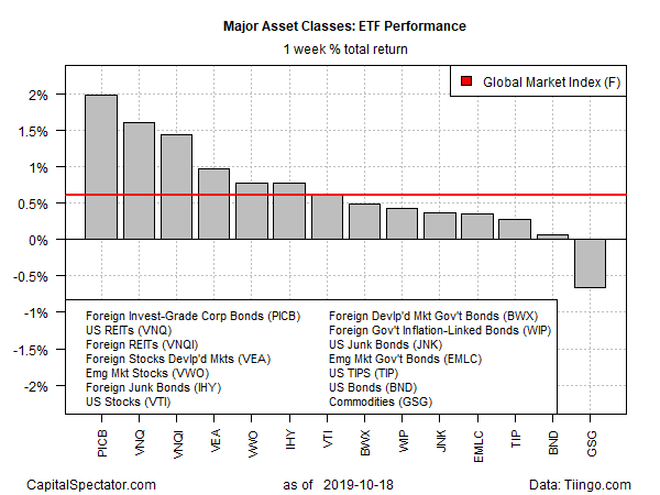
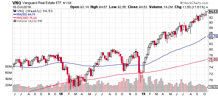
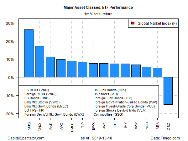
For the one-year trend, another familiar pattern was reaffirmed last week: the dominance of US real estate investment trusts (REITs). Vanguard Real Estate (VNQ) is now up a sizzling 26.6% on a total return basis for the trailing one-year period. This year’s momentum has been almost non-stop: the ETF has posted a gain in all but ten weeks of 2019’s trading so far.
The deepest one-year loss for the major asset classes? Commodities, of course. In fact, the only case of red ink for the one-year window is GSG, which has shed 14.0% as of Friday’s close vs. the year-ago price.
Meanwhile, GMI.F is up 7.8% for the trailing 12-month period through last week’s close.
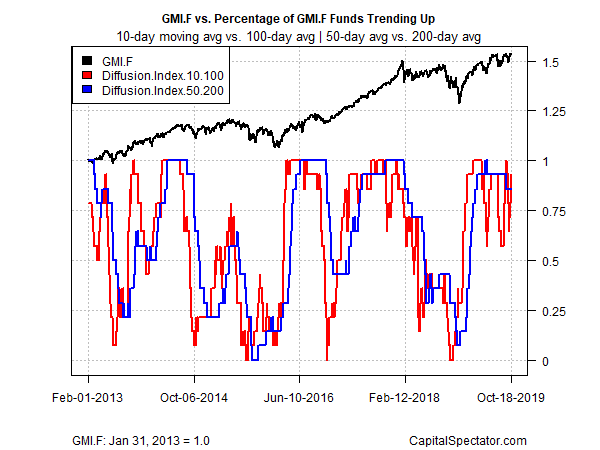
Finally, let’s consider how the major asset classes stack up through a momentum profile, which continues to skew positive by a wide margin. The analysis is based on two sets of moving averages for the ETFs listed above. The first compares the 10-day moving average with its 100-day counterpart — a proxy for short-term trending behavior (red line in chart below). A second set of moving averages (50 and 200 days) represent an intermediate measure of the trend (blue line). Despite recent volatility, a clear bullish bias still prevails.
