If you don’t think the Fed has become an abject handmaid of the Wall Street gamblers, take a gander at the chart below.
Owing to the slight down-tick in this week’s monthly CPI report, the outcry for rate cuts is reaching a deafening roar down in the trading pits. And judging by Powell’s presser on Wednesday, the Fed is fixing to bend over soon, bar of soap in an outstretched hand.
And on everything that makes a difference to the Main Street cost of living, prices are up by 32% to 36% during the UniParty rule since January 2017.
That’s right. Among the five biggies—services, food, energy, transportation and shelter—that comprise an overwhelming share of Main Street family budgets, the rate of price increase during the last seven-and- a -half years is close to 4.0% per annum! And for want of doubt, that rate of gain means that prices would double every 18 years.
Moreover, despite drastically different short-term paths since January 2017 to get to the present index levels, the cumulative gains over this 7+ year period for these five essentials are bunched quite tightly at the 4.0% per annum mark.
Among other things, this reminds us that what counts is the cumulative inflation over a reasonable period of time, and that monthly movements of even major CPI components are definitely not a reliable guide to the longer-term path of the general price level.
CPI Component Increases Per Annum Since January 2017:
- Services less energy services: +3.8%.
- Food: +3.9%.
- Transportation: +3.9%.
- Energy: +4.2%.
- Shelter: +4.3%.
Index Of Major CPI Components Since January 2017
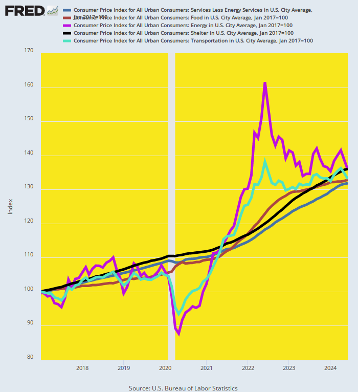
Back in the day, of course, the core mission of central bankers was price stability over time, not statistical game-playing based on the annualized rate of inflation for short, arbitrarily chosen periods.
And the focus was also on a stable general price level, not the present preoccupation with all manner of sub-components of the CPI or PCE deflator and tortured sawed-off variations of the overall indexes.
For instance, a while back, all the rage was the so-called SuperCore CPI, which covers services minus shelter services.
Of course, that meant that over 60% of the weight in the CPI market basket was being deleted from the figure, but, hey, Wall Street economists claimed this particular sawed-off inflation ruler stood at the top of Powell’s data dashboard.
Moreover, two years ago, the SuperCore index was running well below the 9% level recorded in the headline CPI index and also under the so-called core CPI less food and energy.
So it occasioned a lot of hopeful Wall Street chatter to the effect that inflation was overstated and that the Fed was closer to the nirvana of another rate-cutting cycle than might otherwise have been apparent.
Not so much during last week's inflation-victory celebrations, however. As shown below, the SuperCore is still posting at damn near +5% on a YoY basis.
So, as far as we can tell, the SuperCore didn’t get even an honorable mention from hallelujah chorus of Wall Street economists. As usual, it fell upon Zero Hedge to publish the inconvenient truth.
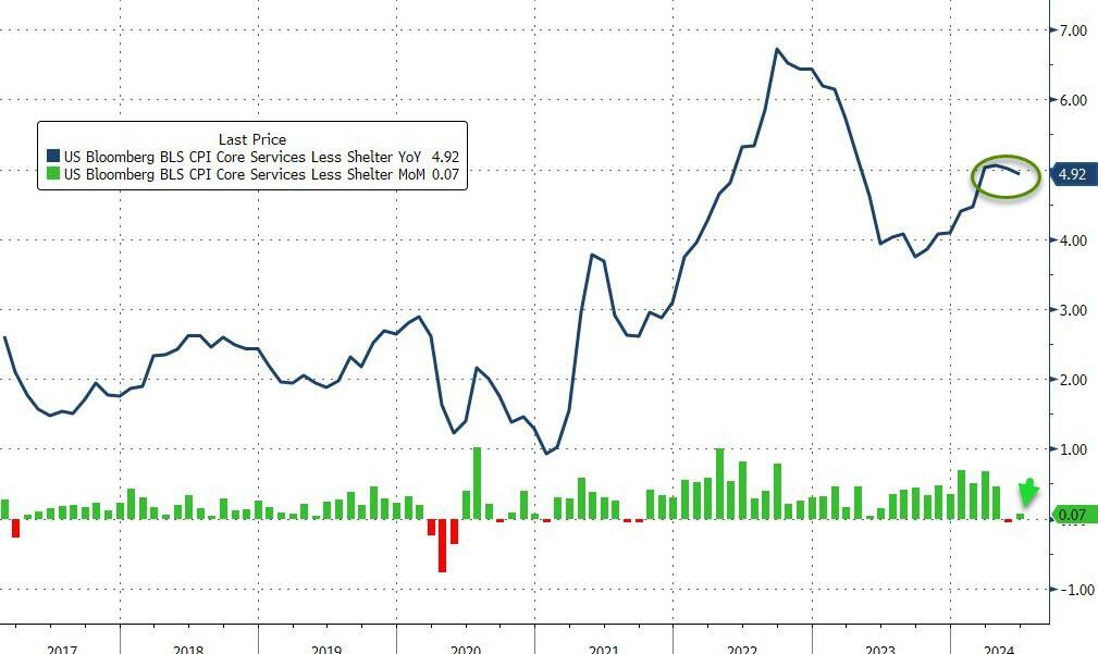
Source: Bloomberg
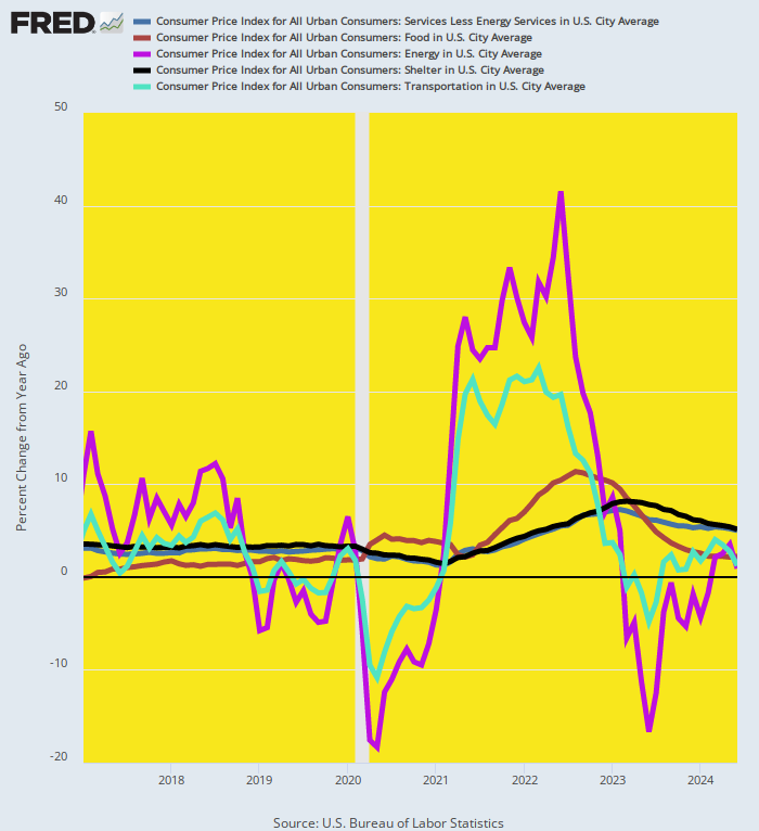
In any event, when you recast the first chart above on a YoY change basis, the true inflation trend gets completely obfuscated by the short-term fluctuations and noise in the data.
Instead of bunching around the true 4% inflation trend of the past seven years, the rates of change for the LTM period ending in June 2024 are all over the lot.
Among the same five biggie components of the CPI, services are still up 5% while energy whipsawed from +42% Y/Y in June 2022 to just +0.9% during the June 2024 LTM period.
In short, the first chart above is the signal. The LTM figures shown below are the noise. Indeed, picking and choosing inflation snapshots on a monthly or even quarterly basis from among inflation components and sub-indexes that are always on the move—and rarely in lockstep—is a mug’s game.
It tells you nothing about the underlying inflation trend nor the cumulative impact on purchasing power of the endless inflationary ratchet that is the explicit "goal" of Fed policy. That is, 2.00% inflation year after year until the cows come home.
YoY Change For June 2024 LTM:
- Services less energy services: +5.0%.
- Food: +2.2%.
- Energy: +0.9%.
- Shelter: +5.1%.
- Transportation: +1.2%.
YoY Change In Five CPI Components, January 2017 to June 2024
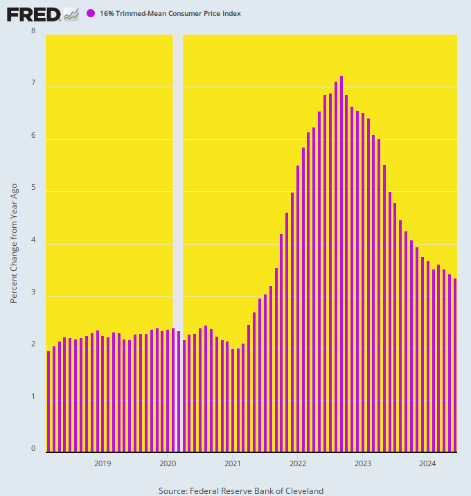
The chart below, which depicts the trend of Y/Y change in the 16% trimmed mean CPI, tells you all you need to know about the true inflation story at present.
For the last 75 months running, the most stable measure of inflation available has posted Y/Y inflation well above 2.00%. On a cumulative basis, in fact, the gains have averaged 3.7% per annum.
To be sure, the 2.00% annual inflation "goal" itself is nonsense. Yet when you overshoot even that arbitrary pro-inflation target by nearly 100%, why in the world is the Fed claiming that victory over inflation is at hand, and that the next round of rate-cutting and monetary stimulus is fixing to commence?
If nothing else, you’d think that the paint-by-the-numbers monetary central planners at the Fed would at least deign to give America’s battered savers and wage earners an extended breather from inflation risk for several more quarters or even years.
That is, by keeping its foot on the monetary brakes the Fed could preclude another burst of inflation—even as the most recent outbreak was being absorbed by savers, wage earners and entrepreneurs.
Indeed, after six years of elevated inflation, the case for diluting the inflation trend with a period of low or no inflation is overwhelming.
For instance, if the trimmed mean CPI were to run at exactly 2.00% per annum for the next three years, the index rise since March 2018 would still average +3.25% per annum; and even at 1.0% annually for another three years, the cumulative gain since March 2018 would be +2.81% per annum.
What’s so splendid about either of those figures? And why shouldn’t the Fed be obliged to average-down for an extended interval, given the inflation surge that it enabled during recent years?
YoY Change In 16% Trimmed Mean CPI, March 2018 to June 2024
Needless to say, this gets us to the fatal flaw of Keynesian central banking. The Fed wants 2.00% inflati0n at a minimum. And it is willing to risk a resurgence of inflation rates higher than that because its real objective is not common sense price stability and stable purchasing power of the dollar.
Instead, its policy model amounts to plenary macro-economic management premised on the erroneous view that there is a Phillips Curve, which embodies a trade-off between macroeconomic growth and inflation.
And that to get optimum growth, job generation and "full employment" a modest level of inflation is necessary; and that when the macro-economy threatens to falter or tumble into recession, a fair amount of inflation risk is not just tolerable, but actually warranted and essential.
That is to say, the Fed’s maniacal focus on the short-run annualized rate of change in the shortest inflation ruler it can find (i.e. the PCE deflator) has absolutely nothing to do with sound money or any traditional notion of central banking.
To the contrary, its an excise in monetary central planning that recurrently pleasures Wall Street with excuses for a new round of rate cutting as often and as early as possible.
Indeed, the Fed goes so far in its Wall Street obeisance as to pick the very shortest inflation ruler published by the US government.
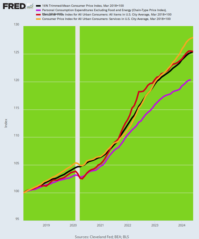
As shown below, just since March 2018, the Fed’s preferred PCE deflator less food and energy (purple line) has risen materially more slowly than almost any other available measure including the headline CPI (red line), the 16% trimmed mean CPI (black line) and the CPI for all services (orange line).
Worse still, the PCE deflator is not even a fixed basket of items functioning as a proxy for the general price level from point to point over time.
It is continuously reweighed monthly, meaning that when hard pressed consumers substitute chicken for steak the PCE deflator reports lower inflation than would otherwise be the case.
Needless to say, that technique may make statistical sense when attempting to measure the constant dollar level of output in the total economy.
However, it does not measure "inflation" of the general price level as embedded in a fixed basket of goods and services.
Indexes of Inflation, March 2018 to May 2024
Needless to say, when this short-ruler bias is extended over longer periods of time, it do make an even greater difference.
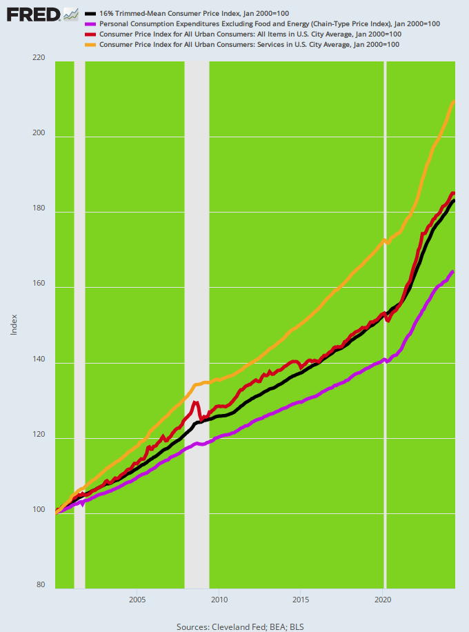
For instance, since January 2000, the PCE deflator less food and energy is up by just 64% compared to 83% for the 16% trimmed mean CPI, 85% for the headline CPI and 109% for the CPI for all services.
Indexes of Inflation, January 2000 to May 2024
In any event, Wall Street loves the Fed's pro-inflation policies and incessant efforts to pretend that the huge cumulative gains in the price level shown in the chart above are all in a days work and occur pursuant to the laws of economics.
Gary Cohn, a typical revolving door operative between Wall Street and Washington, essentially let the cat out of the bag in a comment about the June CPI report.
"Chair Powell does not want to be late to cutting rates," former Goldman Sachs and Trump official Gary Cohn told CNBC after the release. "Especially after we all accused him of being late to raise rates."
For crying out loud, the very idea of "early" and "late" in the arbitrary game of fiddling with the interest rate dials is absurd.
The slop in the steering gear between the rate of interest on what amounts to Wall Street gambling chips (i.e. overnight funds) and the national and global macro-economy is so great as to render short-run inflation snap-shots tantamount to the aforementioned noise.
As it has happened, the US economy was so provisioned with excess cash owing to the massive stimmies and printing press bacchanalia during the pandemic period that the Fed’s rate increases have barely made a dent in the pace of short-term spending and activity.
And by the same token, the US economy is now so waterlogged with debt—$99 trillion on private and public balance sheets combined—-that 100 or even 240 basis points of cuts are not going to stimulate much incremental borrowing, spending, GDP and jobs.
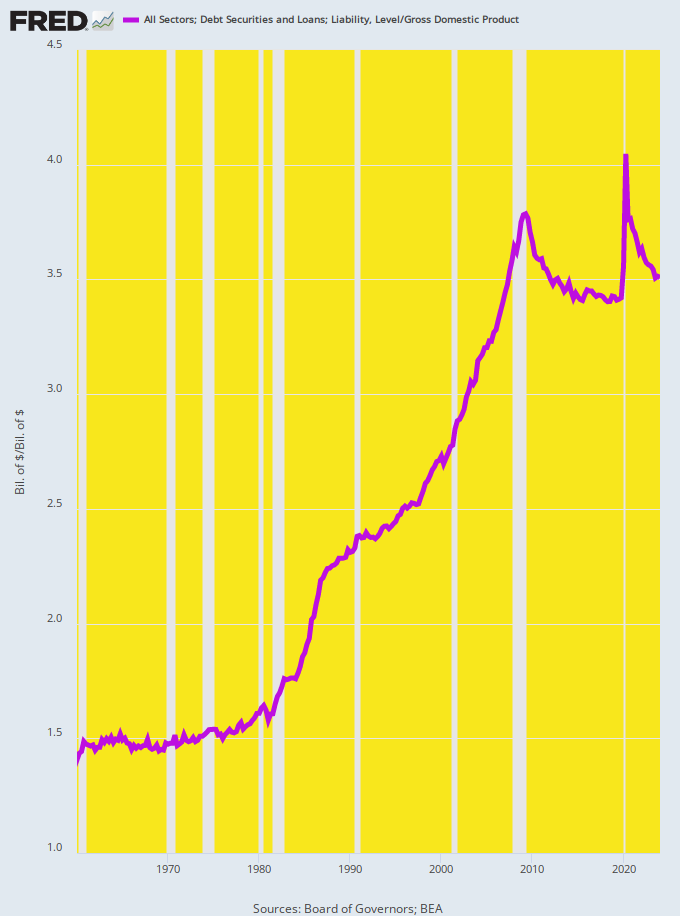
For want of doubt, consider the graph below. During the heyday of Keynesian theory in the 1960s and 1970s, total public and private debt outstanding in the US averaged about 150% of GDP—-a figure that had been largely constant during the prior 100-years of massive industrial growth and steadily rising living standards in the US.
Even though it never made sense that raising the economy’s leverage ratio could generate incremental GDP, jobs and wealth over the long-run, in the short-run cheap interest rates did tend to spur extra borrowing by households and businesses, thereby temporarily adding to GDP, albeit in a manner that actually am0unted to stealing from the future.
But today all bets are off. Since the Great Financial Crisis, the debt ratio has been stranded in the macroeconomic stratosphere at 350% of GDP.
Those two extra turns of debt relative to national income mean that total debt outstanding currently stands at $99 trillion versus what would have been $42 trillion at the old 150% national leverage ratio.
Needless to say, it has apparently not occurred to the wanna be monetary central planners at the Fed that artificially goosing the economy’s leverage ratio via another round of rate cuts back toward the zero bound has lost its zip.
We’d dare so that in a debt-entombed economy like that depicted below—where the productive sectors are lugging an extra $57 trillion of debt—it is likely that interest rate-cutting has almost no macroeconomic potency at all.
So the essence of the matter is plain as day. The Fed’s 2.00% inflation goal is nonsensical and unattainable via the clumsy mechanism of tweaking the overnight funding rate, while still another round of rate cutting will do nothing for full employment, even as it risks yet another upward ratchet in the Fed’s cumulative assault on savers and wage earners.
As we have outlined elsewhere, the time is long overdue for abolishing the FOMC and getting the Fed out of discretionary buying and selling in Wall Street financial asset markets entirely.
The latter accomplishes nothing other than to further impoverish main street, even as the gamblers and 1% are pleasured with still another cycle of ill-gotten wealth from financial asset inflation.
US Economy Leverage Ratio, 1960 to 2024
Editor's Note: We’re headed into one of the most dangerous times for savers, retirees, and anyone who has assets.
The political and financial risks to your capital are the largest they’ve ever been in our lifetimes—what you do next could mean the difference between suffering crippling losses and coming out ahead with your wealth intact.
