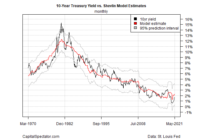
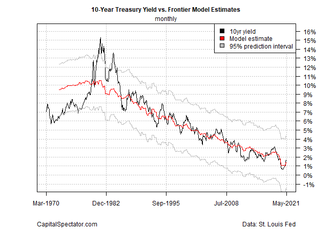
In recent weeks, I’ve been building models that estimate a theoretical “fair value” for the world’s most important interest rate: the benchmark 10-year Treasury yield (see here and here). The goal: combine the results to develop a more robust estimate by using the average.
As such, more models are better and so today I introduce a third approach to econometrically approximate the “correct” level of the 10-year rate.
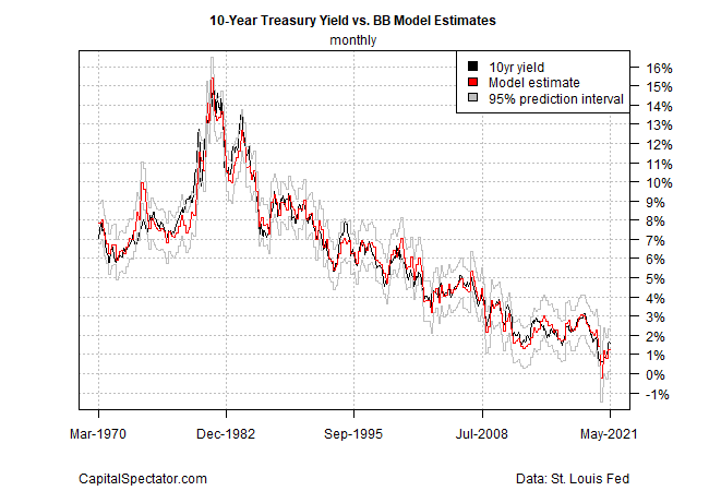
The new kid on the block is inspired by the five-factor model outlined in a recent Bloomberg article. The five factors:
- GDP growth
- Year-over-year Consumer Price Index (headline)
- Federal Reserve assets as percentage of GDP
- Fed funds target rate
- 1-year/3-year curve to estimate Fed bias
The BB Model, as I’m calling it, isn’t radically different from the other models used to generate an average estimate, but no one will confuse this trio. In particular, there’s minimal overlap in the data sets and transformations. That’s a key point since a degree of independence and disparity in combining models promotes a more reliable mean estimate.
Indeed, a decades-long line of economic and financial research demonstrates that using several models tends to provide superior estimates, through time, vs. relying on any one model.
Let’s cut to the chase and show how the average of the three models compares with the actual 10-year rate over the decades. Note that the mean and individual estimates in the first chart below are fitted values, which benefit from running the models on an ex-post basis.
On that basis, the backward-looking review is somewhat better than what would have been available in real time for each data point. Note, too, that economic data is revised—revised numbers are used throughout. Running the analysis with vintage data would deliver somewhat different historical results.
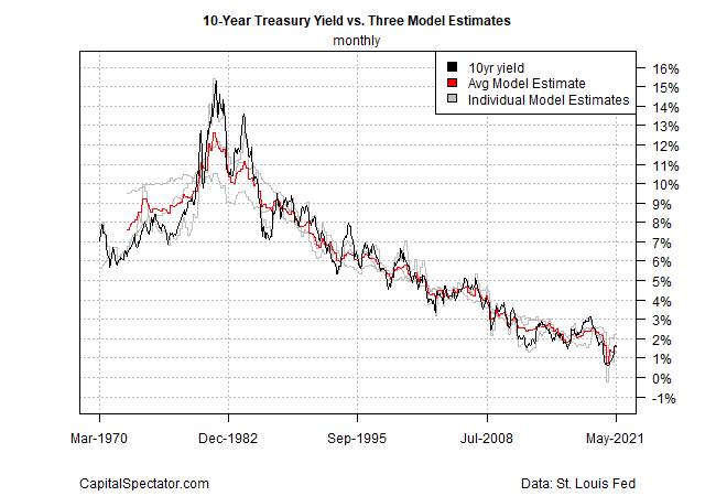
History isn’t bunk, but the main event is reviewing the latest estimate and comparing it with the current 10-year rate for some perspective on how the market bias is positioned for the near-term future. That’s a bit hard to see in the chart above—let’s zoom in on recent history in the next chart.
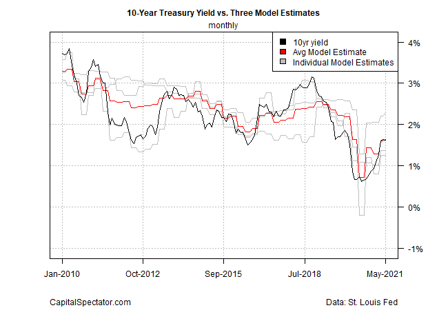
The average estimate for the three models (red line) was nearly identical with the actual yield in May (the modeling is updated monthly and the June numbers will be published in early July). The average 10-year Treasury yield in May: 1.62% vs. an average model estimate of 1.63%. The implication: the bias is relatively low for an expected substantial near-term change in the 10-year rate.
The thin spread is unusual and unlikely to persist, but for now the data suggests that the 10-year rate was close to fair value. Note that in June, the actual 10-year yield has slipped, settling at 1.49% yesterday (June 28), according to Treasury.gov numbers—a mild decline of 13 basis points.
In future updates, I’ll look at applications to extend the modeling to develop near-term forecasts (in comparison with the fitted data discussed here).
Finally, here’s how each of the three models compare individually through history:
