Pay Attention, Then Adjust As Needed
Tuesday’s gain of 19 points in the S&P 500 is a good example of markets showing observable improvement before a big move arrives. The title of last Friday’s article, “Improving Profile More Favorable For Stocks”, was based on evidence in hand, rather than any prediction about the future. Today, we will explore one of the most aggressive predictions making the rounds on Wall Street, and discuss some contingency strategies, as well as the current state of the markets.
Predictions Of A 1929-Style Crash
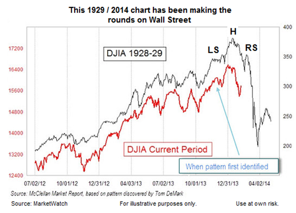
The chart below shows the path of the Dow in 1929 (black) and in 2014 (red). The rationale for showing the chart in a February 11 MarketWatch article was summarized as follows by the article’s author Mark Hulbert:
There are eerie parallels between the stock market’s recent behavior and how it behaved right before the 1929 crash. That at least is the conclusion reached by a frightening chart that has been making the rounds on Wall Street. The chart superimposes the market’s recent performance on top of a plot of its gyrations in 1928 and 1929. The picture isn’t pretty. And it’s not as easy as you might think to wriggle out from underneath the bearish significance of this chart.

Since the Wall Streeters championing the 1929 vs. 2014 chart bring a wealth of experience to the table, we will give them the benefit of the doubt, even though regular readers know we are not big fans of forecasting.
Fear Can Be Tamed With Contingency Planning
Investment fear can be tamed once you develop a game plan for worst-case scenarios. Therefore, let’s assume a 1929-style crash is coming sometime in the not too distant future, which will allow us to explore one of the worst stock market cases in history. The assumption does not mean we believe a crash is imminent; we are simply saying it never hurts to be prepared.
The 1929 Scenario Involves A Common Pattern
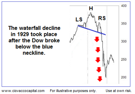
Chart patterns are based on human beings reacting to a shift in the fundamental data. A head-and-shoulders pattern is one example of how investors shift from a bullish bias to a bearish bias. In the 1929 chart below notice how the Dow formed a head-and-shoulders topping pattern before the 1929 crash (see LS, H, and RS). From a risk management perspective, the break of the neckline was significant.

Where Is The 2014 Neckline?
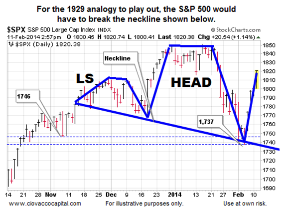
If the analogy between the path of stocks in 1929 and 2014 holds water, we would expect to see a head and shoulders pattern in 2014. Since the S&P 500 is the more widely followed index, we will base our hypothetical scenario on the broader stock index. We can find a head and shoulders pattern on the current chart of the S&P 500. If the 1929 crash path continued in 2014, we would expect to see a break of the blue neckline below followed by a sharp drop in stock prices.

Hypothetical 1929-Like Contingency Plan
If we know the neckline has to break before the 1929 analogy can play out, then we also know as long as the S&P 500 stays above 1,746 and 1,737, then the odds of a 1929-like crash are somewhat limited. Therefore, one way to handle the 1929 scenario in 2014 is to:
1. Not lose too much sleep as long as the S&P 500 stays above the neckline (1,746 and 1,737 are good reference points).
2. If the neckline is violated, begin to reduce risk in a pre-determined manner using an IF, THEN strategy, as described on October 18.
Observable Evidence vs. Predictions
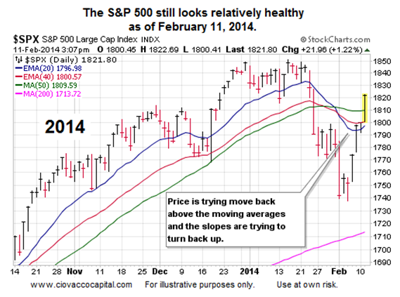
If you want to see some real world examples of using evidence in hand, rather than predictions, to manage risk, this video clip describes the 2010 Flash Crash and this article covers the 1987 stock market crash. If we leverage the concepts from 1987 and 2010 today, what do they tell us about the stock market’s current profile? They tell us some things need to change before we should be concerned about an imminent 1929-like event. The S&P 500 is above all the moving averages in the 2014 chart below, which tells us bullish economic conviction is stronger than bearish economic conviction from a long, intermediate, and short-term perspective.

How About The Fed?
Charts are a way to monitor the aggregate reaction to fundamentals, including earnings, GDP, and Fed policy. With five Fed speakers stepping in front of microphones Tuesday, investors had quite a bit to digest on the monetary policy front. From The Wall Street Journal:
The Federal Reserve’s outlook for the U.S. economy would have to seriously darken before officials would consider halting their gradual reduction of bond purchases, Janet Yellen said during her first congressional appearance since becoming the central bank’s chairwoman. “I think what would cause the committee to consider a pause is a notable change in the outlook,” Ms. Yellen told members of the House Financial Services Committee on Tuesday. She also said “very serious concerns” that low inflation wouldn’t move closer to the Fed’s 2% target could sway their thinking.
Market Headwind Addressed
Tuesday’s pop in stocks was not solely based on the Fed. Investors also received some news related to political gridlock on U.S. debt. From Reuters:
Republican leaders in the U.S. House of Representatives caved in to demands by President Barack Obama and agreed to advance legislation increasing Washington’s borrowing authority, removing a potential market headwind.
Investment Implications – Incremental Improvement
Prior to the S&P 500’s 22-point gain this week, our market model called for an incremental increase in our equity exposure before last Friday’s closing bell.
We took another, and larger, step to increase the growth side of our portfolios Tuesday. We are still holding a mix of U.S. stocks (SPY), technology stocks (QQQ), bonds (TLT), and cash. The recent moves to reduce cash and increase our allocation to stocks were made to bring us back in line with the market’s current, and improved, risk-reward profile. If the evidence continues to improve, we will continue to move incrementally.
