Tweedy Brown published a paper about the importance of dividends in stock selection and total return.
They cited “The Importance of Dividend Yields in Country Selection” by Michael Keppler, Journal of Portfolio Management (Winter 1991).
That study of the twenty years from 1969-1989 showed that among 18 MSCI country indexes, selecting and equal weighting the top 1 or 2 quartiles according to yield, and then holding them for 3 months (then reconstituting the portfolio every three months on that basis — 80 events of portfolio construction over 20 years) created the best returns. The study also showed that doing the same, but with the bottom 1 or 2 quartiles by yield produced the worst results.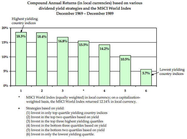
Here is a yield ranking of those country fund ETFs with more than $10 million in assets. Data is from Morningstar Principia as of July 31, 2012.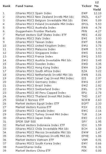
Other studies suggest a similar approach with Price-to-Book works too. Here are the same funds ranked by P/B: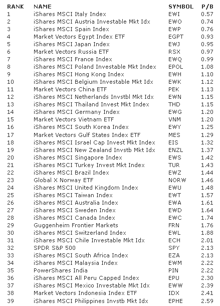
Those who believe in mean reversion, and that the world is not going to fall apart, would own the “cheapest” quartile, and some market neutral types might even short the most “expensive” quartile against the cheap quartile.
We might want to apply a couple of other HI/LO ranking parameters to potentially improve the ranking.
We put together the following unproven ranking system. It relies on three ranking methods that have certain adherents, but we went a step further by combining them.
We ranked the country funds by P/B, and by Yield and by ratio of Price-to-CashFlow divided by the sum of the Projected Cash Flow Growth and the Yield.
That latter metric is an adaptation of Peter Lynch’s modified PEG. To try to put slower growing dividend stocks on some kind of comparable basis with faster growing non-dividend stocks, he would use the P/E ratio divided by the sum of the earnings growth rate and the yield. In the case of country funds, the P/E is not always available, and cash flow is probably more consistently defined than profits [due to variances in income recognition rules, depreciation rates, and other accounting rules]. Therefore, we replace Lynch’s modified PEG ratio with our PCF/(CFG + Y) ratio [price-t0-cash flow divided by the sum of the cash flow growth rate and the yield].
With those three ranks in hand, we found the list of country ETFs that are in the top 1/2 of the rank for each of the three metrics, and those that are in the bottom 1/2 of the rank for each metric.
If this combined ranking system makes sense (and the IF is up to you to decide), then the ETFs for Poland, Hong Kong, Italy and The Netherlands present the greatest opportunity, while Switzerland, Chile, Peru, Turkey and the Philippines present the least opportunity at this time.
The US which is leading the world among large markets, ranked as a low potential market by this method.
Obviously, there is no thematic, macroeconomic or other non-quantitative element in this treatment. Pure quant types may be OK with that, and many others would be incredulous. At this point it’s just data — data that you may find thought provoking.
The implied action is fairly counter intuitive, and perhaps totally wrong, but interesting to consider further.
When we put P/B, Yield and a cash flow and yield modified PEG together we get the list below.
The stock ranks in green are in the top 1/2 fore the particular metric, and the stock ranks in pink are in the bottom 1/2 for the metric.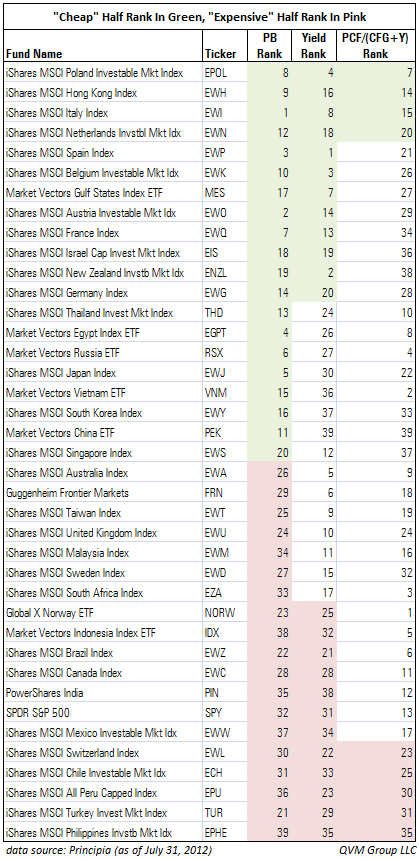
Here are two charts. One plots the percentage performance of the green shaded “cheapest” country ETFs versus the S&P 500 (proxy SPY), and the other plots the pink shaded “most expensive” ETFs against the S&P 500.
“Cheapest” (green)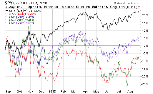
“Most Expensive” (pink)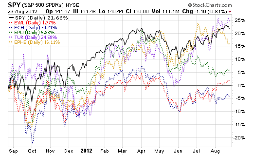
- English (UK)
- English (India)
- English (Canada)
- English (Australia)
- English (South Africa)
- English (Philippines)
- English (Nigeria)
- Deutsch
- Español (España)
- Español (México)
- Français
- Italiano
- Nederlands
- Português (Portugal)
- Polski
- Português (Brasil)
- Русский
- Türkçe
- العربية
- Ελληνικά
- Svenska
- Suomi
- עברית
- 日本語
- 한국어
- 简体中文
- 繁體中文
- Bahasa Indonesia
- Bahasa Melayu
- ไทย
- Tiếng Việt
- हिंदी
Dividend Yields As Important Factor In Country Fund Selection
Published 08/28/2012, 04:10 AM
Updated 07/09/2023, 06:31 AM
Dividend Yields As Important Factor In Country Fund Selection
Latest comments
Loading next article…
Install Our App
Risk Disclosure: Trading in financial instruments and/or cryptocurrencies involves high risks including the risk of losing some, or all, of your investment amount, and may not be suitable for all investors. Prices of cryptocurrencies are extremely volatile and may be affected by external factors such as financial, regulatory or political events. Trading on margin increases the financial risks.
Before deciding to trade in financial instrument or cryptocurrencies you should be fully informed of the risks and costs associated with trading the financial markets, carefully consider your investment objectives, level of experience, and risk appetite, and seek professional advice where needed.
Fusion Media would like to remind you that the data contained in this website is not necessarily real-time nor accurate. The data and prices on the website are not necessarily provided by any market or exchange, but may be provided by market makers, and so prices may not be accurate and may differ from the actual price at any given market, meaning prices are indicative and not appropriate for trading purposes. Fusion Media and any provider of the data contained in this website will not accept liability for any loss or damage as a result of your trading, or your reliance on the information contained within this website.
It is prohibited to use, store, reproduce, display, modify, transmit or distribute the data contained in this website without the explicit prior written permission of Fusion Media and/or the data provider. All intellectual property rights are reserved by the providers and/or the exchange providing the data contained in this website.
Fusion Media may be compensated by the advertisers that appear on the website, based on your interaction with the advertisements or advertisers.
© 2007-2025 - Fusion Media Limited. All Rights Reserved.
