A post by the Pew Research Center based on the Federal Reserve's Survey of Consumer Finances stated that minorities were falling further behind whites in net worth:
- "the median net worth of white households in 2013 was $141,900, about 13 times that of black households at $11,000";
- "the median net worth of white households [in 2007] was $192,500, or 10 times that of black households at $19,200".
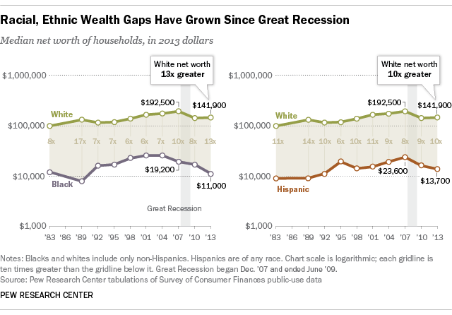
There is no dispute that the data is showing a growing wealth gap, but it flies in the face of what should be improving metrics for wealth generation for minorities.
Employment Levels
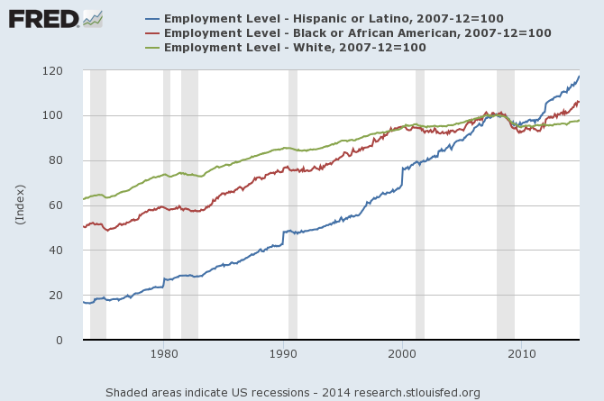
There has been improving metrics for employment of minorities. The graph below indexed the employment levels to the beginning of the 2007 recession. It is white people who have not recovered employment - whilst African American and Hispanics have.
Index of Employment Levels (from the BLS Household Survey) – Hispanic (blue line), African American (red line), and White (green line)
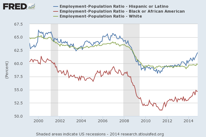
However, population growth is different for each racial group. Here is a look at employment to population ratios which shows NO group has recovered from the Great Recession - but each minority group has done as well or better than whites:
Employment / Population Ratios (from the BLS Household Survey) – Hispanic (blue line), African American (red line), and White (green line)
To more clearly show this point, here is the same data indexed indexed to the beginning of the 2007 recession:
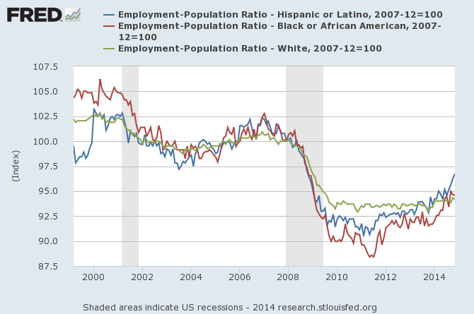
Still, as each minority group in relative employment levels is equal to or better than whites, it is not job growth which is causing the growing wealth gap.
Mean Income by Race
The Pew study states in part:
According to the Federal Reserve data, the median income of minority households fell 9 percent from 2010 to 2013, compared with 1 percent for whites.
US Census data specifically breaks out African American and Hispanic median income. This data shows that from 2010 to 2013, whites, African American and Hispanic household median incomes grew although whites did the worst (and the white growth was statistically zero).
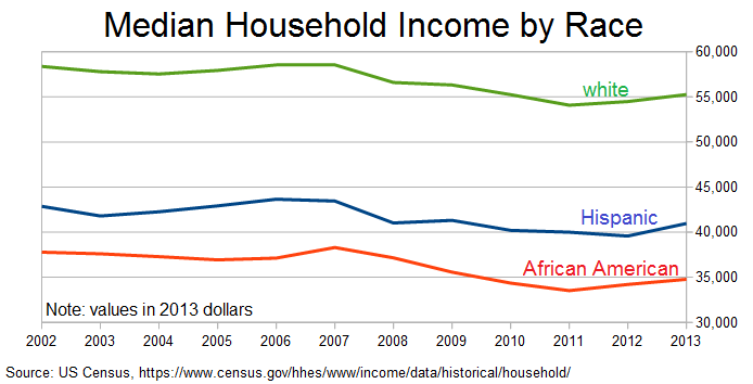
African American and Hispanic median household income is significantly less than whites. The Pew post implies one of the reasons for declining wealth was caused by loss of real income. It is not a fact that African American and Hispanic median household incomes have declined since 2010 based on US Census data.
One could argue that the inflation statics are flawed (which leads to miscalculation of inflation adjusted median incomes) - I have seen some evidence of this in other personal studies. In engineering any methodology, you can do all the correct things and still have the wrong answer. Still, the same methodology was used on all races so the correlations should be valid.
The Takeaway
Minority net worth is declining respective to white net worth. Why it is happening? Pew took a stab at the underlying reasons:
... financial assets, such as stocks, have recovered in value more quickly than housing since the recession ended. White households are much more likely than minority households to own stocks directly or indirectly through retirement accounts. Thus, they were in better position to benefit from the recovery in financial markets.
But the decrease in asset ownership tended to be proportionally greater among minority households. For example, the homeownership rate for non-Hispanic white households fell from 75.3% in 2010 to 73.9% in 2013, a percentage drop of 2%. Meanwhile, the homeownership rate among minority households decreased from 50.6% in 2010 to 47.4% in 2013, a slippage of 6.5%.
But the improving employment and income situation of both African Americans and Hispanics should have more than offset Pew's rationalizations. There is something missing in understanding declining minority wealth. Here is another instance where more research and data is needed.
Other Economic News this Week:
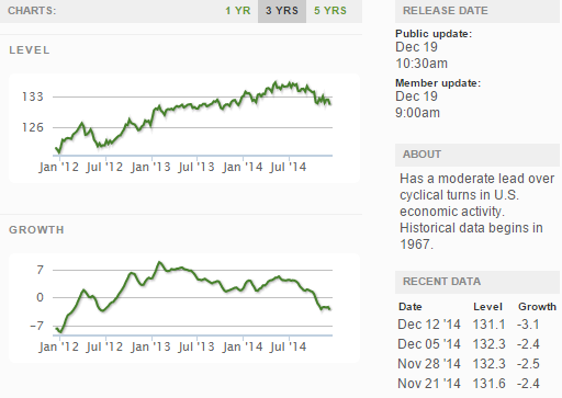
The Econintersect Economic Index for December 2014 is showing our index on the high side of a tight growth range for almost a year. Although there are no warning flags in the data which is used to compile our forecast, there also is no signs that the rate of economic growth will improve. Additionally there are no warning signs in other leading indices that the economy is stalling - EXCEPT ECRI's Weekly Leading Index which is slightly below the zero growth line.
The ECRI WLI growth index value crossed slightly into negative territory which implies the economy will not have grown six months from today.
Current ECRI WLI Growth Index
The market was expecting the weekly initial unemployment claims at 288,000 to 300,000 (consensus 295,000) vs the 289,000 reported. The more important (because of the volatility in the weekly reported claims and seasonality errors in adjusting the data) 4 week moving average moved from 299,500 (reported last week as 299,250) to 298,750. Rolling averages under 300,000 are excellent.
Weekly Initial Unemployment Claims - 4 Week Average - Seasonally Adjusted - 2011 (red line), 2012 (green line), 2013 (blue line), 2014 (orange line)
Bankruptcies this Week: none
Click here to view the scorecard table below with active hyperlinks
Weekly Economic Release Scorecard:
