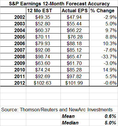
How useful are the forward earnings estimates of the sell-side analysts?
There is a widely-circulated chart that reinforces the popular viewpoint that analyst forecasts are hopelessly optimistic. It comes from a Morgan Stanley research note, first called to my attention by a reader who writes frequent and thoughtful comments, "CautiousInvestor". I knew immediately that there was something amiss, but I wanted to see the original context of the report. Now Josh Brown has joined in, providing a second chart from a different Morgan Stanley department. Josh is both open-minded and influential. He often uses forward earnings in his popular CNBC segments and also features reports from earnings expert Brian Gilmartin. This seems to provide the perfect occasion for a civilized, data-based discussion – difficult to get on a topic that seems to arouse passions.
Summarizing my position
I find the bottoms-up estimates to be very useful, with the most recent full update here. I have frequently noted that most pundits simultaneously claim two things:
- Analyst estimates are too optimistic.
- At the time of reports, the bar is "too low" so the "beat rate" is very high, but not meaningful.
If you think about these two propositions, it suggests that there is a crossover point where the estimates are pretty good. My research shows that estimates are pretty good if you limit the forecast to the next twelve months. The Morgan Stanley chart suggests that my conclusion is wrong. We would all like to have better forecasts of earnings, so this is a good topic for research. If we simply cannot forecast earnings effectively, so be it. Let us dig deeper.
The Attention Grabbing Chart
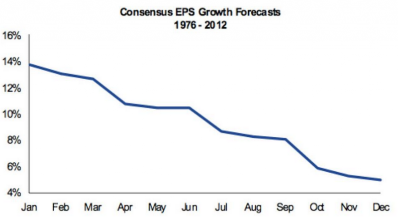
I will be working with the two charts from Josh's article, although the first has appeared in many places.
The message of the chart is pretty clear: Thirty-six years of data show that we should expect estimates to fall throughout the year. My own experience told me that something was wrong. Other observers – even savvy ones – have not worked as closely with the underlying data. Moreover, the conclusion fits neatly with the preconceptions everyone has.
Here are some of the questions that should immediately come to mind:
- What is depicted? Is the consensus for each month the arithmetic mean? If so, it is dramatically influenced by the occasional recession. Using a mean distorts the result when you have a few skewed cases. Suppose, for example, that Bill Gates and Warren Buffett are in a room with a group of other bridge players and we calculate the "average" income. Here is a quote from the report:
"Since 1976, the median year-over-year earnings growth forecast in January for the full year ahead is 14%, but expectations on average decline throughout the year to closer to the 5% average EPS growth we have seen over that period (Exhibit 1). In fact, in 29 of the 37 full years for which we have forward earnings data, the January sell-side analyst estimates proved to be too optimistic."
So the January figure is described as a median. - What is a median value in this context? Did the researchers take the 37 years and choose the middle one? If so, why not tell us which year it was? Does that year really depict the typical behavior? Or do they look at the median change for each month? That would be strange, since the overall curve would not reflect any particular month. A median is best used when there is a cluster of casts that can be described as typical. Is that the case here?
- Why is there no actual earnings result for the year? This is a chart of changes in the forecasts. Normally when we want to evaluate a forecast we compare it with the actual result. That is not known for a few months after the end of the calendar year. Usually the actual beats the final forecast.
- The pattern does not make logical sense. Anyone who does forecasting knows that the estimates get closer to reality as you get more data. You can do a better job of forecasting how many games the Bears will win this year after twelve games have been played than you could before the season started. The same is true for GDP or any other economic series. The shape of the forecast curve should flatten as data appears during the year. This is another reason why an expert should be suspicious of the chart.
My conclusion is not that the chart is not accurate, although it would help to see the underlying data. It is yet another example of taking data and creating a false impression.
Compare this with a typical chart from Doug Short. When there are many variables, he makes the data come alive by showing the effect of each. This chart takes a complex situation and incorrectly reaches a simple conclusion. The error of this method is the reason that those analyzing forward earnings use a "squiggle" chart. Let us dig still deeper.
The Squiggle Chart
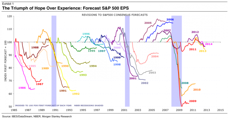
A different Morgan Stanley branch produced the second chart Josh cites. Here it is.
The researchers begin each of the forecast years when the first prediction is made and continue the squiggle until the final report for that earnings year. They start each squiggle at 100 to make the changes equal in percentage terms. The visual impact is dramatic, with the final result finishing below the 100 axis in every year except 2005 and 2006. It is a very convincing presentation, but once again, the conclusion is wrong. There are three problems (not counting that they only have 26 years of data rather than the 36 from the first chart).
- There is no distinction for recessions. Showing this visually could be done easily with the original data. For now, please look at each squiggle. Compare those that move through the recession years with those that do not. You should be able to see the dramatic difference, particularly in the years since 2001.
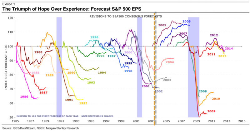
- The researchers ignore Sarbanes-Oxley, the legislation designed (after Enron, WorldCom and other incidents) to fix some of the abuses in the relationship between investment analysts and companies. No one believes that SOX solved all problems, but we should at least entertain the idea that it improved the data. I did not care much for forward earnings before SOX, but I read a lot of research reports. There was a difference. Let us look at the squiggle chart with a line for SOX, passed in 2002. The actual effect might have come a little earlier or later, depending on anticipation and compliance, but this is close enough.
It is obvious that the pattern to the right of the line is different from what we see on the left. The difference is even more dramatic if you consider the recession.
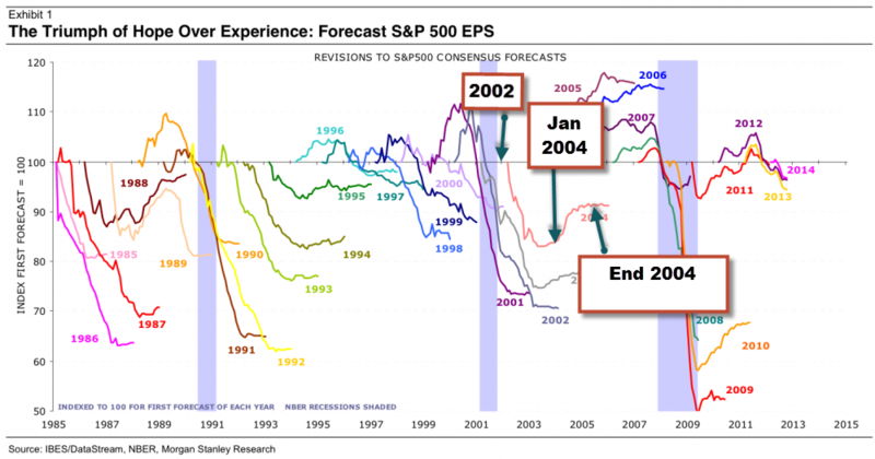
- The researchers use the wrong starting point. Do you care about earnings forecasts for 2016? No? Neither do I, but that is what we will see starting in April. The "early line" for a given year starts more than 18 months early. I do not think that earnings estimates can be very accurate that far in advance, and I doubt that analysts take them very seriously. It is like asking how many games the Packers will win during the 2016 football season. Good luck! This adjusted chart shows the misleading nature of the Morgan Stanley squiggles.
I direct your attention to the 2004 calendar year. The chart scale is difficult to read, so I have provided arrows showing the start of 2002 in the data and the first estimate for 2004, which was posted at the start of May, 2002. I also have an arrow for the start of the 2004 calendar year, at which point the estimate had dropped from $70 to $60.37. The early line did not reflect the effects of 9/11 or the 2001 recession. The squiggle unaccountably continues for several months after the end of earnings season.
The researchers have bamboozled you by focusing on the "early line" that no one cares about. Most of the dramatic declines occur in this period, a preamble to the actual earnings year. If they were to redraw the squiggles with an accurate scale, starting at the beginning of the year, you would see a very different picture. Since they have the data, someone should ask them to produce such a start.
Conclusion
Forward earnings provide a valuable information source for truth-seeking investors who want an edge. Here is a good summary:
The earnings estimates actually are too bearish, except for the recession years. This explains why I spend so much effort on recession forecasting!
An astute investor should embrace this valuable source of data, following the updates on forward earnings.
A Personal Afterthought
This post may have required the most time and effort of anything that I have ever done. I did the work because the subject is important. It goes to the heart of the current market debate about what to expect next year. There is absolutely no payoff for publishing this kind of research. I already knew the conclusion. The extra hours come from explaining it clearly.
It is much easier to do short posts that cater to the popular mood. Instead, the result is a long post that runs counter to current prejudice. You need to be open-minded, intelligent, and patient to consider the various points. People would rather read about whether we are in a bubble.
The incentive structure for this sort of work is all wrong. Street research is not peer reviewed. It is often misleading. The top research teams get paid high salaries to do this full-time. Guys like me spend our evenings and holidays trying to shine a light. No one shares the underlying data, even if there is nothing proprietary about it. That raises the barrier for anyone trying to understand the work.
Investors are skeptical of sell side earnings estimates, but blindly accept research charts like these. They should do the opposite.

