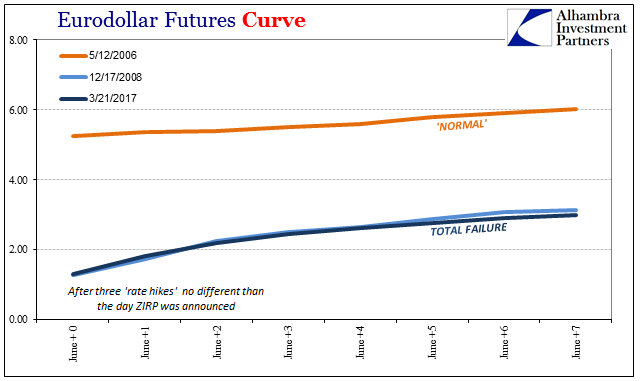
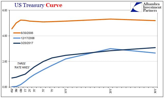
As the yield curve flattened out almost in a straight line from late 2013 until July 2016, it became common to suggest the historical relationship between inversion and recession. While that may still be a valid interpretation, as the yield curve ultimately did not invert and the U.S. did avoid falling fully into recession, it misses the far more important dynamics that define this era (as well as the one or two before it). You just won’t find any answers in the cyclical.
During the relatively brief “reflation” trade of later 2013, the yield curve for U.S. Treasury securities peaked in the 5-year/10-year part at 141 bps. Though most attention turns to the 2s10s as a means to digest cyclical interpretations, it is really the 5s10s where all that matters truly occurs. Much like the 5-year/5-year forward inflation rate, the 5s10s on the UST curve is the section where the intermediate economic conditions, including monetary policy perceptions, run into the long run trajectory where expectations for potential opportunity are more completely expressed.
Though that peak steepness on November 20, 2013, was less than it had been at the peak in early November 2010, it was significantly more than historically justified. In September 1992, for example, the 5s10s topped out in that recovery at around 110 bps; a sudden an unusual spike in the shape in November 1976 brought the 5s10s up to 100 bps where throughout most of the postwar era more than 40 bps or 50 bps was considered steep.
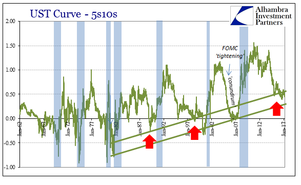
The current curve would in that context be considered similarly, yet we know that it can’t be the case. At around 50 bps currently, the 5s10s are equal in distance to the steepening trend immediately after the end of the dot-com recession in early 2002 as well as the same in August 1991.
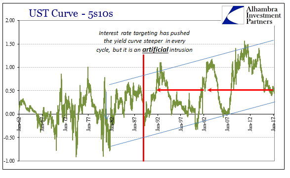
While the term spread may work out the same, the whole curve is vastly different across those time periods. Therefore, there is much more going on than just the yield curve shape, whether inverted or not (or even never again).
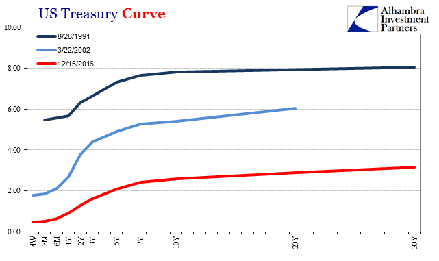
In fact, the distances between the yield curves at each of these historical points are so large as to be defining wholly different conditions. There may be some interesting information in that 5s10s spread as it relates to perceived opportunity as well as opportunity’s financial opposite: liquidity preferences. The 50 bps steepness at August 28, 1991, cannot be anything like the 50 bps steepness at December 15, 2016, even though the curve shape overall is strikingly similar at both. In other words, relativity is demanded by virtue of the situation nominally.
Because the yield curve in 1991 was anchored around 8%, the so-called term premium related to something far different than the one for December 2016; in the former, it was sufficiently steep so as to suggest normal or normalizing conditions; in the latter, it is instead remarkably flat telling us just the opposite. In other words, the yield curve just ain’t what it used to be.
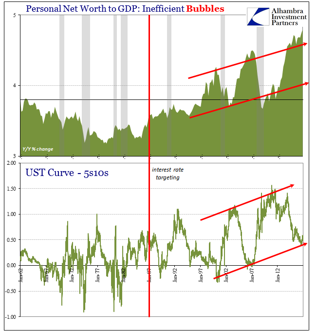
From the point of view of orthodox policy, it has been the needs of monetary policy that drove everything lower and by extension upside down. The yield curve has only steepened in the 21st century, and yet the economy of this period has been slower and weaker (in sustained fashion) than at any point since the 1930’s. It sets up an inversion to where the yield curve gets steeper the more the economy slows, which by mainstream definitions can’t be the case.
To solve the “equation” we merely have to frame all references to the nominal. Thus, the steepness of the yield curve itself is a byproduct of monetary policy effects on the shorter rates. For policymakers that has meant R*, the assumed natural rate of interest.
We have to keep in mind that R*, or R-star as it is sometimes notated, is not something that can be observed directly, but despite that limitation is immensely important to monetary policy. It is supposed to define the balance between inflation and deflation; if monetary policy can get “real” rates below R* it is thought of as stimulative. Conversely, if the “real” policy rate is above R* monetary policy is believed functionally restrictive.
Given that framework, if R* is falling then each time the Federal Reserve or any other central bank wishes to “stimulate” it must do so with lower and lower short-term rates in order to get the policy rate underneath where it assumed the natural rate has fallen. Once at the Zero Lower Bound (ZLB), policy is constrained in nominal terms leaving authorities to undertake unconventional policies so as to push “real” rates down where they are calculated to be stimulative.
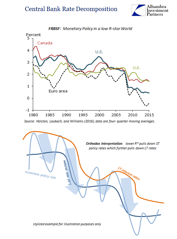
According to calculations performed by the San Francisco branch of the Fed, R* is indeed falling and has been doing so for decades. As a result, each time the U.S. economy is confronted with cyclical economic weakness such as the Asian flu (which resulted only a near-recession) or the dot-com recession, the “required” monetary policy response has been that much more so. The result is what we see of the yield curve, where it steepens due to the weight of policy on the front end essentially pulling it downward.
But is this really true? There isn’t a whole lot of sense in this formulation. You can see at times that it amounts to reverse engineering rather than defining an internally consistent and logical explanation of the last thirty years, starting with the fact that economists have no idea what might have caused R* to decline in the first place. Further, the bond market just doesn’t work that way, as again interest rates define opportunity rather than being anchored almost exclusively to monetary policy.
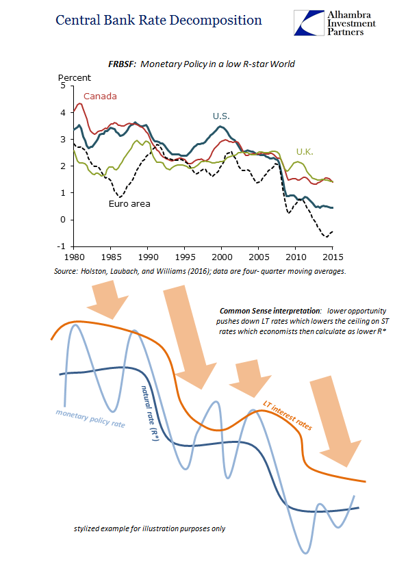
A more common sense explanation would be the opposite direction for the chain of causation: the economy slows in structural terms causing the bond market to reduce in its overall nominal framing, where cyclical weakness is therefore more pronounced over time leaving the Fed not to “stimulate” with lower and lower policy rates but to announce in review what has already happened. In short, they are calculating a lower R* as a result of being unable to square reality with the orthodox parameters of how orthodox theory posits reality is supposed to be.
R* is just the plugline or balancing factor that attempts to make sense of why neither ultra-low interest rates after the dot-com recession nor QE in the aftermath of the Great “Recession” failed to work as they “should” have. For policymakers, policy rates went low and lower but since no great recovery resulted, especially from the QE’s, it is merely asserted that R* must have been that much lower still. From this view, QE was surely powerful “stimulus” but it didn’t appear to have worked, therefore R* was just that much lower than QE got the policy rate to. If “real” policy rates had been pushed down to -10%, the still lack of recovery would have left Fed officials claiming R* surely was -10.01%.
This reverse engineering is actually quite common and necessary for a philosophy that is so often backward. What comes first is the lack of growth, leaving economists to calculate an R* based on wherever interest rates happen to be due to their reactionary efforts trying (and inevitably failing) to do something about it. We can observe this relationship in any number of important ways:
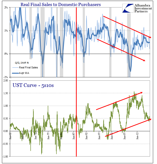
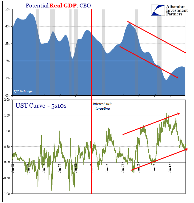
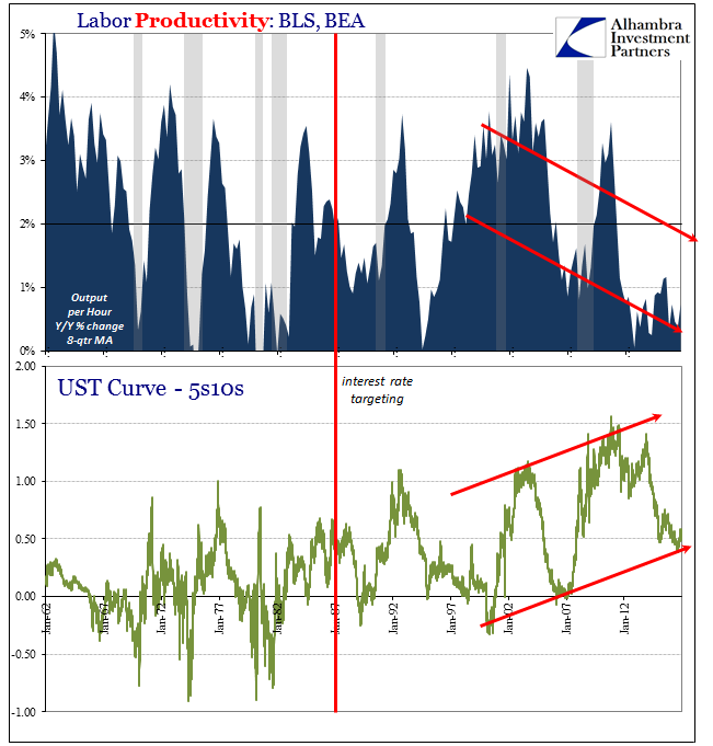
How could this have happened? Ironically, for answers we can turn to the Fed for some very relevant pieces – just not in the way they were/are presented and understood. To start with, the San Francisco Fed provides us with an enormous clue derived from their lack of ability to offer an explanation for their R*:
These findings suggest that declining natural rates of interest are an international phenomenon and therefore stem in large part from developments common to many countries, rather than idiosyncratic national factors. This argues for more research that takes an international perspective in analyzing natural rates, by including data from economies besides the United States and by examining structural changes that influence natural rates across the globe.
The highly synchronized global economy leaves but few competing explanations. The first that immediately springs to mind is “globalization”, but that is more of a buzzword than a coherent elucidation of actual processes. For more depth of detail we turn to Ben Bernanke who in 2005 actually figured out nature of this growing, already immense imbalance:
The table confirms the sharp increase in the U.S. current account deficit, about $410 billion between 1996 and 2003. (Data from the first three quarters of 2004 imply that the current account deficit rose last year by an additional $140 billion at an annual rate.) In principle, the current account positions of the world’s nations should sum to zero (although, in practice, data collection problems lead to a large statistical discrepancy, shown in the last row of table 1). The $410 billion increase in the U.S. current account deficit between 1996 and 2003 must therefore have been matched by a shift toward surplus of equal magnitude in other countries.
As is usual, Bernanke was reverse engineering reality but by orthodox definitions. Because of that, this $410 billion discrepancy by 2004, a monetary one, “must therefore have been matched by a shift toward surplus”, or what he called a “global savings glut.” It surely couldn’t have been a money supply explosion and an external one at that because that would mean there was no Great “Moderation” for which he at that time in particular was itching to take credit for. Without accounting for the global monetary imbalance somehow, the Fed was left open to righteous criticism. The fact that this “global savings glut” was the best he could offer is very telling, but no less important in defining the parameters of economic reality.
Globalization in the context of the eurodollar system, by contrast, gives us the answers to all these problems.
That is what is so often missing from any point in the current argument. No pool of labor no matter how cheap and deep is a sufficient allure on its own. The miracle of capitalism, including that which Ricardo used to theorize as to comparative advantages, is the productivity that is achieved by the marriage of labor and capital. There may have been so many tens of thousands Mexicans willing to work at $1 per hour as Ross Perot once argued, but without a massive infusion of equally cheap and available “cash” those Mexicans would simply have to wait for the true capital (capex) for it to actually matter. That is why the “giant sucking sound” did not appear until 2000-01; the eurodollar system was simply not ready for the volume, too immature right away even in its final form developed fully after 1995.
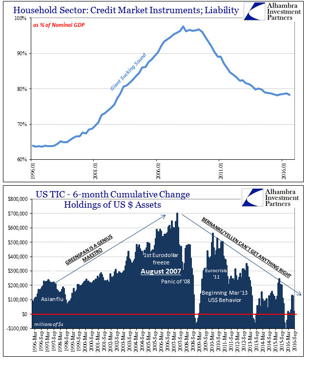
The late 1990’s saw opportunity in eurodollar expansion inside the United States and Europe, the result of which was the dot-com bubble. Thereafter, it was increasing outside the U.S. (and Europe) to where EM’s financed by eurodollars were all productive opportunity leaving the U.S. (and Europe) instead to variable forms of liquidity preferences (including UST’s, Greenspan’s “conundrum”) – the shriveling UST curve. This was the housing bubble where debt financed consumption of a greatly weakened and still weakening U.S. economy counterintuitively hollowed out by rapid even exponential eurodollar expansion. You don’t normally associate drastic monetary growth with worsening economy, but in an open system architecture it is not only possible but given the constraints of those times perhaps the only way it could continue as long as it did.
It was only (seemingly) stable so long as both parts worked – rapid monetary growth had to finance consumption in the DM end markets as well as construction and investment in the EM production capacities. Taking away first the finance of consumption left the entire global system unable to function – and economists to calculate the resulting lack of recovery as the low R* they set today.
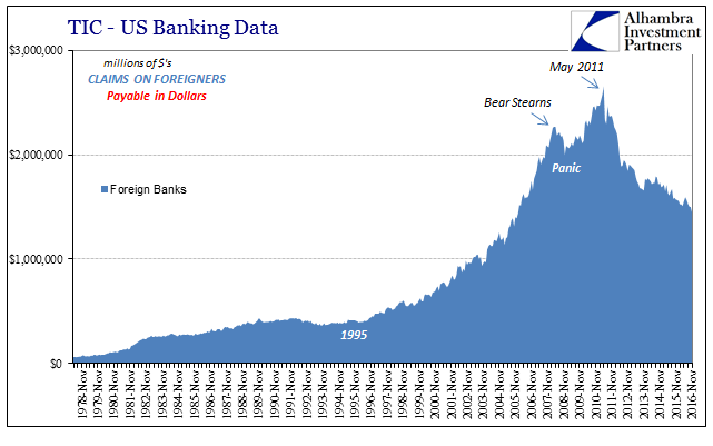
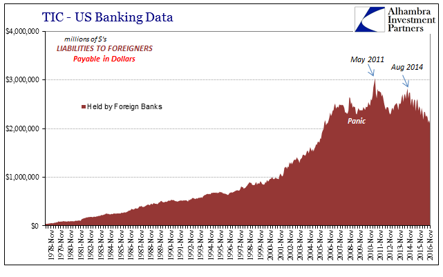
From this perspective, the 50 bps 5s10s spread of late is relevant only to the 5s10s spread from November 2013 and immediately before; with the latter suggesting a higher probability of this paradigm being broken, the economy escaping from this dungeon of depression; the current curve though steep in historical terms rightly diagnosing the chances of that happening as exceedingly small and getting smaller. The shrinking of the curves (eurodollar futures as well as UST) in nominal reference defines the interpretation of their steepness. Opportunity and probability, leaving liquidity preferences the baseline case, is what we find in interest rates, not monetary policy. As shocking as that may be for some, it has been this way for a very long time already.
