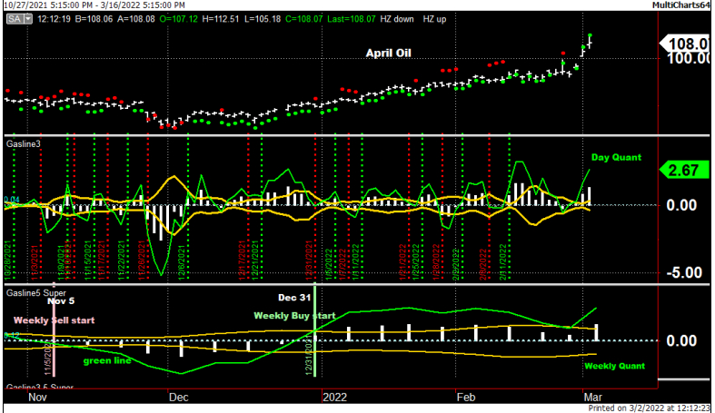
Below is our April crude oil analysis. The green lines indicate strength or weakness in the market. First, we examine the weekly chart at the bottom of the chart. When the Green Line moves above the zero line, it indicates strength.
On Dec. 31, strength moved into the market. This indicated a Weekly buy signal, and a change in trend occurred. Before this shift in direction, the chart had been in a Weekly sell. Notice how the green line slid below the zero line on Nov. 5, indicating weakness.
Next, we examine the center chart based on daily data. The same rules apply here that apply to the Weekly chart. When the green line is below the zero line, it signals short-term weakness. If the green line is above the zero line, signaling short-term strength.
The top chart is a daily bar chart with Red and Green dots. Green dots indicate strength and Red weakness. The White histogram bars and gold mirror bands are useful indicators as well. We will explain them in future articles.
All three charts, the red and green dots at the top, the Daily (center), and the Weekly (bottom) quants indicate that Crude is in an uptrend in the short and long term. The Weekly Math Quants have confirmed strong directional trends, issuing only two directional trends over the past five months.
The Daily quants almost always exhibit market action over the short-term only to run the markets up or down within their weekly trends.
