The economic and financial shocks unleashed by the global coronavirus crisis have reordered risk profiles for markets in unexpected as well as expected ways. One of the shifts that should surprise no student of market history: the recent rise (and in some cases dramatic spikes) in return correlations.
As the historical record clearly shows, return correlations (a staple in risk analytics for portfolio design) tend to rise in market corrections. That’s certainly been true for the major asset classes this year.
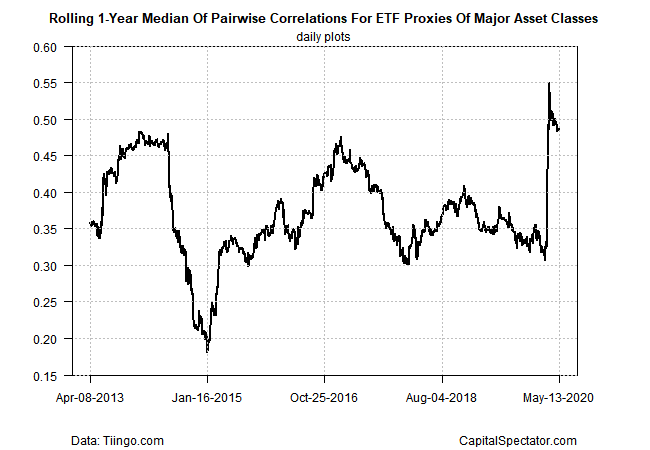
Let’s begin with a proxy that summarizes correlations for the major asset classes via the median data for a rolling 1-year window. In recent weeks the correlation has surged, rising sharply and suddenly in March to around 0.50 from the low-0.30 range. (Note: correlation readings range from -1.0 (perfect negative correlation) to zero (no correlation) to +1.0 (perfect positive correlation.)
Profiling the broad sweep of assets masks some of the more extreme changes this year. For a closer look at how some correlation relationships have evolved recently let’s focus on a select group of return pairings between the US stock market and foreign equities in developed, emerging markets and also vs. US bonds. Using ETF proxies, the chart below reveals that correlations have jumped in recent weeks, based on rolling 1-year windows. For example, the correlation between US stocks — Vanguard Total US Stock Market (NYSE:VTI) – and shares in foreign developed markets — Vanguard FTSE Developed Markets (NYSE:VEA) – increased to 0.95 lately, close to the highest possible positive reading (red line in chart below). Note, too, that the US equity-US bond correlation has spiked. In short order, the 1-year correlation between VTI and Vanguard Total Bond Market (NASDAQ:BND) has shifted from negative readings to a modestly positive 0.2 correlation (green line).
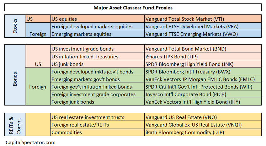
Let’s dig down further into all the pairwise correlations for the major asset classes, based on this set of exchange traded funds:
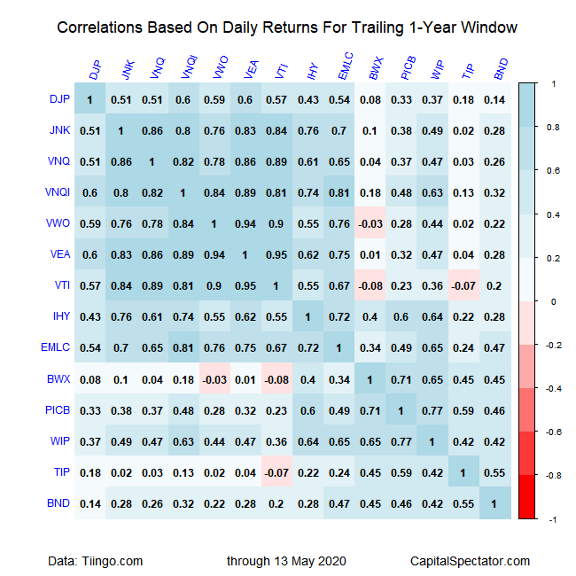
Using the ETFs above for analysis shows that most of the correlation pairings for daily returns over the past year are positive in varying degrees. Notably, the positive readings have increased substantially compared with The Capital Spectator’s correlation profile in January 2020. As the table below shows, the darker-blue squares dominate, which indicates relatively high correlations. This is a conspicuous change from the start of the year.
For another perspective, the next table below maps all the pairwise correlations for daily returns for the current five-year trailing window. Although correlations are lower overall for this longer window, most of the comparisons show an upside shift vs. the January results.
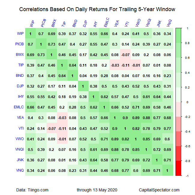
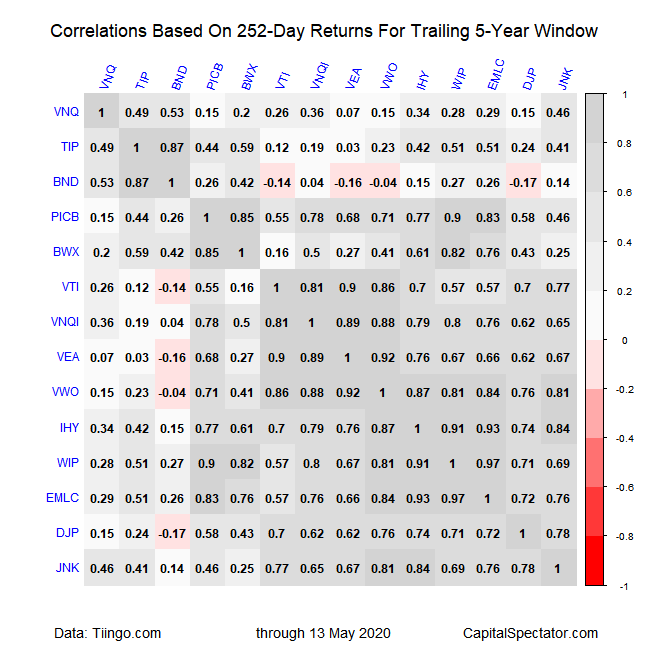
Finally, here’s another perspective based on rolling one-year returns (252 trading days) to calculate correlations for the trailing five-year period through yesterday. Analyzing correlations via this time period suggests that diversification opportunities show more stability over a longer-run perspective across asset classes.
