Intech Investment Management recently published a primer on monitoring market stress by way of several risk metrics, including skewness of returns (SoR). In the grand scheme of quantifying risk, SoR is relatively obscure, but Intech makes a good case for paying more attention to this data.
Applied to financial markets, skewness measures the degree of return asymmetry in terms of the probability distribution around the mean. In English, skewness tells us if returns have been extreme or not. A relatively high positive skewness reading indicates returns deep in the right tail of the distribution. A negative number equates with a loss in the left tail. In short, skewness offers a straightforward tool for quantifying and monitoring tail risk.
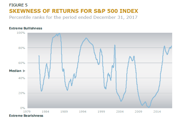
Intech advises that “when investors become irrationally exuberant, market returns tend to become less negatively skewed or, even briefly, positively skewed (e.g., beginning of 1987 and mid-1990s), which supports the potential for an increased likelihood of a significant market dislocation. Conversely, very low levels of skewness often coincide with the market shock itself, and eventually manifest themselves as increased market dislocation with positive outcomes (e.g., early 2004 and following the Global Financial Crisis in 2009).”
Measuring return skewness for, say, the US stock market offers a useful lens for quantifying the degree of exuberance, or the lack thereof. A chart in the Intech research note shows the ebb and flow of market sentiment through time.
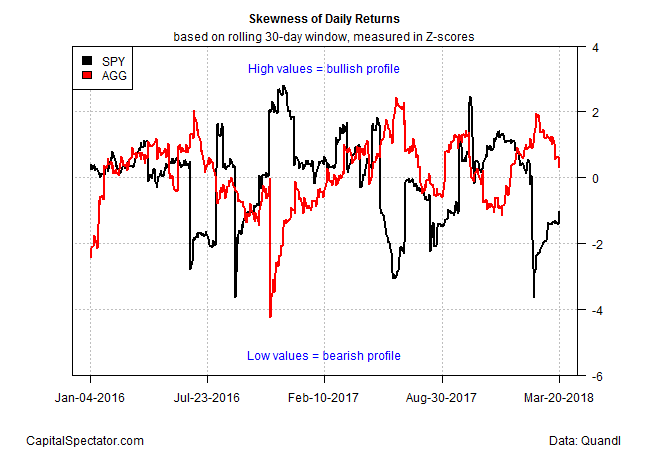
Another way to use skewness is by comparing markets. Consider, for instance, how the US stock market stacks up against the US bond market in recent history. Let’s use two ETFs as proxies to crunch the numbers: SPDR S&P 500 (NYSE:SPY)) for equities and iiShares Core US Aggregate Bond (NYSE:AGG) for fixed-income securities. For easier comparison, the data in the chart below is shown as Z-scores, which reflect how the skewness values rank in terms of standard deviations above or below their means. For this example, the results are based on a rolling 30-day window of daily returns.
Note the negative relationship between stock and bond skewness values. The correlation for the two data sets in the time period shown in the chart above is -0.46. That’s a key clue for expecting that when the crowd is relatively bullish in one market, the opposite will be true in the other. No one should be surprised by that relationship, but it’s valuable to have hard data for tracking the stock/bond connection in real time, perhaps with an eye on a tactical asset allocation application.
At the moment, bonds have a mildly bullish profile, as indicated by the Z-score reading of 0.32 was of yesterday’s close (March 20). Meantime, there’s a mildly bearish bias for stocks via a Z-score of roughly -1.0. The real value in this data is identifying periods when the gap is at an extreme, as it was at one point last month, in the wake of the sharp stock-market correction.
Adjusting the length of the rolling window will, of course, change the results and so it’s important to carefully consider which trailing period matches your analytical focus.
Skewness is hardly a silver bullet for quantifying tail risk. In fact, no one metric will tell you everything you need to know about risk. Instead, look to several methods for modeling extreme returns – value at risk and extreme value theory, for instance. Skewness, however, deserves to be on the short list. As a simple, intuitive tool for monitoring crowd sentiment through a relatively objective lens, it’s a tough act to beat.


