Well, I sure felt one hell of a lot better yesterday than I did on Tuesday, when I had one of the only times in 17 years that I didn’t even want to write about the market. Yesterday, as we began Slope’s 18th year in business, we got some relief.
What I will do at this point is share 11 interesting ETF charts below and put a few words about each of them beneath.
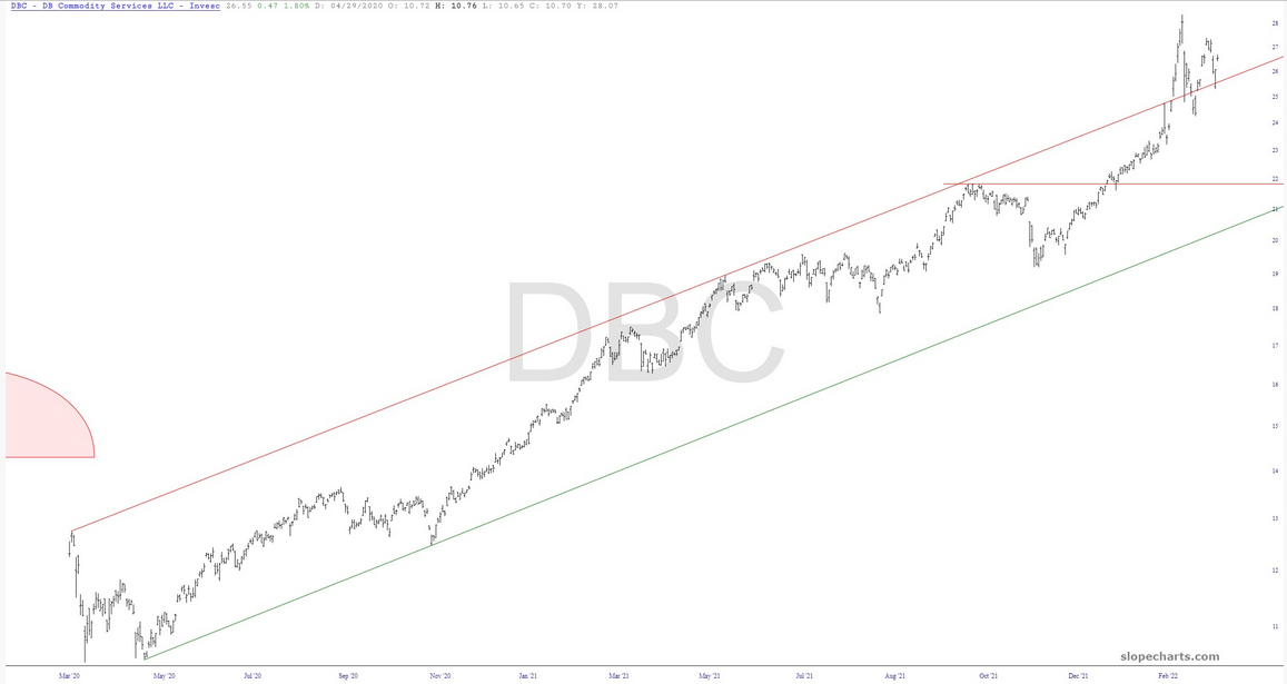
We seem to be in an entirely new era in commodities. Invesco DB Commodity Index Tracking Fund (NYSE:DBC) has slipped the surly bonds of its channel, and Thursday morning’s latest inflation number will probably reflect this.
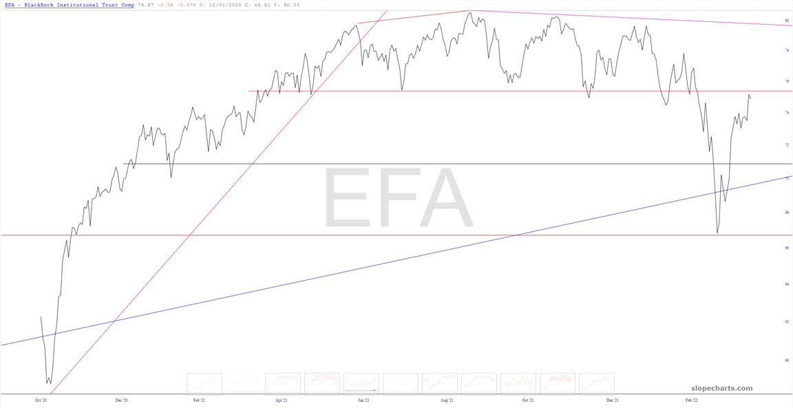
I’ve charted since the 1980s. I have looked at millions of charts. I’m telling you, this is one of the cleanest tops I’ve ever seen in my life.
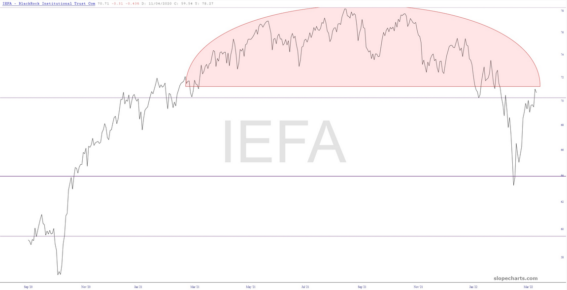
The same applies for iShares Core MSCI EAFE ETF (NYSE:IEFA), which is pretty much a tick-for-tick equivalent.
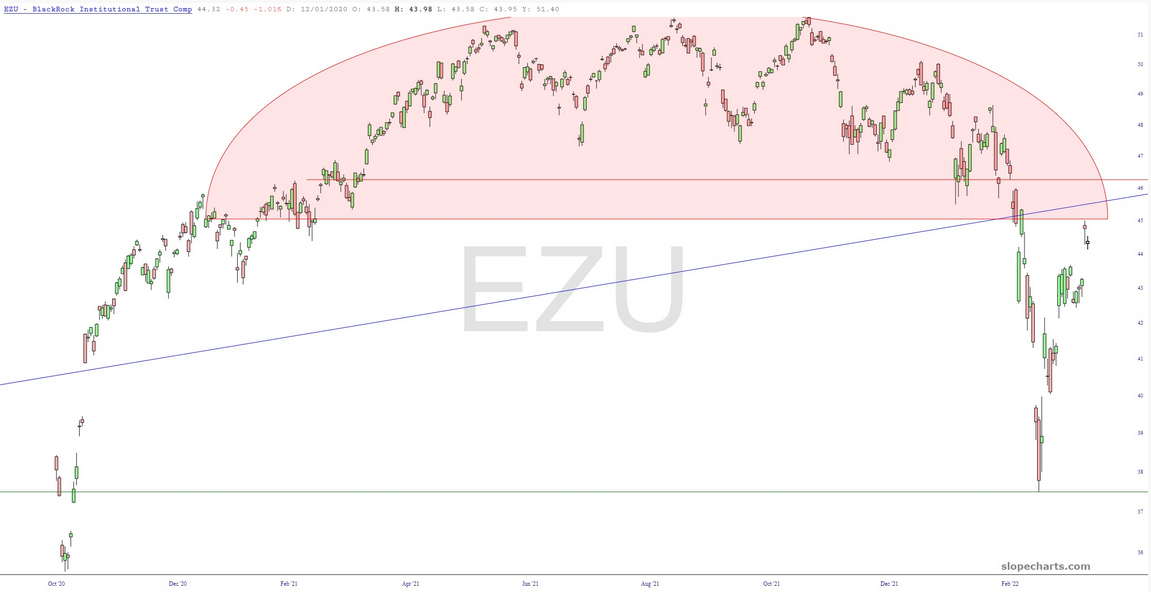
The iShares MSCI Eurozone ETF (NYSE:EZU) is likewise an absolutely alluring topping pattern.
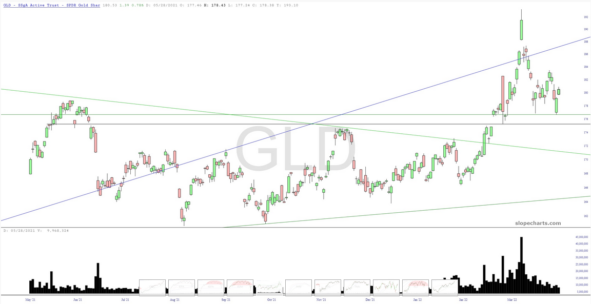
The only asset whose bullishness I praise is gold, and although we’re not completely out of the woods, this is still bullishly-configured and has proved its public support by way of much stronger volume this year.
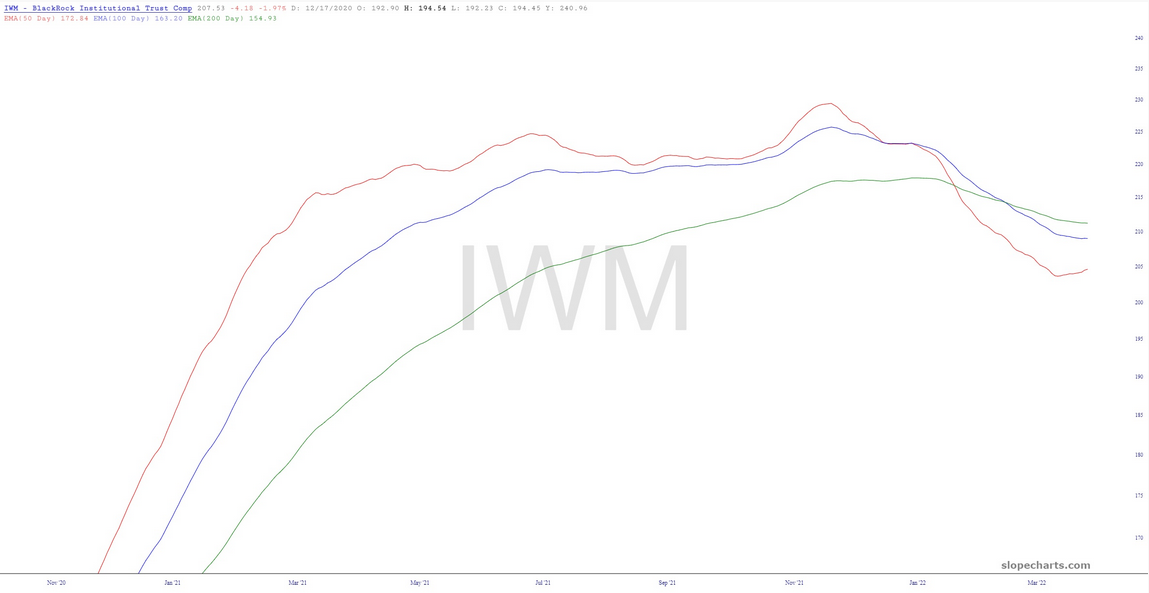
The small caps broke down nicely yesterday, and the exponential moving averages remained poised for lower prices.
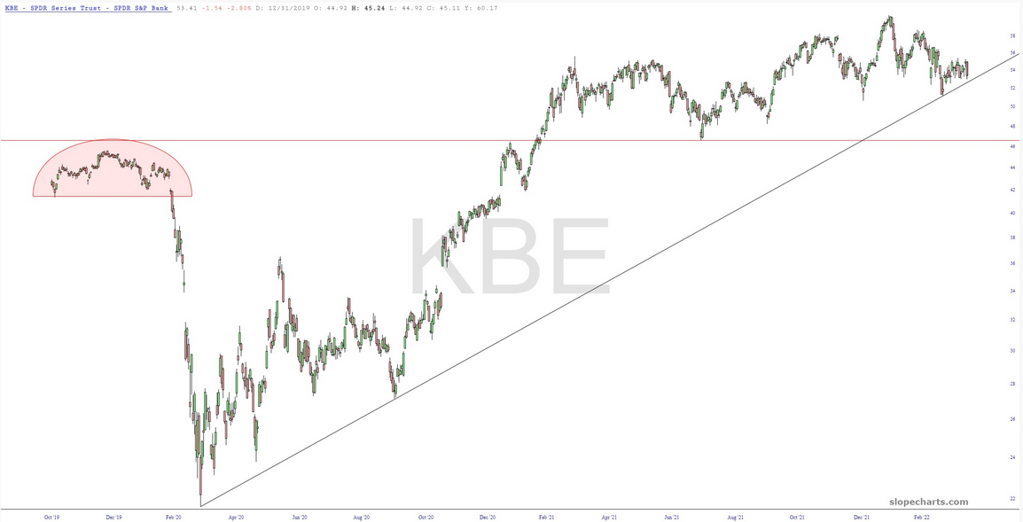
We are getting tantalizingly close to a major trendline failure on the regional banks.
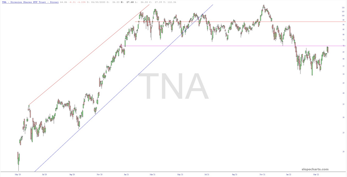
This is a leveraged instrument, but it still does a good job showing what an important top has been reached for the small caps.
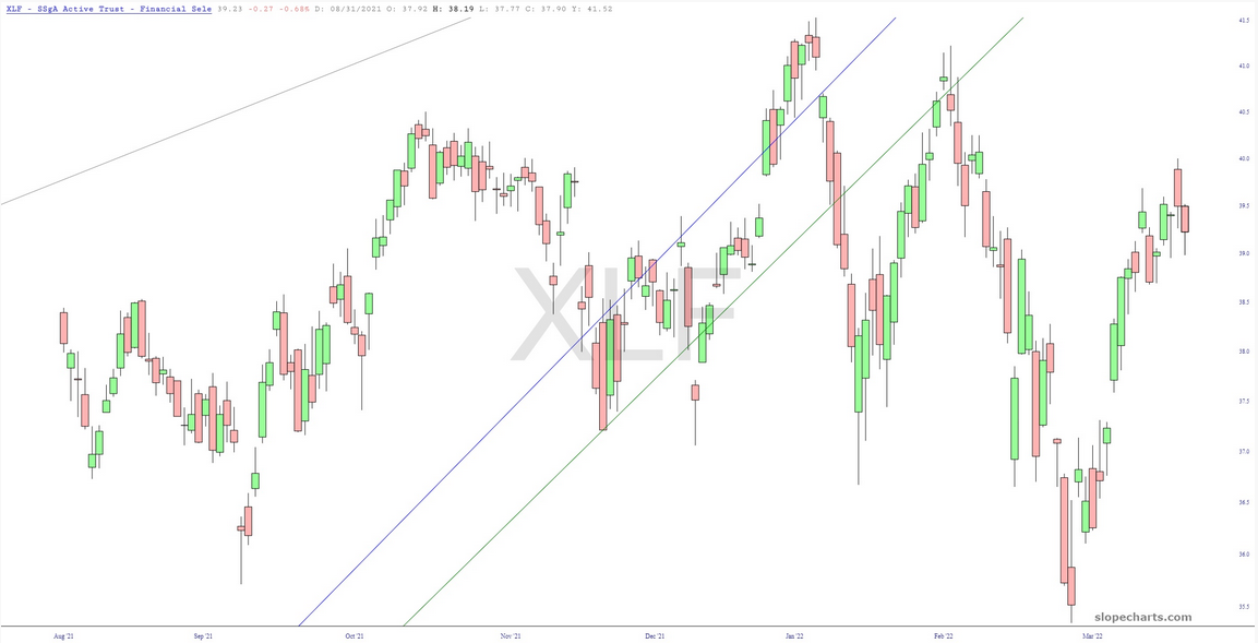
The financial stocks have hammered out their most recent "lower high."
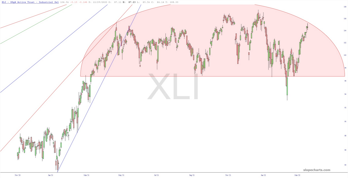
This isn’t as popular an industrials ETF as the SPDR® Dow Jones Industrial Average ETF Trust (NYSE:DIA), but I like the shape of the chart better.
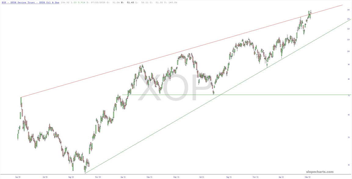
The oil companies have been very strong for months, for obvious reasons, but it wouldn’t surprise me to see SPDR® S&P Oil & Gas Exploration & Production ETF (NYSE:XOP) reverse lower and drag the market down with it in general.
