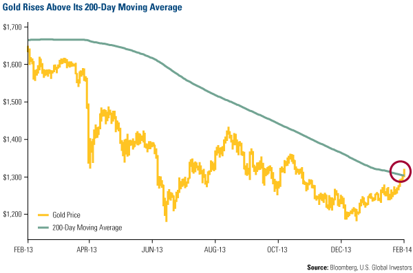
Gold lovers’ hearts beat faster last week, as the metal rose above $1,300 an ounce for the first time since November. The precious metal also climbed above its 200-day moving average, which hasn’t happened in about a year.
ISI’s John Mendelson noted that the generic gold future “rallied off its mid-December low and has decisively broken out above its downtrend line connecting the descending tops from late August, a near-term positive.” The next price he’s targeting is $1,350, the price gold was at in late October. 
So while gold may correct over the next several months as the metal enters its seasonally weak period of the year, this looks promising for gold investors.
Here are a few more gold charts that just might have your heart beating faster:
1. The Love Trade Endures in the East
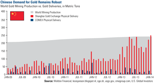
In January, 246 tons of gold were withdrawn from the Shanghai Gold Exchange, as China continues expressing its love for the precious metal. This marks a record level of gold deliveries on the exchange as well as a significant increase over the same time last year.
In addition, you can see on the chart below that January’s total also exceeds world mining production for the month. 
As Portfolio Manager Ralph Aldis likes to say, “Once the metal moves from the West and goes into China, we won’t get that gold back very easily.”
2. Money Supply Grew Faster in January
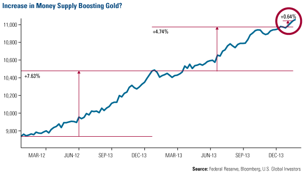
In the first month of 2014, the M2 money supply, which is a measure of money supply that includes cash, savings and checking deposits, grew faster than the previous two years. In 2012, M2 grew 7.6 percent and in 2013, money supply rose 4.7 percent; at an annualized rate, January’s money supply growth “reached an annualized rate of increase of 8.75 percent,” according to Bloomberg’s Precious Metal Mining team.
This may mean “the U.S. Federal Reserve is trying to resurrect inflation, thus increasing the appeal of gold, the supply of which can only increase about 1.5 percent to 2.5 percent annually,” says Bloomberg. 
Last year, gold started to take it on the chin when the real rate of return went from a negative 0.62 percent in March to a positive 0.54 percent by December. Like I told Jim Goddard from HoweStreet, a positive real rate of return is typically a major headwind for gold.
Between March and December of 2013, two things happened: 1) Yields rose in anticipation that the Federal Reserve would begin tapering its bond purchases, and 2) the consumer price index declined. However, going forward, I anticipate that CPI will increase, and, given the modest economic growth we’ve been seeing in the U.S. economy, interest rates won’t be able to rise too quickly.
3. Gold Stocks Poised to Rebound After Rare 3-Year Loss
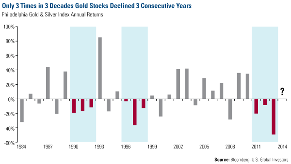
What I think is tremendously powerful for gold stock investors is this chart. At the beginning of January, we took a look back at the annual returns for the Philadelphia Gold & Silver Index. In three decades, there were only three times that gold stocks only saw a consecutive 3-year loss. 
These aren’t the only gold charts to love. See more in my latest presentation from the World Money Show.
Disclosure: All opinions expressed and data provided are subject to change without notice. Some of these opinions may not be appropriate to every investor.
- English (UK)
- English (India)
- English (Canada)
- English (Australia)
- English (South Africa)
- English (Philippines)
- English (Nigeria)
- Deutsch
- Español (España)
- Español (México)
- Français
- Italiano
- Nederlands
- Português (Portugal)
- Polski
- Português (Brasil)
- Русский
- Türkçe
- العربية
- Ελληνικά
- Svenska
- Suomi
- עברית
- 日本語
- 한국어
- 简体中文
- 繁體中文
- Bahasa Indonesia
- Bahasa Melayu
- ไทย
- Tiếng Việt
- हिंदी
Charts To Make Gold Bulls Happy
Published 02/19/2014, 04:32 PM
Updated 07/09/2023, 06:31 AM
Charts To Make Gold Bulls Happy
Latest comments
Loading next article…
Install Our App
Risk Disclosure: Trading in financial instruments and/or cryptocurrencies involves high risks including the risk of losing some, or all, of your investment amount, and may not be suitable for all investors. Prices of cryptocurrencies are extremely volatile and may be affected by external factors such as financial, regulatory or political events. Trading on margin increases the financial risks.
Before deciding to trade in financial instrument or cryptocurrencies you should be fully informed of the risks and costs associated with trading the financial markets, carefully consider your investment objectives, level of experience, and risk appetite, and seek professional advice where needed.
Fusion Media would like to remind you that the data contained in this website is not necessarily real-time nor accurate. The data and prices on the website are not necessarily provided by any market or exchange, but may be provided by market makers, and so prices may not be accurate and may differ from the actual price at any given market, meaning prices are indicative and not appropriate for trading purposes. Fusion Media and any provider of the data contained in this website will not accept liability for any loss or damage as a result of your trading, or your reliance on the information contained within this website.
It is prohibited to use, store, reproduce, display, modify, transmit or distribute the data contained in this website without the explicit prior written permission of Fusion Media and/or the data provider. All intellectual property rights are reserved by the providers and/or the exchange providing the data contained in this website.
Fusion Media may be compensated by the advertisers that appear on the website, based on your interaction with the advertisements or advertisers.
© 2007-2025 - Fusion Media Limited. All Rights Reserved.
