
The first chart below shows the behavior of Australia's All Ordinaries since the turn of the century. The index is up 9.82% in 2013 at 5,122.70 as of yesterday's close, which puts it pleasantly above the interim highs in 2010 and 2011, which also pierced the 5,000 level.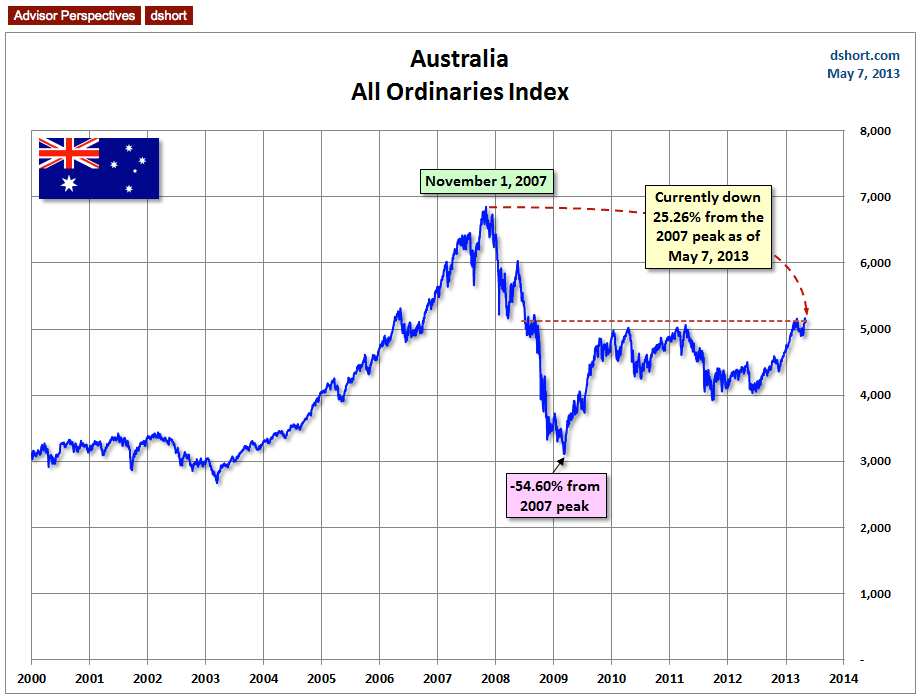
How does this index compare with the eight world markets in my weekly updates? The chart below has the latest "gang of eight" update, through Friday's close, with the AORD added (the bold red line).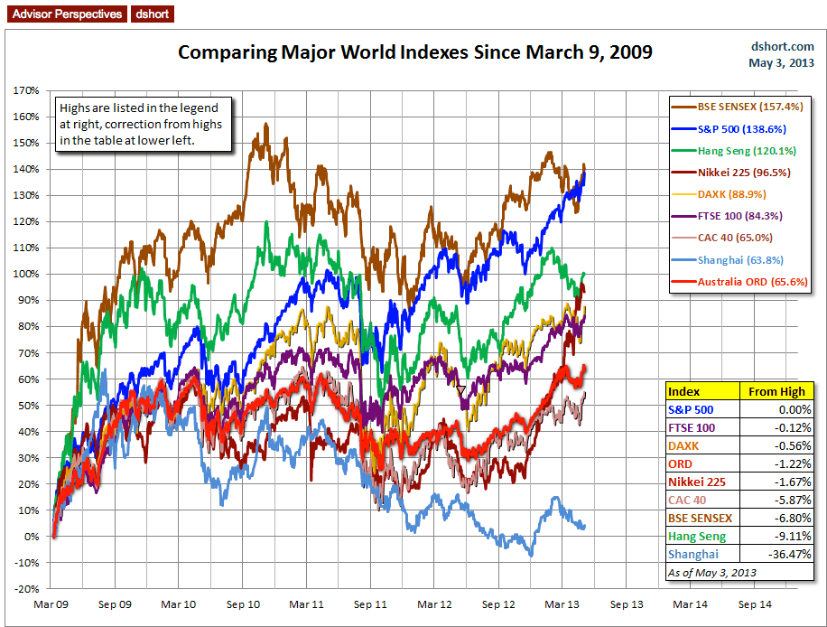
Since the arbitrary start date of Monday, March 9 2009, which was a trough for several world indexes (the AORD's was the Friday before), Australia's benchmark index is now positioned in the middle of the pack and in fourth place in the percentage below its interim high at the end of April. The top five, of course, is a tight race for the lead. The overlay chart is through Friday's close and shows the All Ordinaires at 1.22% off its interim high. But through yesterday's close, its now only 0.89% below that interim high.
- English (UK)
- English (India)
- English (Canada)
- English (Australia)
- English (South Africa)
- English (Philippines)
- English (Nigeria)
- Deutsch
- Español (España)
- Español (México)
- Français
- Italiano
- Nederlands
- Português (Portugal)
- Polski
- Português (Brasil)
- Русский
- Türkçe
- العربية
- Ελληνικά
- Svenska
- Suomi
- עברית
- 日本語
- 한국어
- 简体中文
- 繁體中文
- Bahasa Indonesia
- Bahasa Melayu
- ไทย
- Tiếng Việt
- हिंदी
Charting Australia: The All Ordinaries Index
Published 05/08/2013, 11:52 AM
Updated 07/09/2023, 06:31 AM
Charting Australia: The All Ordinaries Index
Note from dshort: It's been quite some time since I've updated my chart of Australia's All Ordinaries stock index. In response to a request from a Australian friend, I've refreshed my chart of the All Ordinaries and the overlay of my weekly world markets snapshot that includes the Australian index along with the eight regulars.
Latest comments
Loading next article…
Install Our App
Risk Disclosure: Trading in financial instruments and/or cryptocurrencies involves high risks including the risk of losing some, or all, of your investment amount, and may not be suitable for all investors. Prices of cryptocurrencies are extremely volatile and may be affected by external factors such as financial, regulatory or political events. Trading on margin increases the financial risks.
Before deciding to trade in financial instrument or cryptocurrencies you should be fully informed of the risks and costs associated with trading the financial markets, carefully consider your investment objectives, level of experience, and risk appetite, and seek professional advice where needed.
Fusion Media would like to remind you that the data contained in this website is not necessarily real-time nor accurate. The data and prices on the website are not necessarily provided by any market or exchange, but may be provided by market makers, and so prices may not be accurate and may differ from the actual price at any given market, meaning prices are indicative and not appropriate for trading purposes. Fusion Media and any provider of the data contained in this website will not accept liability for any loss or damage as a result of your trading, or your reliance on the information contained within this website.
It is prohibited to use, store, reproduce, display, modify, transmit or distribute the data contained in this website without the explicit prior written permission of Fusion Media and/or the data provider. All intellectual property rights are reserved by the providers and/or the exchange providing the data contained in this website.
Fusion Media may be compensated by the advertisers that appear on the website, based on your interaction with the advertisements or advertisers.
© 2007-2025 - Fusion Media Limited. All Rights Reserved.