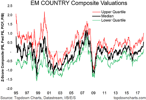
The chart of the week is EM country valuation trends. This chart shows the median (because it is less sensitive to outliers) and upper + lower quartiles of emerging market equity valuations across countries.
The valuation indicators are derived from the trailing PE ratio, forward PE ratio, price to cash earnings ratio, and price to book ratio - using multiple valuation metrics helps strengthen the signal and reduce the noise (a constant challenge and key priority!). These are standardized across countries using a z-score (which compares the current valuation to its long-term history, so it tells you whether the market is more expensive or cheaper than usual).
Now that we've explained what the chart is, let's look at what the chart is telling us. Basically the median country valuation across the 24 emerging markets we monitor is looking increasingly expensive, similar to the dot-com period and the 07 EM/commodities bubble.

As valuations get higher, it makes investing more challenging, because the price you pay for an investment is one of the most critical inputs which determines your ultimate return on investment. It highlights the importance of relative value, and staying focused on the process as we enter the later stages of the cycle.
