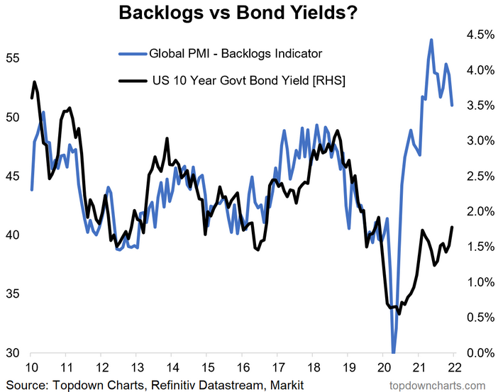
Back on Backlogs… and Bond-Yield Back-Ups: In this chart we map the path of the global backlogs indicator and the US 10-year Treasury yield. I think it’s fair to say that there are a number of good reasons why this yawning gap opened up (e.g. the initial pandemic shock to activity, demand for safe assets in the early stages of the crisis, and the massive global monetary response— i.e. QE, QE, QE, and more QE (and rate cuts + silly forward guidance).
There’s also a number of good reasons why the relationship shown in the chart below has been fairly reliable in the past (in that backlogs reflect the ebb and flow of demand, ultimately impact inflation, and also reflect and influence the path of monetary policy).
Now that QE is wrapping up around the world (many central banks have already ceased their asset purchase programs, and the Fed is tapering), and inflation/growth have come back, perhaps we see bond yields recoupling to backlogs?

Key point: Backlogs point to bond-yield back-up risk.
