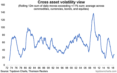
This unassuming chart contains a wealth of information about the challenges we currently face with active asset allocation and the global macro backdrop. Basically what it shows is an alternative measure of the average volatility across stocks, bonds, commodities, and currencies. The bottom line is volatility across asset classes is starting to wake up from a deep sleep.
What's driving this? We can talk about how you should expect higher volatility as the market/business cycles mature (and indeed they are), but a big driver is and will continue to be politics and policy. We're in the middle of a major monetary policy experiment (quantitative tightening or QT) - if QE was a force for volatility suppression, it's pure logic that QT should work in the opposite direction. So investors need to start thinking about how to deal with this in their investment process, because with greater volatility comes greater opportunity.

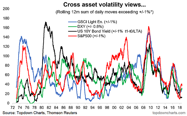
BONUS CHART: Here's the breakdown of the components in the chart above. You can see a slight tick up in the US dollar and commodity volatility measures, but treasuries volatility is still slumbering by our numbers. So I think it's fair to say that bond volatility is going to be what really shakes things up here... more on that next time (yes I'm holding out, sitting on a couple of charts here!).

