
Utilities have been taking a beating lately, as the worst performer of the S&P sectors over the last six months, down 1.59% while the S&P 500 is up over 7%.
Heavy Selling
Tat type of drop make for some interesting chart setups. Below we have a chart of the Utilities Select Sector SPDR ETF (XLU). On the top panel I’ve put the Relative Strength Indicator (RSI), which we can see has fallen to under 30, a sign that selling momentum has been extremely heavy.
On the bottom panel we can take a look at one of my favorite indicators, the Money Flow Index (MFI), which takes into account both price and volume in the form of an oscillator. Over the past three months we have seen three divergences take shape in the MFI. First we saw Money Flow diverge as price made lower lows, a sign that sellers could be losing their momentum to drive the ETF lower. We then saw a similar divergence in October but this time MFI was unable to hit new highs alongside price, which was followed by XLU dropping 10%.
Now we are seeing another bullish divergence take place just as we saw in September. First the MFI became ‘oversold’ as it broke below 20 then began to rise while price continued to be depressed. One of the differences between now and September is we did not see momentum (via the Relative Strength Index) at such low levels.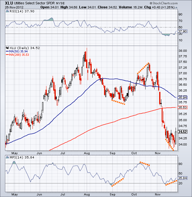
Watching The Divergence
I’ll be watching to see if this divergence continues to play out or if price begins to advance to potentially its 200-day moving average. Traders have not been a fan of XLU lately, time will tell if sentiment towards this ETF shifts.
Disclaimer: Do not construe anything written in this post or this blog in its entirety as a recommendation, research, or an offer to buy or sell any securities. Everything in this post is meant for educational and entertainment purposes only. I or my affiliates may hold positions in securities mentioned in the blog. Please see my Disclosure page for full disclaimer.
- English (UK)
- English (India)
- English (Canada)
- English (Australia)
- English (South Africa)
- English (Philippines)
- English (Nigeria)
- Deutsch
- Español (España)
- Español (México)
- Français
- Italiano
- Nederlands
- Português (Portugal)
- Polski
- Português (Brasil)
- Русский
- Türkçe
- العربية
- Ελληνικά
- Svenska
- Suomi
- עברית
- 日本語
- 한국어
- 简体中文
- 繁體中文
- Bahasa Indonesia
- Bahasa Melayu
- ไทย
- Tiếng Việt
- हिंदी
Bullish Divergence In Utilities
Latest comments
Loading next article…
Install Our App
Risk Disclosure: Trading in financial instruments and/or cryptocurrencies involves high risks including the risk of losing some, or all, of your investment amount, and may not be suitable for all investors. Prices of cryptocurrencies are extremely volatile and may be affected by external factors such as financial, regulatory or political events. Trading on margin increases the financial risks.
Before deciding to trade in financial instrument or cryptocurrencies you should be fully informed of the risks and costs associated with trading the financial markets, carefully consider your investment objectives, level of experience, and risk appetite, and seek professional advice where needed.
Fusion Media would like to remind you that the data contained in this website is not necessarily real-time nor accurate. The data and prices on the website are not necessarily provided by any market or exchange, but may be provided by market makers, and so prices may not be accurate and may differ from the actual price at any given market, meaning prices are indicative and not appropriate for trading purposes. Fusion Media and any provider of the data contained in this website will not accept liability for any loss or damage as a result of your trading, or your reliance on the information contained within this website.
It is prohibited to use, store, reproduce, display, modify, transmit or distribute the data contained in this website without the explicit prior written permission of Fusion Media and/or the data provider. All intellectual property rights are reserved by the providers and/or the exchange providing the data contained in this website.
Fusion Media may be compensated by the advertisers that appear on the website, based on your interaction with the advertisements or advertisers.
© 2007-2025 - Fusion Media Limited. All Rights Reserved.