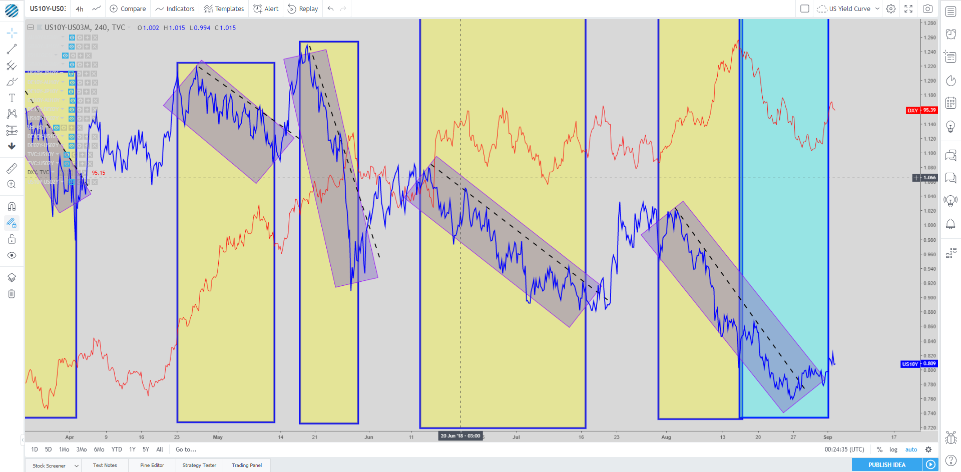
Last week, when scoping out the latest movements in the US yield curve, a noticeable pattern arose. It came to our attention, via a report by Morgan Stanley -0.25% , that it was the first time this year that the US Dollar index 0.01% had been depreciating during a flattening of the curve, represented by a blue rectangle (yellow rectangles show the flattening of the curve not altering USD value).
This is significant as it implied a slowdown in US capital inflows, which paved the way for a case in which it would allow us to assume, until proven wrong, the utilization of the curve as a more accurate predictor of the state of demand and supply for credit in the US, with an increase of the curve meaning higher demand for credit and lesser supply of capital by reduction in savings, and vice-versa.
Barring no further distortion in the interpretation of the US yield curve via re-shift in capital inflows, it suggests that for now, with the steepening of the curve once again, the market is turning more positive on both the USD and the economy. Visually, one can notice that each recent break of the trendline has served as the trigger for the correction higher in the curve.

