Bond troubles could just be starting.
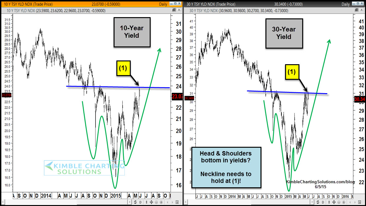
This chart looks at the 10-year and 30-year yields. Each could be making Head & Shoulders bottoming patterns. If this pattern read is correct, each are testing the neckline at (1). A breakout above the neckline could push yields a good deal higher.
From a bond price perspective, what does this pattern look like?
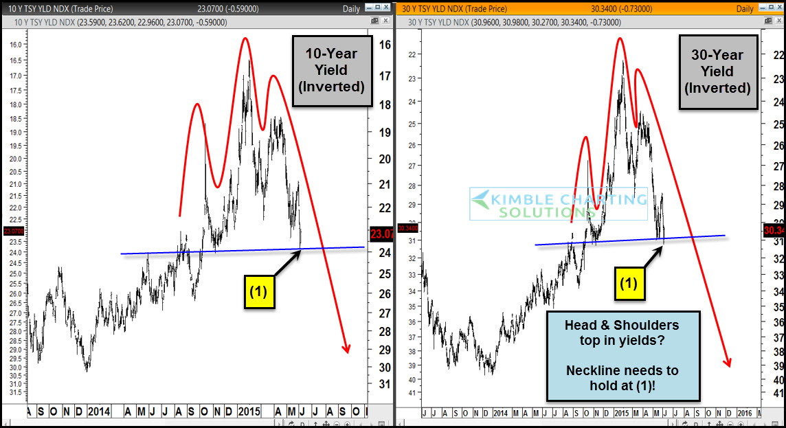
These charts are the 10-year and 30-year yields inverted to look like bond prices. Both appear to have made head and shoulders topping patterns with the neckline being tested right now at (1).
If this pattern read is correct and the neckline gives way, yields move much higher and bonds move much lower.


