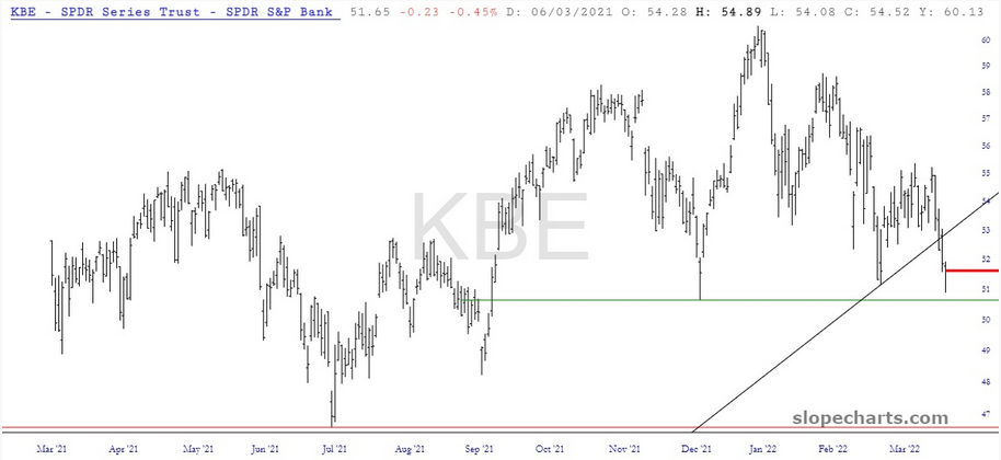
In spite of the eye-rolling rally on Monday, the financial sector (by far my biggest exposure in my live positions) continues to weaken. Here are the regional banks, by way of the SPDR® S&P Bank ETF (NYSE:KBE), which has (1) broken its key supporting trendline, and (2), is getting within spitting distance of completing a topping pattern, assuming it breaks under that horizontal.
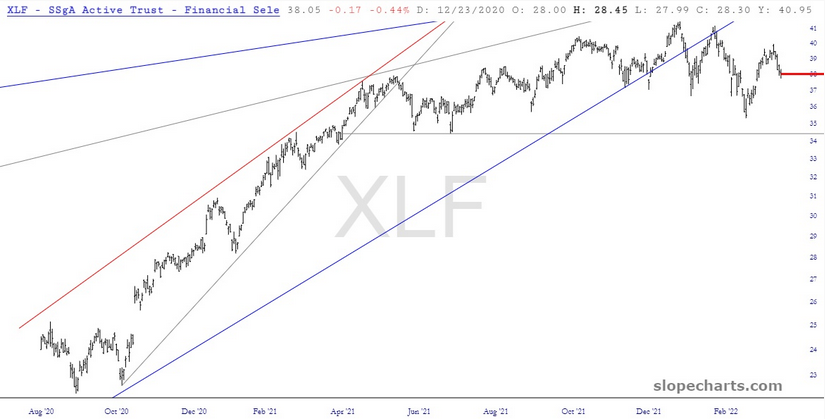
The other big bank ETF, Financial Select Sector SPDR® Fund (NYSE:XLF), has proved to be more robust, but its series of "lower highs" is still intact, and it, too, has a clean horizontal which, if broken, will constitute a completed top.
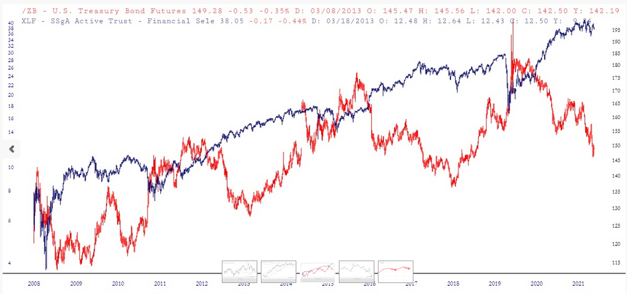
I was monkeying around with layered charts (naturally) and was rather intrigued by the item I constructed below. The red chart is the long-term continuous contract on ZB (the U.S. T-Bond futures) and the blue line is the XLF.
Over a span of decades, they certainly seem to increase their distance (like right now, a new record) and then gravitate back toward one another. Seems to me we are poised for a major gravitational pull to reconcile this chasm.
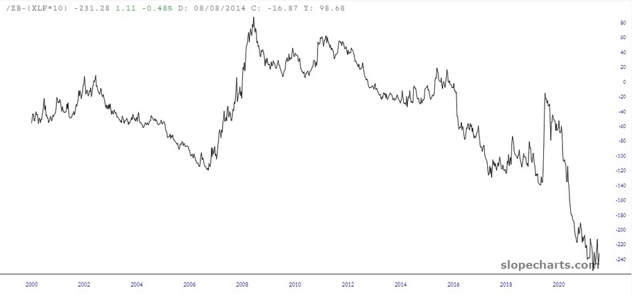
Just for the hell of it, I put together a custom-symbol chart using /ZB and a multiple of XLF, and I came up with this item below. Suffice it to say that bonds are extremely depressed relative to financial stocks.
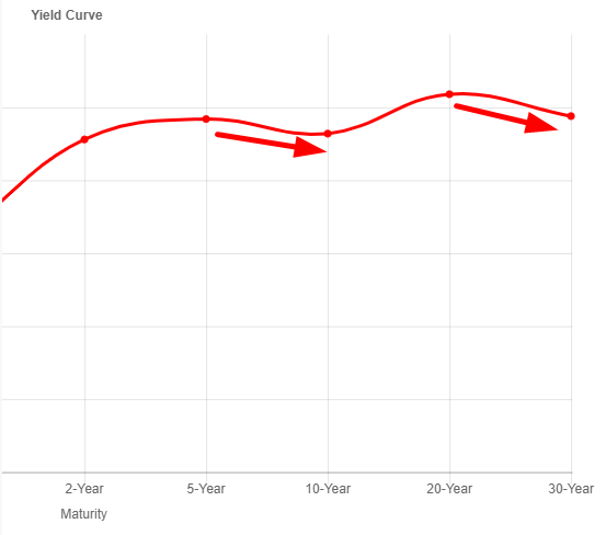
And what’s driving all this weakness? I suspect the inverted yield curve has a lot to do with it. After all, it kind of messes up the entire banking industry’s "borrow short, lend long" strategy of making money.
