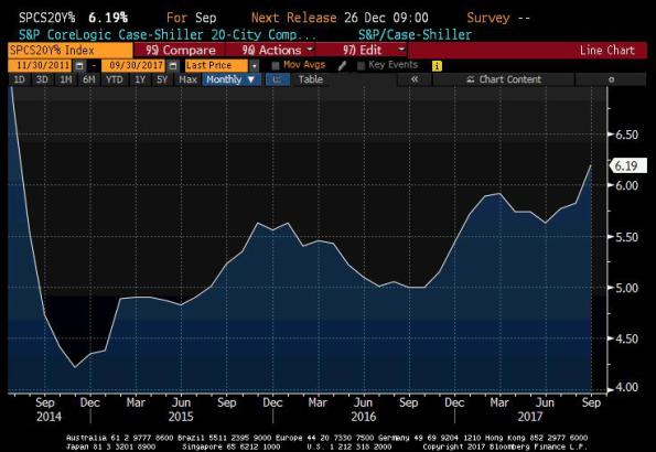
I posted this chart yesterday to my Twitter feed (@inflation_guy, or @inflation_guyPV through PremoSocial for some additional content), but didn’t have time to write very much about it. This is the Shiller 20-City Home Price Index year/year change (Source: Bloomberg).

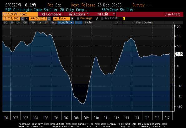
My observation was that when you take out the housing bubble, it looks more ominous. It’s actually really the bubble and bust, which makes the recent trend look uninteresting. This is what the chart looks like if you go further back like that.

So it actually looks calm and stable, because the axis explodes to -20% to +20%. The volatility of recent years has caused us to forget that for decades before that, the behavior of home prices was actually pretty sedate.
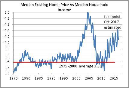
Although residential real estate over very long time periods has only a slightly positive real return, adjusted for the maintenance and other required expenditures, that means the ratio of home prices to median income has tended to be fairly stable. We have historically valued homes as a consumption good only, which meant that the home price traded as a multiple of rents or incomes within a pretty narrow range. Here’s a chart of median home prices to median household income going back to the 1970s (Source: Bloomberg, Enduring Intellectual Properties calculations).

This is true even though there have been important tax changes along the way which changed the value of the home as a tax shelter, changes in the structure of the typical family unit, and so on. Despite that, homes were pretty stable investments – really, they were more savings vehicles than investments.
The fact that home prices are now accelerating, and are rising faster than incomes, implies several things. First, as the last chart above shows, the ‘investment value’ of the home is again inflating to levels that, in 2005-2008, proved unsustainable. The bubble in housing isn’t as bad as it was, and not as bad as stocks are now, but the combination of those two bubbles might be worse than they were when they were mostly independent (in 2000 there wasn’t a housing bubble and in 2007 the bubble in stocks wasn’t nearly as bad as in 2000 and now).
The second implication is that as home prices rise, it isn’t just the value of the investment in the home that is rising but also its cost as a consumption item. Because shelter to rent is a substitute for shelter that you own, rising home prices tends to imply that rents also accelerate. Recently, “Owner’s Equivalent Rent” has been decelerating somewhat, although only coming back to our model. But the gradual acceleration in the home price increase implies that shelter inflation is not going to continue to moderate, but rather should continue to put upward pressure on core inflation, of which 42% consists of “Rent of Shelter.”
