Many Mish readers have been asking about US treasury yields.
Are yields going up or down?
My fearless forecast is yes, yes, and yes. A series of charts will explain.
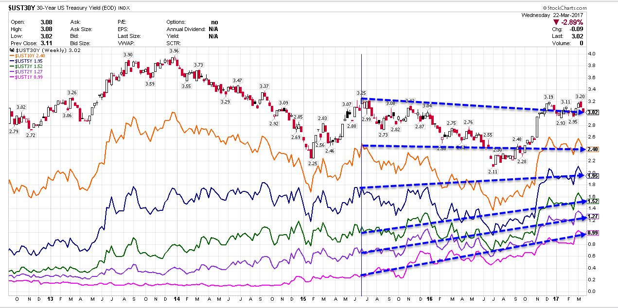
US Treasury Yield Curve Chart #1

Since mid-2015, yields on 1-year, 2-year, 3-year and 5-year treasuries has risen. Yields on 10-year and 30-year treasuries have fallen.
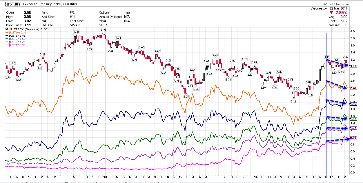
US Treasury Yield Curve Chart #2

Since December 2016, the yield on 1-year treasuries has risen. The yield on all longer-dated treasuries has fallen.
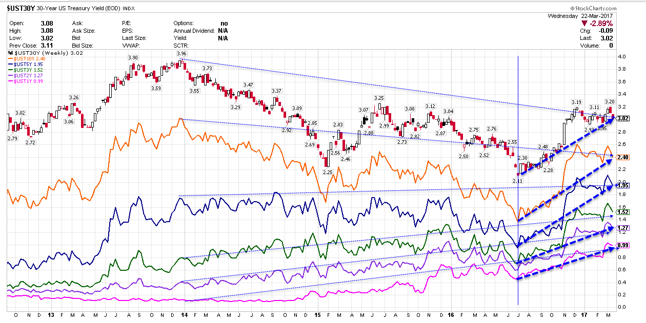
US Treasury Yield Curve Chart #3

Since July 2016, the entire yield curve, including shorter-term durations not shown, has been rising.
Since the beginning of 2014, 30-year and 10-year yields have fallen. The rest of the yield curve has risen.
What’s Happening?
Clearly, yields are headed up, down and sideways. The direction depends on duration and timeframe.
At the shorter end, five-year and less, yields have been rising since January 2014. In the same timeframe, yields on 10-year and 30-year treasuries have fallen.
Overall, we have had a bearish flattening of the yield curve since 2014.
Where To From Here?
The above charts show what has happened. But that is all water over the dam. Where we are headed is far more important.
If you think the economy is weakening (and I do), then long-dated treasuries will rally (yields fall) regardless of what short-dated treasuries (dependent on Fed hikes) will do.
