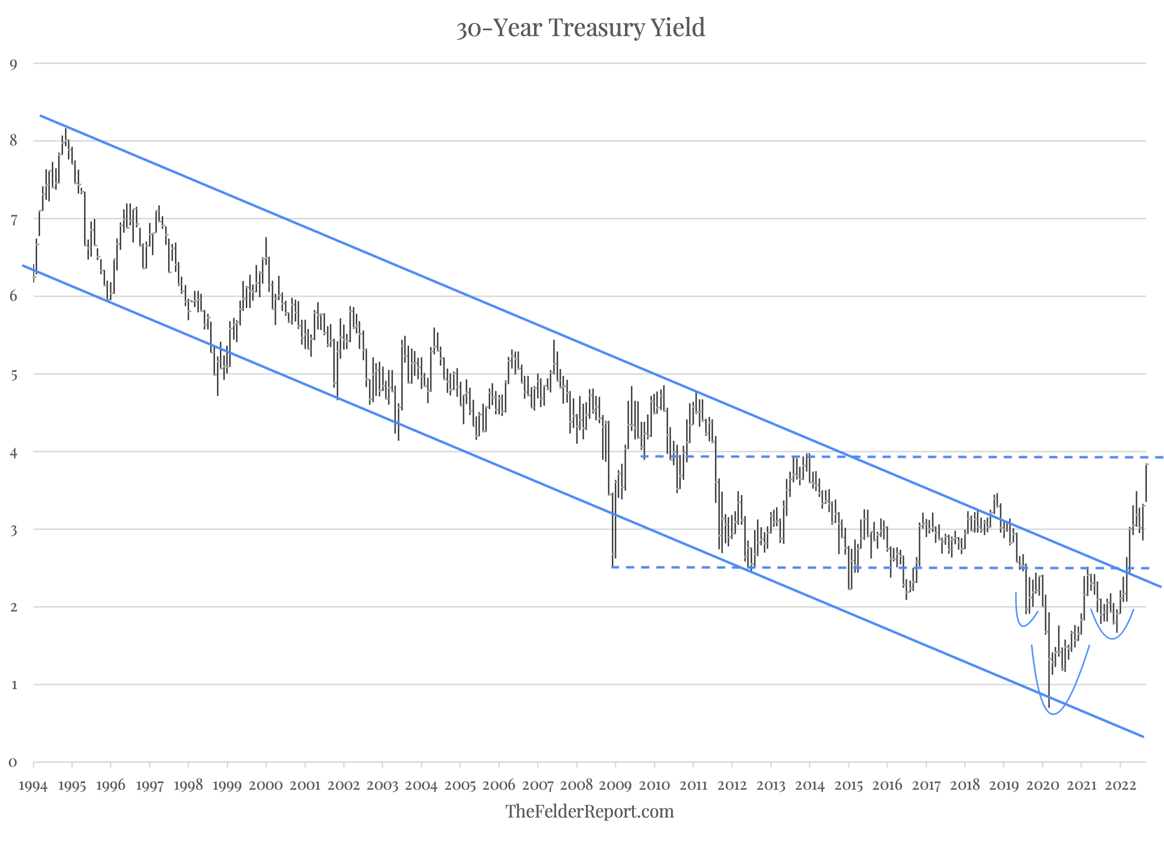
“The long-term chart of the 30-year treasury yield may now be the most important chart in the world. For the past 30 years or so, the yield on the long bond has formed a fairly neat channel that has only been violated relatively briefly at times.”
Below is an updated version of that chart and it’s clear to see that the 30-year yield has decisively broken out of its downtrend channel. This suggests that the bond vigilantes have finally been woken from their long slumber by rapidly rising inflation and a Federal Reserve that has fallen woefully behind the curve.

Fundamental indicators, however, like the copper to gold ratio suggest interest rates should actually be falling, not rising. And from a technical standpoint, the 30-year yield has now completed the projected target from its head and shoulders bottom pattern and is running into horizontal resistance that dates back to 2013 so the rise in rates may now be due for a rest.
Longer-term, however, the breakout sends a “loud, clear signal” that the trend in rates has reversed. As a result, it appears the bond vigilantes may throw a wrench in the Fed’s plans for balance sheet “normalization” which could further challenge the central bank’s waning credibility.
