Based on comments on my last post, that there are misconceptions about consumer spending patterns and the effects of price increases. Consider several potential effects caused by price increases:
- A consumer can do without. No vacation, no private school, no newspaper, or no medical insurance.
- A consumer can perform the same task with lower unit consumption. Examples are buying a more fuel efficient car, moving closer to where you work.
- Lower the quality of what you buy – single malt to blended whiskey, steak to hamburger, private car to public transport, change the temperature in your home, big house to little house, Cheesecake Factory to McDonalds.
- Change the item purchased – switch from fuel oil to natural gas, theatre to satellite TV,
- Do it yourself – haircuts, gardener, home or car repair / maintenance.
- Find a cheaper source of a product or service.
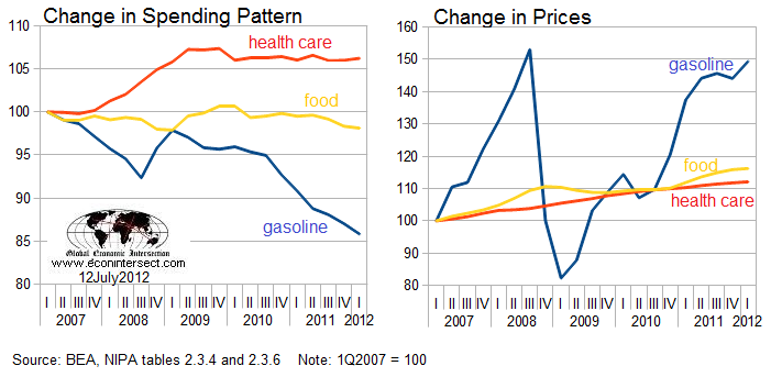
In the graph above, the change in spending pattern was determined by calculating the ratio of the individual elements (health, care, food and gasoline) to the total personal consumption expenditure (PCE). All values were normalized to 100 for first quarter 2007. The price index comes from the BEA PCE price index.
I keep writing, but many miss, that there is no such thing as an average consumer. Each one of us is a different animal with different consumption profiles. The graphs above represent BEA’s total of all consumption (Joe Sixpack, 0.01%, banksters, retired, farmers, students ….). To believe a consumer stands still for any long period in the face of price changes is ludicrous. Price changes beget consumption changes.
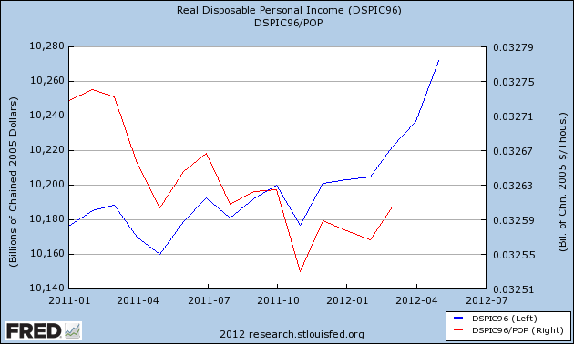
On the other hand, I believe the vast majority of consumers spend much of what they make. This is why many pundits (including me) keep their focus on changes in real income. This was the point of last week’s post. The downward trend in Real Disposable Personal Income has been broken for at least one month – both on a real and per capita basis. This is one of the few positive trends currently in play economically.
One other thought emanating from last week’s post is the difference between changes in home values and the changes in home equity. The blue line in the graph below shows how owner’s equity loss is significantly more than what the home price indices are saying.
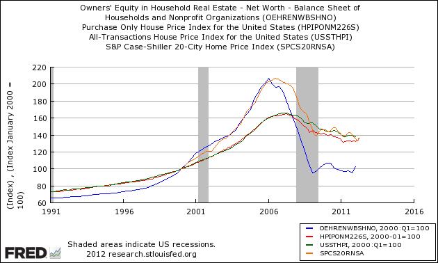
As (if) the housing recovery plays out, the increase in home equity values will be a multiple of the change in home prices. Yes, it will take some time for homeowners to feel (and believe) their home equity is increasing.
Other Economic News this Week:
The Econintersect economic forecast for July 2012 shows continues to show moderate growth. Overall, trend lines seem to be stable even with the fireworks in Europe, and emotionally cannot help thinking this is the calm before the storm. There are no recession flags showing in any of the indicators Econintersect follows which have been shown to be economically intuitive. There is no whiff of recession in the hard data – even though certain surveys are at recession levels.
ECRI stated in September 2011 a recession was coming . Their data looks ahead at least 6 months and the bottom line for them is that a recession is a certainty. The size and depth is unknown but stated this week was already underway. A positive result is this pronouncement has caused much debate in economic cyberspace.
The ECRI WLI index value is tip-toeing in negative territory – but this week is again “less bad”. The index is indicating the economy six month from today will be slightly worse than it is today. As shown on the graph below, this is not the first time since the end of the Great Recession that the WLI has been in negative territory.

Initial unemployment claims decreased from 374,000 (reported last week) to 350,000 this week. Historically, claims exceeding 400,000 per week usually occur when employment gains are less than the workforce growth, resulting in an increasing unemployment rate (background here and here). The real gauge – the 4 week moving average – declined from 385,750 (reported last week) to 376,500. Because of the noise (week-to-week movements from abnormal events AND the backward revisions to previous weeks releases), the 4-week average remains the reliable gauge.
Weekly Initial Unemployment Claims – 4 Week Average – Seasonally Adjusted – 2010 (blue line), 2011 (red line), 2012 (green line)

Data released this week which contained economically intuitive components(forward looking) were
- Rail movements (where the economic intuitive components seem to be indicating a moderately expanding economy);
- Import portion of Trade balance (less good but still strong);
- Although we are not able to correlate the FOMC to the economy – it is hard to ignore the effect of quantitative easing
Weekly Economic Release Scorecard:
Click here to view the scorecard table below with active hyperlinks.
Bankruptcy this Week: Dynegy Inc., Patriot Coal, Valence Technology, Ocala Funding, Peregrine Financial Group
