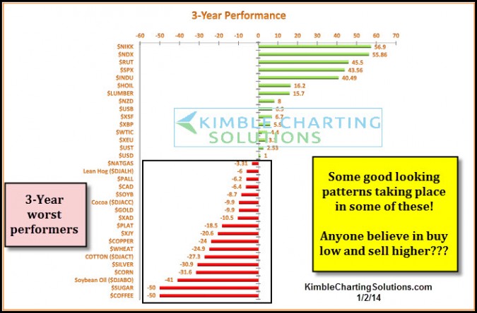
At the beginning of the year, I shared the table below with Premium Members, reflecting on what assets had done the worst over the past three years. If you believe in the 'ole idea of making good money by buying low and selling higher, this type of analysis might be of interest. Notice below which asset has the lowest three year average?
It was Coffee! What happened soon after I shared this table? Coffee almost doubled in a couple of months!

Several of these bottom dwellers over the past three years have had a decent year so far in 2014, even ole UNG/the Natural Gas ETF (top bottom dweller above), which is up almost 19% YTD.
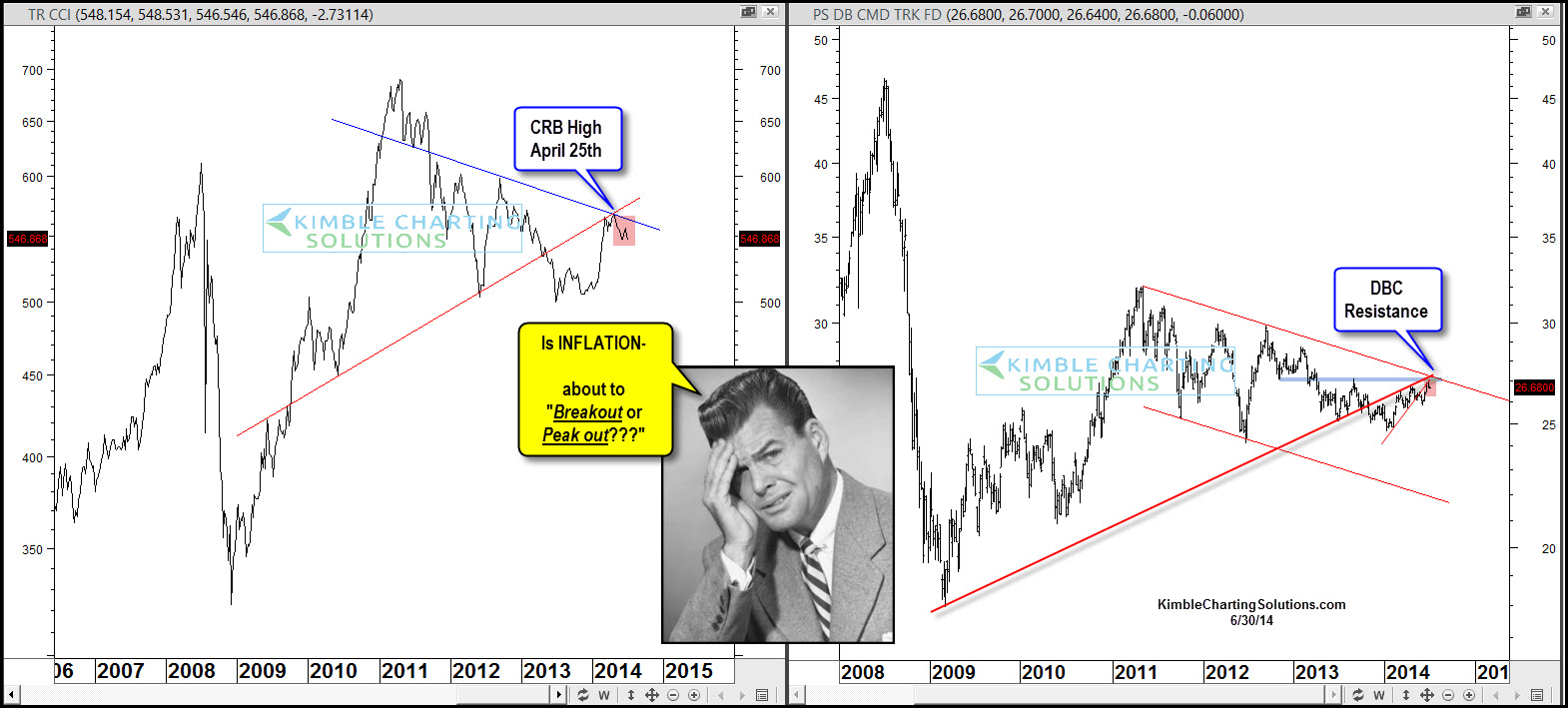
The top 2-pack highlights the CRB index and a leading commodity ETF (PowerShares DB Commodity Index (ARCA:DBC)). The CRB index started moving higher soon after I shared the above chart with members and hit resistance the week of April 25th. Since then it has declined around 4%. DBC has rallied this year taking it up to a couple of resistance lines in the right chart above.
If you've been to the grocery store of late, or pay for health insurance, you are well aware of rising prices in these key sectors of our lives. This is just a couple of areas of our lives that prices are moving higher.
The CRB Index and DBC have created lower highs over the past few years. Are inflation related assets about to Peak Out or Break Out? What happens with these two in the next few months could tell us a ton about pricing pressures in many parts of our lives and forecast appropriate portfolio construction.
Will prices move closer to the definitions of inflation or deflation going forward???
