William Bernstein penned an intriguing e-book a few years ago that considered the possibility that correlations are destined to rise among asset classes due to indexing’s growing popularity. “The average investor can build and manage multi-asset class portfolios to a degree that was once the exclusive province of institutions,” the financial planner wrote in Skating Where the Puck Was: The Correlation Game in a Flat World .
“As a result, the low-hanging fruit of low correlations has probably been picked.” If he’s right, designing and managing asset allocation strategies faces new challenges in the years ahead. For some insight on how Bernstein’s 2012 observation looks at the midway point in 2016, let’s crunch the numbers for a preliminary evaluation via a broad set of ETFs and mutual funds.
But first, let’s recognize that there’s a lot at stake here. If Bernstein’s thesis is correct, risk premiums may be lower, in part because correlations will be higher. (There’s some support for this line of thinking, as suggested by The Capital Spectator’s monthly reports on projecting risk premia of late–see here, for instance.) In that case, you’ll have to work harder (and smarter) to keep portfolio returns steady relative to a given risk level. That’s hardly a reason to abandon asset allocation. But it’s a reminder that managing the mix isn’t getting any easier.
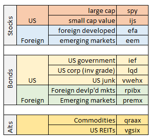
Let’s turn to the data for some insight. Generating rolling correlations across 11 funds is a computationally expensive task and so we’ll use R to perform the heavy lifting. Note that I’ve borrowed a few lines of code from Ramin Nakisa for calculating and packaging all 55 pairwise correlations into one data set. (Don’t try this in Excel!). The procedure here is generating rolling 3-year correlations using daily data, which begin at the start of 2007 (based on price data from the close of 2003). And here’s the R code to generate the data shown below. Also, note that the correlation analysis is based on the following 11 funds, which serve as proxies for various asset classes:

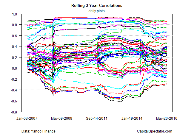
Here’s how all the correlations stack up in a single graph.

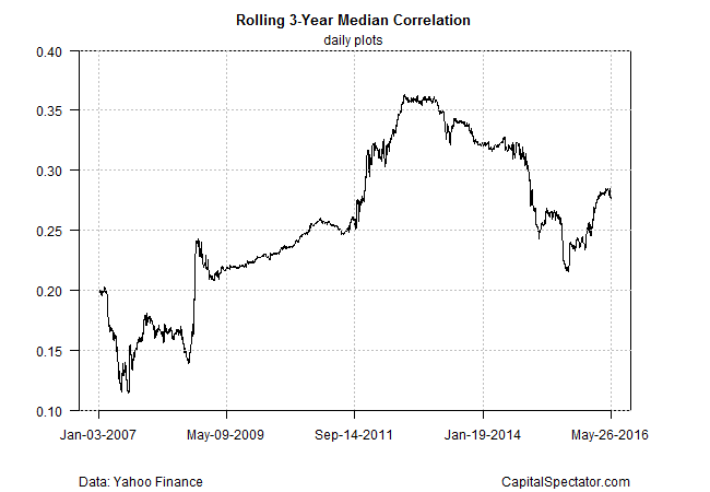
Yikes! That’s a lot of data and not particularly useful for deciding what’s going on. Let’s boil this down by computing the median correlation for all the funds, as shown below. Note the rising trend in recent years. Although the median correlation has fallen to around 0.28 from 0.33 in mid-2014, it’s clear that there’s a generally rising trend over the past decade. Indeed, the median correlation for the 11 funds listed above was routinely below 0.20 in 2007 and 2008, before the market meltdown in the wake of Lehman Brother’s collapse in Sep. 2008. (Note: a correlation of 1.0 equates with a perfectly positive correlation; 0 indicates no correlation; negative readings reflect negative correlations.)

In other words, Bernstein’s 2012 prediction that correlations are destined to rise appears generally accurate. Granted, a median correlation in the range of 0.25 to 0.30 is still quite low–low enough to make the case that holding a broad set of assets is still a productive strategy. Nonetheless, it appears that a degree of correlation inflation is in progress. If so, there are implications for asset allocation. The potential rewards for tapping into the so-called free lunch of asset diversification–reducing risk without impairing return—may deliver less-impressive results going forward.
Then again, there’s more than one way to analyze correlations and so the results can and will vary, depending on how you crunch the numbers. Is rolling 3-year data appropriate? Should we use weekly or monthly returns rather than daily? And how should we define the list of assets for analysis? And what about modeling for developing intuition on correlation paths in the future? In short, there’s plenty of room for customization and deeper analysis.
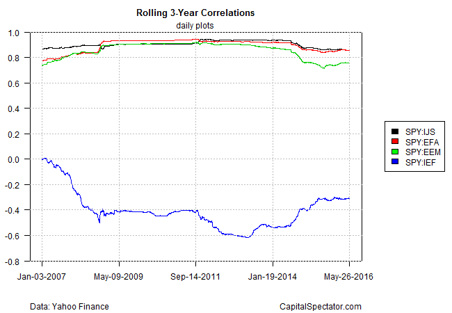
But this is a blog post rather than a consulting project and so let’s wrap this up with one final example. The next chart below shows rolling 3-year correlations for the US stock market (SPDR S&P 500 (NYSE:SPY)) vs. foreign stocks in developed markets (iShares MSCI EAFE (NYSE:EFA)), emerging markets (iShares MSCI Emerging Markets (NYSE:EEM)), and US Treasury bonds (iShares 7-10 Year Treasury Bond (NYSE:IEF)). Not surprisingly, the equity correlations are quite high between equities (stock beta is stock beta, with only slight variation). Yet note that equity correlations have eased a bit in the last two years. Meanwhile, the correlation between US stocks and US government bonds is moderately negative (blue line at bottom of chart below), which marks a conspicuous change from the roughly zero correlation in 2007.

It appears that correlations overall are trending up. But that may not be relevant for every portfolio, as the last chart above suggests. The foundation for asset allocation—holding stocks and bonds—appears to be as valuable as ever, or so the negative correlation between the two in the chart above implies. That’s no guarantee that the future will dispense a similar result. But for the moment, it’s hard to argue via correlation data that the traditional benefit of a stock/bond portfolio has evaporated.
