Investing.com’s stocks of the week
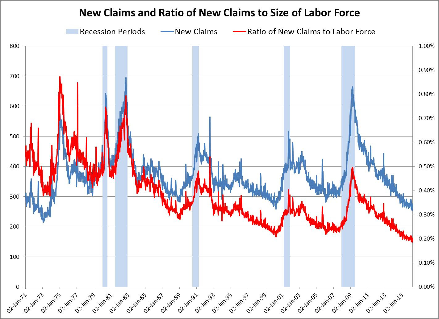
Much was made of last Thursday’s release of new claims for unemployment insurance. The weekly total of 247,000 was reported to be the lowest since the fall of 1973. Clearly, this must be interpreted as a sign of an improving labor market, as more and more people are employed. Most recent BLS data show that hires, job openings and quits have all been steadily increasing as the labor market improves and more and more people feel comfortable leaving their present jobs for other, more attractive positions.
The FOMC meets this week and we know that the labor market will be high on its list of discussion items. From previous minutes we also know that participants will drag up their favorite measures of labor-market conditions to support their particular policy positions. What I would like to suggest is that the 247,000 new claims offer stronger evidence than the raw number suggests, especially when compared with the experience of the 1970s or even lower numbers in the 1960s. But as we shall see, comparing the absolute numbers years apart can be misleading because both the labor market and the real economy are much larger now than they were then.

The above chart shows the absolute number of new claims in blue (left scale) and the ratio of new claims to the size of the labor force in red (right scale). The new claims numbers are similar to those of the early 1970s, but relative to the size of the labor force, today’s numbers are less than half what they were in the 1970s. Clearly, today’s new claims imply a much more robust labor market than in the 1970s.
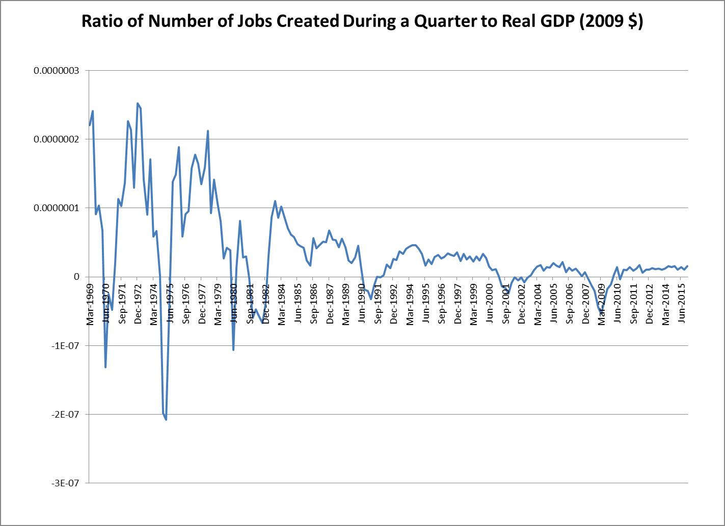
However, before we get too excited about the new-claims data, we should also look at another set of absolute numbers, the new-jobs data reported in the BLS’s Employment Survey. The following chart shows the ratio of new jobs created per quarter as a percentage of real GDP. The striking feature is the sharp decline in job creation beginning in the 1980s relative to the preceding period. To be sure, that earlier period was more volatile, but we got more jobs per dollar of real GDP then than we were able to generate in the next four decades.

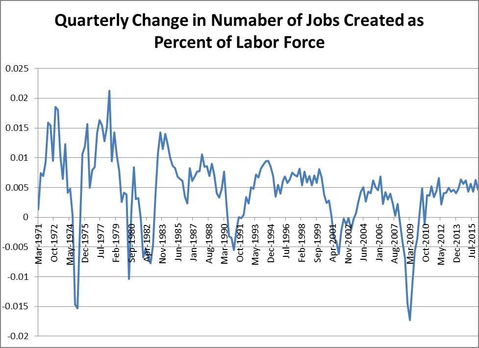
The same general picture emerges if we look at the ratio of new jobs created relative to the size of the labor force, as shown in the next chart.

Put another way, if the economy were creating jobs today relative to real GDP at the level it did in the 1970s, we'd be seeing monthly jobs numbers in the range of 520,000 to 540,000. Clearly, by that standard our economy is still underperforming.
But the other clear conclusion is that our low jobs numbers coming out of the Great Recession are not due solely to the damage that was done to the economy by the crash, but are instead part of a longer-run secular problem. We know that the structure of our economy has changed significantly since the 1970s as we have moved increasingly to a service economy. Many industries and much production have moved offshore and we have replaced low-productivity jobs in many sectors of the economy with higher-productivity jobs through the extensive application of new technologies. Domestic car production today in modern plants in Mississippi, for example, looks far different than assembly lines used to look in Michigan. So while the new-claims data relative to the size of the labor force may suggest an optimistic view of the current labor market, the job creation numbers tell a different story that is worthy of much further study by policy makers.
To some the glass may be half full, but it is also half empty.
