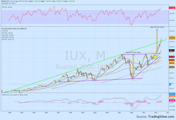
The Russel 2000 is known as the Small Cap Index. It historically outperforms the larger cap indexes like the S&P 500 and Dow Jones Industrials, as would expected of smaller higher growth companies. It has also been leading the markets higher throughout the rally that began November 2012. The monthly chart below shows that the the Index broke above the trendline resistance that connected the 2007 and 2011 highs in January of 2013 and has been moving higher since. For the technician the start of the rally was not unexpected as the Hammer reversal candle in November was confirmed in December. Looking back further the trend support line that goes back to 1997 creates a channel with that resistance, and augers for a move to 1334 from the channel break and the ascending triangle since 2009. There is also a rising trend resistance line that goes back to October 1989 that was broken to the upside in November 2013, 24 years later. The trend is clearly higher and with the Index holding over that green trendline in November and then extending it in December it looks positive.

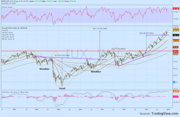
But there are also signs that the move may be running out of steam. The Relative Strength Index (RSI) is at 77, in technically overbought territory, and above levels where it has corrected from in 1994, 1996, 1998, 2000 and 2007. This does not mean it cannot go higher or that it cannot correct by moving sideways. A pullback is not a certainty. The MACD is rising and looks strong, but it is at levels it has not seen before. So the trend is higher but with potential for some reversal. This requires a shift to the weekly timeframe to look for clues for the next few months. It does not show the overbought condition that was prevalent in the monthly chart. It does show some incentive for a pause though. There was an Inverse Head and Shoulders pattern that broke the neckline in November 2010. After retesting the 2007 high and a short pullback it has just not reached the price objective of that pattern near 1175.

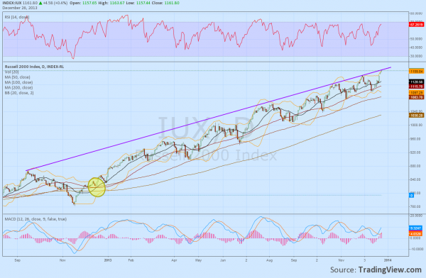
The recent consolidation over 1100 can also be explained by the Index reaching the target of the ascending triangle break from January 2013. But the Simple Moving Averages (SMA) unmistakably show that the trend is strong and higher. All are rising parallel and below the Index. A pullback on this timeframe does not look imminent. The daily chart also looks strong and the chart below highlights the trend since the November 2012 bottom. The 50 day SMA has been acting as support with the occasional retreat to the 100 day SMA. The tight crossing jumble of SMA’s acted as a catalyst in December 2012 to ignite the rally and it has had an ebb and flow to it. This created a rising trendline resistance which it is touching now. A pullback is not unexpected here, but the recent history would suggest it would be limited to about 1115, near the 50 day SMA.

On the monthly chart that would be barely measurable. But it would retest the support of the last consolidation following the triangle breakout on the weekly chart. So failure could crescendo lower to 1000 or lower. To keep moving higher it would be healthier for the Index to move sideways for a while or to have a small pullback, like to 1100 or 1000. That does not mean it will. The charts suggest that this rally is going to continue but the caution flags are rising up the flag pole for some sort of a slowdown or pullback.
